This is an updated version of a post I wrote back in 2013 about Julie wrestling with her quilt, See Rock City.
It was my Mother's comment that spurred Julie to make major changes in
the quilt, which she had thought was finished. The "Meh" story is hinted
at in Julie's book.
Honesty is crucial in a good relationship. But so is kindness. Julie and I get along so well because we tell each other what we see in each other's work, even if it isn't complimentary. At this stage of the game, we have so much trust in each other that know it will be beneficial, and we have each gained from the other's perspective. Julie had worked so hard on her barns and they were truly breathtaking. Julie had really cracked open something inside herself and made a terrific breakthrough, but then she stopped. I knew it right away, but hesitated. I didn't want to hurt her feelings. When my mother expressed the same disdain, I knew i had to tell Julie. I knew I wouldn't be a good friend if I kept silent. So this was a big moment in our friendship. And I didn't do it via email. I picked up the phone and called her. I have to say, however, that I had NO IDEA that the SECOND part of Julie's quilt would be as big a breakthrough as her first. She didn't just go for it, she WENT ALL THE WAY. I was, and still am, so proud of her for her courage and the fearlessness with which she tackled it. And she did it (pardon the pun) like a barn on fire. Julie generally makes her quilts very methodically and patiently. But when she took the blocks apart and rebuilt the thing, she worked like a proverbial tornado. I don't think I've ever seen her work that passionately or voraciously since. Then again, I could be wrong. After all, I do live 1127 miles away...
(This jumps a bit ahead in our friendship story timeline, but I'll get back to it next time.)
Back in November of 2013, when I was making letters for Too Much Chicken, my Mother and I had lunch together.
"That quilt of yours with the box... " she said, "the one where the words pop out of it...
(The Black Box) That's a piece of art, and deserves to hang in a museum."
Then she continued, "The one you're making now, with all the letters," she paused. "Meh."
This is an in-progress shot of the Chicken quilt. Yes, it was kinda boring.
I laughed. "Ma, the one I'm making now with the chickens is just a silly
quilt. It isn't anything close to the Box. I'm not done. I've got a lot
to do still."
I really enjoyed telling the story of lunch with my Mom, both on this
blog and to my colleagues at work. What was really interesting though,
was the reactions. Most of them were of the "You are so lucky to have a
relationship with your Mom where you can tell each other what you really
think," variety.
My Mom thought Julie's quilt, "See Rock City," was a knockout, and deserved "Best in Show."
It was true, but
that wasn't what struck me.
What really struck me was the concept that
many artists simply don't have anybody to give them a good critique.
What's a good critique? A good critique recognizes craftsmanship (or
good drawing), design (or structure), execution (or technique.) The
rules apply to these no matter what the medium. A good critique will
tell you
if what you've created is what you think you're looking at.
Let
me explain.
Sometimes you work so hard on something you can't see it.
You can't see what's wrong, you're too close. You need to step back, or
take a walk and look again with a fresh eye. A good crit comes from
somebody else who brings a fresh eye.
Somebody who isn't tainted by
being in love with the idea.
The most important thing
is the crit is about the WORK, and not the PERSON. My Mom can paint, and
draw. She's been making a living as a working artist for over 40 years.
She knows what she's doing, and she can tell right away. She knows to
consider only what she's looking AT, and not criticize or offer her
opinion on what I am trying to DO, whether my
concept is a good idea or
not.
We know that juries or judges don't care how much work you put into it,
or how hard you tried to come close to the idea you had in mind. If the
artwork doesn't say it on its own, there's not much else that can help
it. (Quite frankly there's nothing that bugs me more than a little story next to the piece that explains what you should be seeing. To me, that's a crutch, and it's like cheating. Like somebody explaining the joke. Unnecessary.)
A good critique can help you know if the artwork (or quilt) says
what you WANT it to say, or if it doesn't.
A good crit tells you what is
working, and what isn't. What isn't? Maybe something is taking
attention away from the main idea. Maybe some elements are competing
with each other. Remember, a good piece of art is one where all the
elements convey the main idea TOGETHER.
My Mom and I also know the difference between what we like (subjective) and what
we're looking at (objective.) I am not interested in making traditional
quilts (subjective), but I can tell a really good one from a mediocre
one (objective.)
This is what my Mother looked at and said, "Meh."
The subjective is what the "Meh" came
from that day. My Mom simply loves color, and a mostly grey chicken
quilt just doesn't float her boat. (Meh!)
But "Meh" can
also mean, "It's not as good as it could be." or, "It's just so-so."
It could be a good idea and poor execution, or some variation of "good
start, lost energy, direction..." whatever.
My Mom thinks this could be an award-winning quilt and deserves to hang in a museum.
Regular readers know I'm always after the emotional response. I want
you to look at my quilts and say "WOW." The Black Box does that. If you
followed along my journey of making that quilt, you know there were
times when it just didn't have that punch, and I set it aside for a
while to regroup.
"Meh" isn't necessarily a BAD thing.
"Meh" can simply mean, "I've seen it a million times before, it's
pretty, but it's boring." If you like making pretty and
same-old-same-old, that's OK. It's not for me. Which is not to say
making lovely quilts is a bad thing. There are a lot
of truly beautiful quilts out there. Hell, I make pretty quilts too, in
between the "Arty" ones. They are different, and they have different
audiences.
When my Mom looks at one of my "pretty"
quilts (Sunshine, Exquisite, Rainbow Baby) and says "It's nice," in a
rather bored tone, I know what she means, and I'm not offended. (For the
record, my Mom loves the
Red Sticks quilt, and the
Sunburst Rainbow.)
The
"Meh" can also be a swift kick in the ass. It's a "Look, it's okay, but
you can do better than that." It's a call to action. It's a "What
happened, did you lose your nerve?" or a "Is that it? You're stopping
there?"
Want proof? When my Mom saw the Barns quilt when Julie first put the blocks together, do you know what she said?
"Meh."
Yup.
I had had my own reservations, so I called Julie and told her. Julie
had been having second thoughts on her own, so she took the quilt apart,
removing the dark blue border around each barn, and then went into her
studio and made it better. The result is the second photo in this
post.
We learn best not by the things we do RIGHT, but
from the things we do WRONG and if we're paying attention... by the
things that elicit the "Meh."
~ ~ ~ ~ ~
By the way, a few days later I told Julie what my Mother said about the
Chicken quilt in progress ("Meh"). I told her my job was to change my
Mother's opinion from "Meh" to "Magnificent."
"You're not worried about doing that are you?" Julie asked.
"Too Much Chicken" finished.
"Hell no," I replied.
When I showed my Mother the finished quilt, "Too Much Chicken," she loved it. "I love the way you used the colors."
I laughed, "Ma, four months ago you hated the colors."
"Yeah I know."
Don't let a "Meh" stop you in your tracks. Use it to push from "Meh" to "Magnificent."


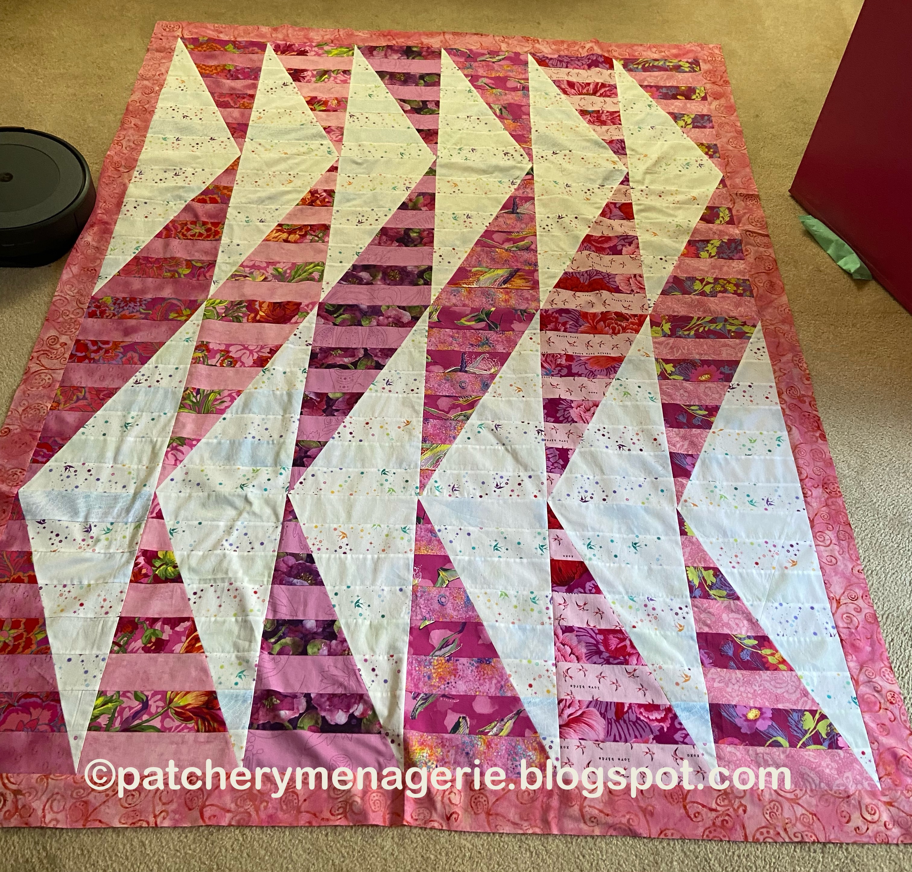
 I had fairly strong contrasts between the pairs in the sashaying triangles, but the secondary triangles didn't really have any place to go. Their darks were often equal in value to the lights directly adjacent. So the sashaying triangles did their thing, sorta, but the lighter triangles really distracted from that. And THEIR dark fabrics didn't sink back into the background, so they fought with the sashaying ones.
 In Greensleeves, the sashaying shapes are LIGHTER, and while the contrasting shapes are not all darker fabrics, (they are generally duller, or less intense) there is a kind of ambiguity that makes it work. The other thing that makes it work is the sashaying shapes have brighter, more patterned fabrics which capture your eye. And this photo is somewhat deceiving. In real life, this quilt is much more successful than in the photograph.
 However, it was the biggest piece of light anything in my stash that was big enough (yardage wise) to do what I needed to do. I didn't mind the blue, because there are several kinds of color contrast: Value, Hue, and also Temperature. The pink quilt use primarily Value contrast, so introducing a cool bluish white was another way to make the pink show up. Besides, I keep telling everyone that pink is really nothing more than a light red violet. So in color formula it is this: Red = R, Violet = Red + Blue. Thus pink is a light RRB. Blue is an inherent part of pink, so the blue was not out of place.


 Lastly, some have asked WHY did I take this apart? What did I think was WRONG with it?