Last night, as the Alcatraz / Medvedev match went through the third and fourth sets, I cut my strips and this morning I sewed them together and cut them into triangles.
(btw, WHAT A MATCH! NOBODY saw that coming.)


In the drawing I didn't bother taking the time to make it fussy - I wanted to convey the idea that the lighter areas were connected to the shapes by their color.
 I had fairly strong contrasts between the pairs in the sashaying triangles, but the secondary triangles didn't really have any place to go. Their darks were often equal in value to the lights directly adjacent. So the sashaying triangles did their thing, sorta, but the lighter triangles really distracted from that. And THEIR dark fabrics didn't sink back into the background, so they fought with the sashaying ones.
 In Greensleeves, the sashaying shapes are LIGHTER, and while the contrasting shapes are not all darker fabrics, (they are generally duller, or less intense) there is a kind of ambiguity that makes it work. The other thing that makes it work is the sashaying shapes have brighter, more patterned fabrics which capture your eye. And this photo is somewhat deceiving. In real life, this quilt is much more successful than in the photograph.
 However, it was the biggest piece of light anything in my stash that was big enough (yardage wise) to do what I needed to do. I didn't mind the blue, because there are several kinds of color contrast: Value, Hue, and also Temperature. The pink quilt use primarily Value contrast, so introducing a cool bluish white was another way to make the pink show up. Besides, I keep telling everyone that pink is really nothing more than a light red violet. So in color formula it is this: Red = R, Violet = Red + Blue. Thus pink is a light RRB. Blue is an inherent part of pink, so the blue was not out of place.
The contrast between the two sets of triangles is what is required to make this particular quit a success. You need the primary shapes (in this example, the six primary colors) to have a great degree of contrast to the fabrics that make up the secondary shapes (the paler triangles. In the earlier versions of the pink quilt...

I believe that if you have to THINK about what a design is trying to do so you can figure it out, then the design is a failure. PERIOD.
What's kinda funny, is that the green version, Greensleeves seems to work in spite of this:

That the green one works better than the pink one is also due to the fact that there is a larger range of values to work with in green than there is in pink. Between light green to dark green there is an ocean of difference. But between light pink and dark pink, not so much (and available fabric makes it less so.)
Now, Gail. You didn't like the reworked pink with whitish because there was, in your estimation, too much blue in the white. To wit:

If you don't LIKE something, that's a SUBJECTIVE opinion. It doesn't mean the design is bad or wrong.
 Lastly, some have asked WHY did I take this apart? What did I think was WRONG with it?
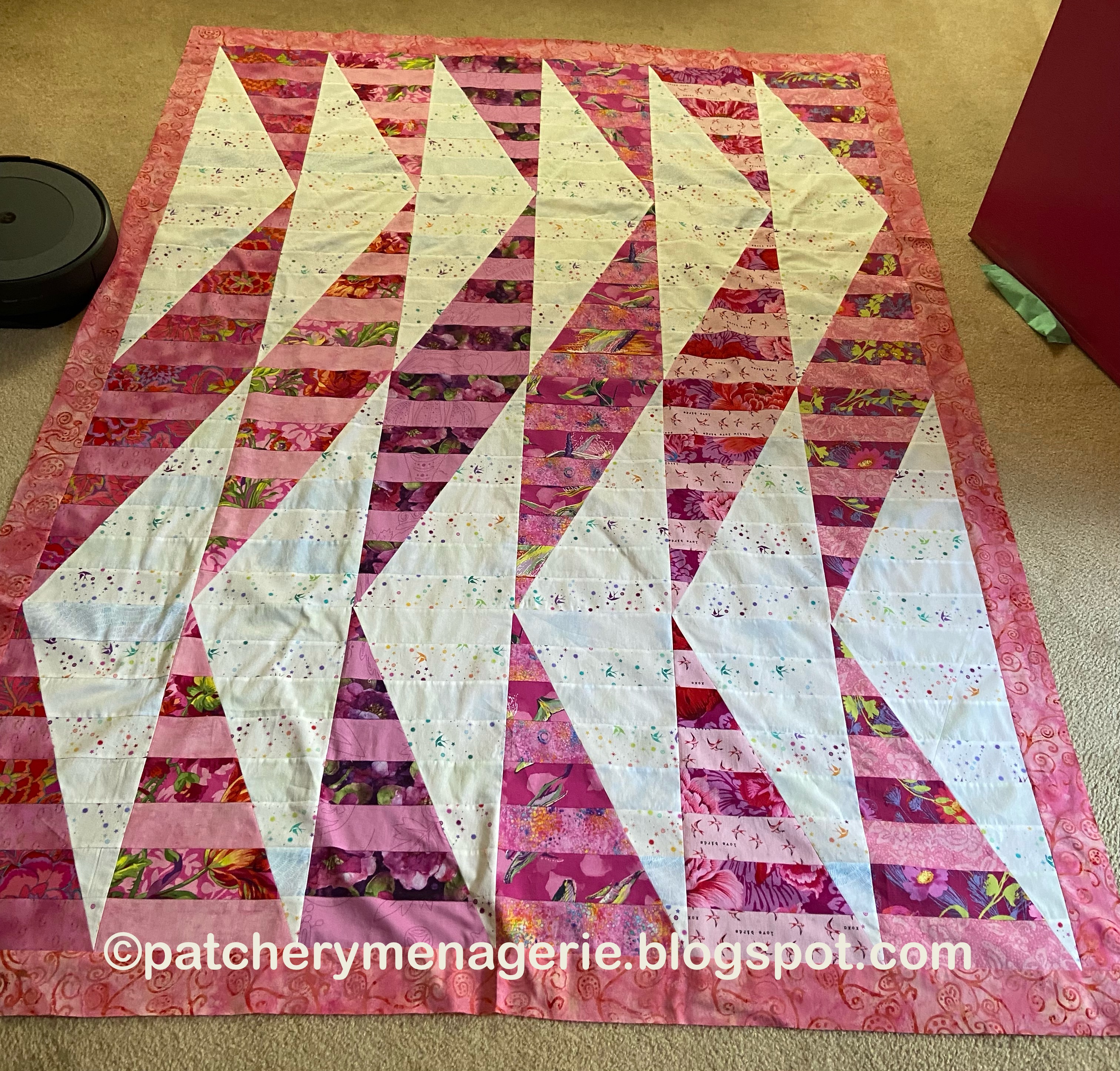
The answer: Nothing. Nothing whatsoever was WRONG with that quilt. It was perfectly lovely. It was fine. It was OK. It was predictable.
THAT was what was wrong with it. It did not SING! It did NOT say "LOOK AT ME!! LOOK AT ME SOME MORE!!!! LOOK AT ME AGAIN!!! Don't look AWAY! ME! ME! ME! LOOK AT MMEEEEE!!!!"
Now, it's OK to laugh. But I am quite serious. With my quilts, I want to grab you by the collar and say LOOK AT ME! LOOK AT ME SOME MORE! OH YOU JUST FOUND SOMETHING YOU DIDN'T EXPECT? LOOK AT ME AGAIN."
This quilt was an epic wimp. So I took it apart.