Here are some before and after birds:
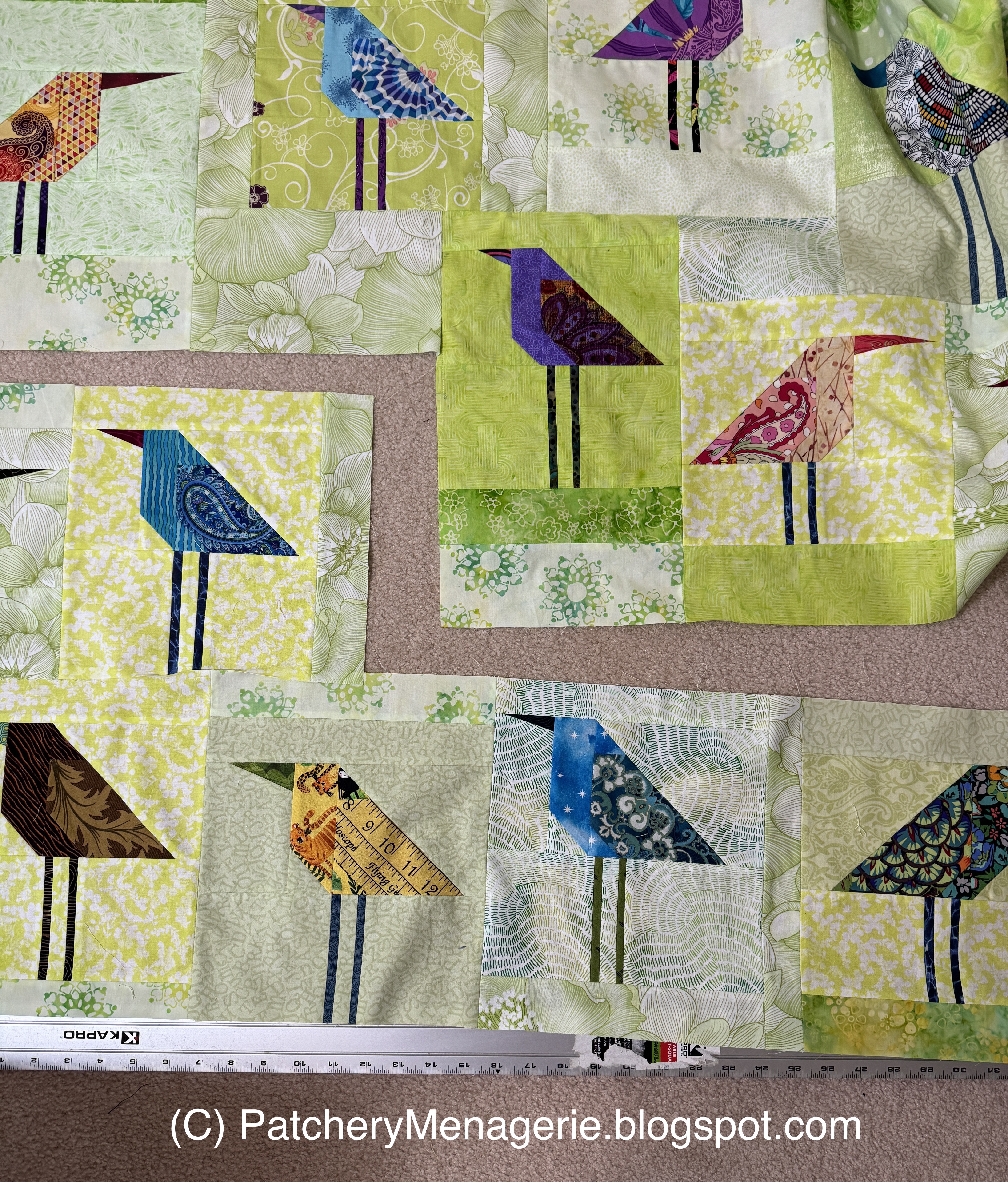
This is a really handsome block, and part of it is the combination of the warm green background and the brown in the breast and body fabrics. The blue-grays in the wing fabric are also warm tones, so this combination is very harmonious.
The bird now doesn't look quite so handsome in photos but in real life it's better. The background fabric has very subtle light green dots that don't seem to photograph well. Still though, if this does not illustrate that colors look different depending on what surrounds them, then I don't know what will.
I really liked this bird, with the flowers on the wing fabric.
Fussy-cutting can really show something off well. Here I think I fussy cut the wing of THIS bird better than I did the original. Just goes to show that you really have to play and possibly risk wasting a little bit of fabric to find something that really sings.
This bird was kind of a missed opportunity. His wing looks ok...
until you see the replacement bird. I always try to fill the wing shape in my birds in an interesting way and I can never understand why other customers and students resist.
One gal actually complained that the birds "waste fabric" because I suggest fussy-cutting. Well at $12.95/yard USD, one square inch of fabric costs 0.00856 cents, or less than one cent per square inch. In fact, at that rate one bird uses up $1.17272 worth of fabric. So my question is, why make something only so-so when with a little more effort you can make something really special?
Let's face it, the basic cup of coffee at Dunkin's costs $2.49. That would make TWO birds.
Here is another original version.
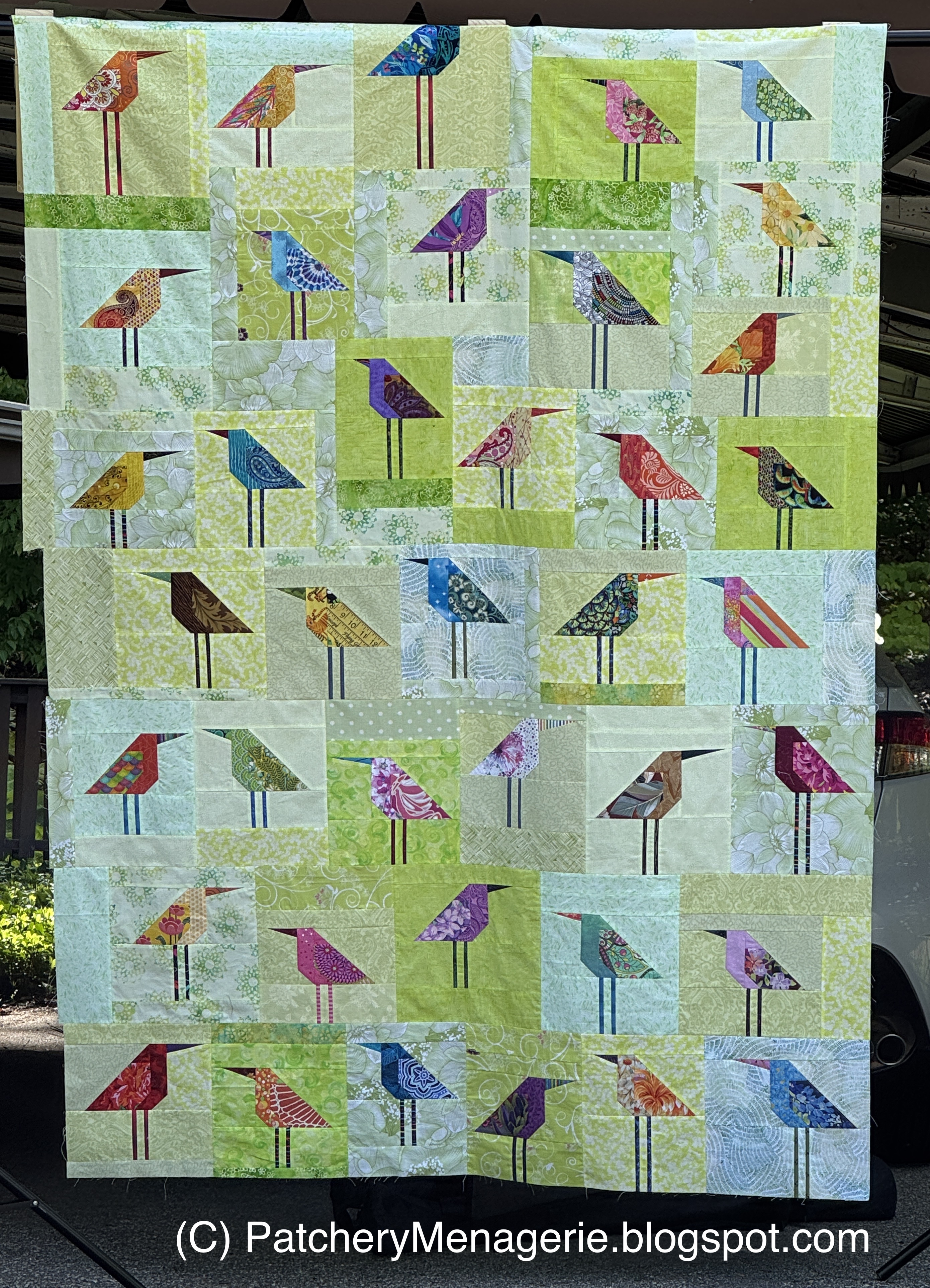
And here's the replacement. I tried to make the replacement birds as close to the original as I could, but that didn't mean I was interested in slavishly copying them. Nobody is going to see the "originals," so they won't know the difference.
I have to reiterate here, that what I didn't like about the "original" birds was the yellow green fabrics of the backgrounds mixed with the birds with the lighter backgrounds. Had I made ALL the birds with the yellow-green backgrounds I would probably have been OK, but that color just didn't sing for me. I thought it was too much of a green that I didn't like. Since I don't want to make work I am not very proud of, I decided to switch gears.
Part of that was I had an idea of where I wanted this quilt to go, and it wasn't going there. I did not feel that what was happening on my design wall was very successful, and filling in the spaces between the birds would have been problematic. The goal of any design is to have a cohesive idea and what was on the design wall was not that. Again, this was MY decision, and MY opinion. There is, always, more than one solution to any design problem.
Happy Mother's Day to all Moms and mother figures everywhere. It's a tough job with no instruction manual and every kid being different and the world changing every day. Go Moms!