Showing posts with label fabric choice. Show all posts

Saturday, November 1, 2025

The HOW and the WHY of Fabric Choices

 I am opinionated. I believe that all other things being equal, fabric selection determines the success or failure of a quilt. 

There are lots of ways to make something look good. There isn't only one right answer. The right answer depends on what YOU want.

Having said that, I really want to make sure the quilts that I make or even simply the birds that I make are as great as they can be. And believe me, sometimes even I have to do it over to get it really right.

To wit:

I used this fun fabric on the back of the PRIZM quilt, and I thought it would be fun in a bird for my Mom's bird quilt because my mom loves FUN and a good joke. So I cut a big triangle and searched through my stash for breast and beak fabrics.

I was probably thinking with only half my brain. The wrong half. I thought the orange would sort of echo the patterns on the cats in the print. And the green would echo the green cats. But seriously, there is nothing to connect the three fabrics together, and compared to the fun cats, the orange and green are pretty boring and don't bring anything to the party. (Also, and more importantly, they don't share any OTHER colors with the fun print, and there's nothing connecting the wing fabric to the breast fabric to the beak fabric.)

Another issue was the pattern of the cats wasn't really being taken advantage of in the best way. 

BACK TO THE CUTTING TABLE....

Fiddling around a little bit (Can you say FUSSY CUT?) I found this fun green guy, and then it was OBVIOUS I had to use some fun green fabric for the bird breast.

And, OH! Look what I found for the beak! These colors repeat the colors that surround the silly green cat!

This is SO MUCH BETTER! And when I found that strip of bird legs with the colored blocks, I knew I had a winner. Silly and fun, here we come!

But you know, sometimes one idea generates another one, and you know me... gotta follow that!

So here are more silly cat-like animals having fun. The breast fabric here is leftover blue fabric from the backing of the Blue Ribbons quilt I just finished. The legs are gray, and they seemed to fit perfectly.

But check out that beak fabric! Yes, those colors are in the funny animal print too....

See anything familiar?

When I say look at your fabric for what it CAN BE instead of just WHAT IT IS, I am not joking.

Here are the two fabrics next to each other, so you can see how much they have in common. This kind of similarity is something you have to be on the lookout for.


You too can make birds: Get my tutorial here, at my Etsy shop.

Saturday, February 18, 2023

The Fabric Makes the Misfit


 When I had the idea in my head to make misfit birds, I had to think what constituted a "misfit." How could I convey, using fabric alone, that this bird was a "misfit" while following the basic brief for this quilt   - that all the birds would be PINK?

This is, in a nutshell, what I "do." I use my fabrics to get the message across. Wanda has said "You use your fabrics to do the heavy lifting in your quilts." That's exactly it. I believe that, all things being equal, fabric selection determines the success or failure of a quilt, and that you really should make your fabric work FOR YOU, because, like, duh, isn't that what it's for?

For the misfits, I wanted fabrics that would be sorta pink, or have a lot of pink in them, but wouldn't be the   things you normally associated with "pink." To get to the fabrics I had to figure out what a misfit was. What do "misfit" teenagers look like? They wear a lot of black, they may have tattoos. They may dress sloppily, or wear mismatched clothes. They may wear clothes with subversive images or ideas.

I thought this pink fabric with the spiderwebs would make the viewer think not only about spiders and spiderwebs (yuk!), but would also suggest tattoos. OK, so now we have the basic part of the bird. But now we need the rest.

I tried different fabrics, but nothing really supported the spiderweb. But then I did this and I thought, I like the colors and the swirls.. AND THEN I HAD A BRAINSTORM!

What if I SWITCHED the two fabrics? Made the swirly fabric the wing and the spiderweb fabric the body?


And then I saw this fabric scrap!!! OH HOLY HELL YES!


Then I figure out how to make the spiderweb fabric work best in the shape of the bird breast and body.

Audition beak fabric, determine placement and shape...


Add some funky legs, (because hello, misfit bird) and Voila!


Remember, YOU know this is a misfit bird because you have watched me create it. YOU know the story about the families of birds, the siblings, the whole concept. But when I show the finished quilt, nobody will know any of that. Viewers will only figure it out as they look carefully at all the birds. They will put it together, because I have left a lot of clues.

AND, because I chose my fabrics carefully, and used them to their best advantage. I remember someone told me once "You have the best fabrics." I said "Maybe, maybe not. But I know how to get the best out of the fabrics I do have. That's more important."


You can get my tutorial about making birds here, at my Etsy shop. They don't use traditional patterns or templates and they are NOT paper-pieced.  

Tuesday, July 13, 2021

What's In, What's Out?

 Remember this photo when I got started? These are the 21 fabrics I bought for the pink quilt.

If you look at them, there are six fabrics I did not use.

I didn't use five of these creams from my stash. I didn't use six of the pinks on the left.

What didn't make the cut? Fabrics that were more coral (light red orange) than pink (which is really a light red-violet.) Pink is generally a little cooler in color temperature. What we call HOT PINK is simply a very intense (brighter), darker pink. It's a synthetic color, usually a variation of a Quinacridone. (Images here.) Of the lights that didn't make the cut, I used whites instead of fabrics with a cream background. This was more in keeping with the idea of the quilt as a cool tone.

To the commenter yesterday who asked how I would sew this together - in horizontal or diagonal rows, the answer is shown above. Why? Because each diagonal here is on the bias, (which means it can get stretched out of shape very easily), so my #1 rule in sewing things together is this: Always stabilize the bias edge. Sew it to something. Since sewing two triangles together here forms a rectangle, and since I am always careful to cut my triangles so two sides are on the straight of the grain*, all four sides of the rectangle are stable. 

Ask me how I know this. I've made enough quilts with diamond shapes to know this to be true. 

(Oh, oh, Snark Attack coming: I believe that anybody who knows how to sew clothes won't have any trouble making a quilt because they know how fabric behaves and how to handle it properly. That means they understand the bias. Folks who don't know anything about sewing clothes with have a tougher time learning to make a quilt. And I think that's because there is so much emphasis on making the quilt top and running a sewing machine, that nobody bothers to tell beginning quiltmakers the importance of the bias in fabric. To wit: If you overstretch it, (like if you press the bejesus out of it and now you have something looking like a potato chip) NO, there is No Way you can fix that. You have to start over.)


*In this quilt only two triangles are fussy cut with no regard to the grain of the fabric.


Saturday, April 17, 2021

More Fabric

 Rebecca left a comment on my last blog post: "... you do that lead in thing very well..." which is a kind way of saying I left you all dangling and waiting for more. That is part of it, but the other thing is that I have friends from various parts of the country who will email me if I don't post regularly. "Are you OK?" they will ask, "You haven't posted on your blog in a couple of days and I was worried about you." So, sometimes, Rebecca, I just post something quick to let everybody know I'm still around.

I really do have something pretty cool in mind for those greens and yellows I showed the other day, but I couldn't quite get started because I had a small logjam in the shape of fabric that I had bought that needed to be ironed. (Which is only partly true. You all know I will throw fabric on the floor if I need space on my worktable...)

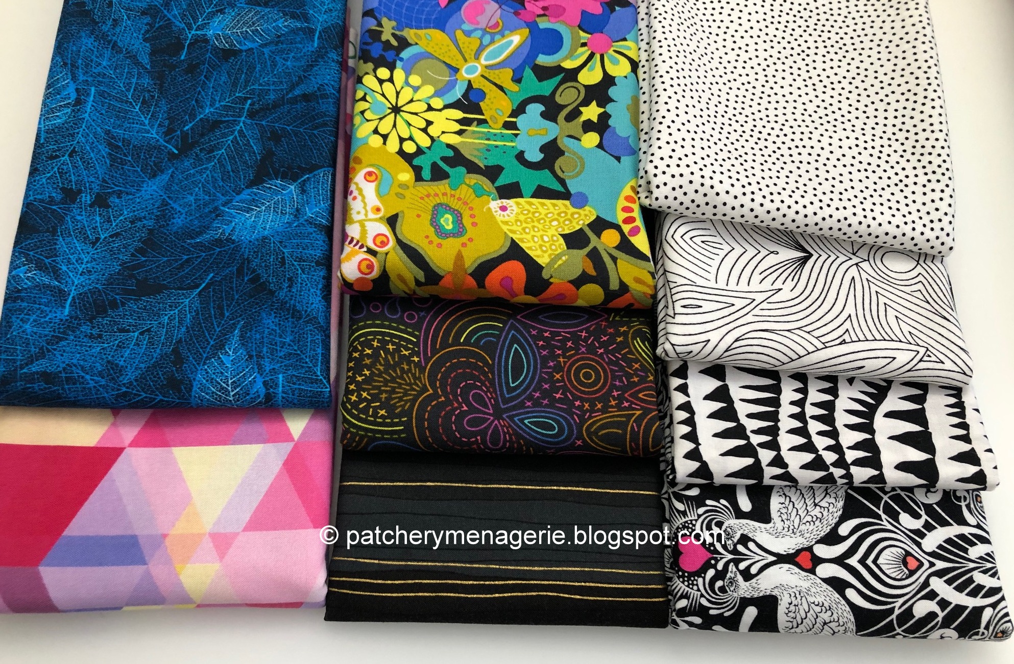
While I was buying some of the other fabrics, I also bought these. I love the black and whites on the far right, I love the top two in the middle (the topmost one is a rainbow of colors on black) and I loved the blue teal leaves. The pink one was on sale and I liked it when it wasn't on sale, so I bought some.

I like blenders, especially pale ones, because I like to fool the eye with them. They are not always easy to find, and since usually only shop when I need something, if I see something I can use, I'll buy it. The two on the top right are WOWs, so that's a no-brainer for me, and the one on the lower right is a slightly busier blender, so that came with me.

Anybody who knows me at all won't have any trouble understanding why I bought these two. LOTS of potential here, and I am a sucker for brights on a black background. I considered the white one at the bottom as the backing for the Gardens of Our Imaginations (Asterisk) quilt, but the shop only had 3/4 yard of it, so I bought it all.

I chose this quilt backing as the backing of the asterisk quilt, but now that it is here in person I am less than thrilled. Instead I will probably use it for one of the Bananas quilts, which will be a utility quilt.

I've put my hand here so you can see the scale of this print. It really would be perfect for the Asterisk quilt, but it is a digital print, and thus more expensive than most yardage. I believe the backing and binding of a quilt is as important as the frame around a painting, so it is important to me the find just the right backing for a quilt. I'd need six yards for the backing of the asterisk quilt, and the more I thought about it, the more I felt it really WAS the right fabric, so I searched online and found it. It is on order.

By the time my readers in the US are reading this, I'll be in the studio cutting up those yellows and greens I showed you the other day, but I must warn you, I will have a knockout quilt to show you (not made by me) and I will interrupt my posts about the green and yellow quilt when the story is ready.

I PROMISE it will blow you away. I love it when my students take what I teach them and make something of their own with it. Ronda made a bird quilt, quite unlike any bird quilt I have ever seen. YOU WON'T WANT TO MISS IT!!


Oh Rebeca, THAT was a tease (aka lead in...)

Friday, March 12, 2021

Fun Stuff & Fixes

 If, when you look at your quilt, and you see stuff that bugs you, you should fix it. (You really should. DON'T fix it, and it will bug you every single time you look at the quilt for the rest of its existence.

Take these two green dragonflies, for instance. They are too much the same too close to each other, and they create a focal point on that block that I do not want to be there. 

It was a simple fix, and now it looks better.

SOMETIMES you get ideas and you should act on them. Or at least try them out. With one of the background fabrics looking decidedly like outer space, when I noticed this scrap in my stash...

I thought I could fussy cut it to get a couple of the cute rockets and stars in a block.

Great block! Just what I was after.

Until I looked at in on the design wall when I stepped across the room. It was the biggest, brightest red orange thing on the wall, and my eye went RIGHT TO IT. (sigh)

I wanted the curious viewer to see it, but I didn't want to make the rockets "hit you over the head" obvious.

This is much better.

 I am going to use the little satellite in another block!

Regular readers know how much I like to fool my viewers. The light green center of the block on the right is one example. It clearly isn't white, or light blue, but there are enough light values in the quilt so the casual viewer might not notice it is green right away. I'm not quite convinced, but so far the presence of this light green in the quilt doesn't bother me. 

But look again at the fabric surrounding the green in the block above. It isn't black, and it isn't dark blue. It is a purplish brownish color. I am going to put it in the quilt anyway. Purple is close to the dark blue and the blue black I am looking for in this quilt, and more importantly this fabric exhibits another one of those color rules you know, but probably never put into words. It is this: Value trumps color. If you get a fabric close enough to the chosen value of another fabric, it will look like it belongs there, and not disturb the eye.

If you were in one of my classes, you would have heard me say, (if you, for example, said, "I can't use this, the color doesn't match...") "Don't be so darned literal. Back up. If you can't tell the difference from six feet away, your viewer won't either." This is another example of how you can get your stash to work for you You do not need to have a room full of fabric to find the right one to use. You just have to look at your fabric creatively.

I was at Quilted Threads last summer, and while I was waiting in line (six feet apart, masked), I happened to look over to where a lady and her husband were holding a pile of blue fabrics and conversing over a pattern the lady clutched in her hands. From where I was standing, six feet away, the four bolts the man held in his arms looked like the same color. I had to look away and think of something else. WHAT I REALLY wanted to say was, "Are you planning to use all four of those dark blues in that one quilt? Because from here they all look alike, and I don't know what you're planning to do with them, but unless you separate them somehow, they are going to look like one big blob and you aren't going to like it." Of course I kept my mouth shut.

What was the difference in the two situations? In my example, I wanted to fool the viewer into thinking the two fabrics were the same color. In the second, there was nothing to distinguish the various fabrics apart from a distance, and you know I've said more than once that you want to avoid areas in your quilts where there are too many darks clumped together, because it will read like a dark blob.

Finally, my friend Julie sent me this medallion to stick to my sewing machine. It's about the size of a quarter. As a member of the mask-making brigade, it is entirely appropriate.

Tuesday, February 16, 2021

The Fabrics of Blue Ice


These are the fabrics I bought last week. They arrived, surprisingly enough, on Sunday. After taking this picture, I ran them through the washing machine.

My friend Buffy asked if I took my fabric out of the dryer slightly damp and ironed it right away to get rid of the wrinkles. As if. I get it out of the dryer, and then drape it on a table, like this, or over the back of a chair to minimize wrinkling. If I leave in in the laundry basket and Millie naps in it, I have to run it through the washer all over again.

Buffy asked about how I bought fabrics. "I was so surprised to read that you rarely buy more than half a yard." That's partly because I can buy more fabric that way, and it's also part of my experience. Unless I am making a quilt with eight major fabrics, I can get away with buying a lot less. 

I thought in addition to seeing what I bought in the top photo, that you might be interested in hearing WHY I chose the fabrics I bought, and I thought you'd like to see them "up close and personal." This dark blue black print looks pretty obvious when you see it with the light shining right on it, like in the photo above,

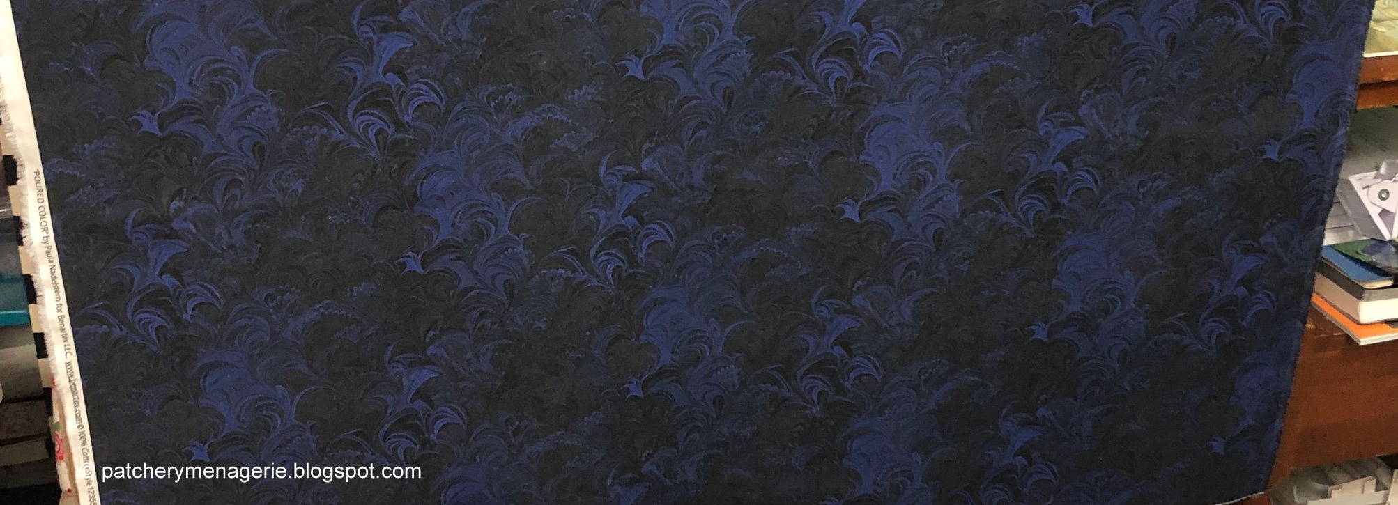
But this is what it really looks like, and once I get it up on the design wall, all you are going to see is almost all black. This is what I mean when Julie and my son say "your quilts look great in pictures, but in real life they are SO MUCH BETTER. It's like they are completely different." As you can see, I bought a full yard of this. I felt this was going to be the "backbone" of the quilt, and I didn't want to run out.

This blue is a bit too green, but otherwise this fabric most closely resembles the color story I saw on the road last week. When I buy fabric, I care not one whit about which manufacturer or which "line" I buy from.

This is another fabric I bought a full yard of. For me it has POTENTIAL written all over it. I knew my quilt would have other colors than dark blue and blue and white, so to me, this was fine. I don't think "Oh that could be like star in the night sky...." I don't get that fussy. Generally I scream through the fabric options pretty quickly, stuffing everything I like in my shopping cart. When I've gone through everything, I'll open up the design board and put all the fabrics in it to see if they play nicely together. It's pretty obvious when stuff doesn't fit, so I delete it from the cart. I'll make decisions about how much to buy of each when I've narrowed down my choices.
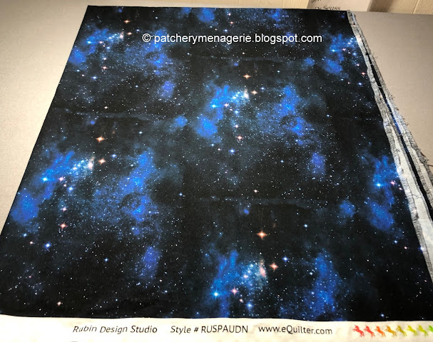
If you want specific color combinations, you don't always have a wide selection from which to choose. If you say "Dark blue with black and white" 90% of people will think "Night Sky." This isn't exactly a wildly creative rendition of these colors, but it fits the profile of what I needed, so in the cart it went. Now look, we all know it is so dark I can't put it right next to the very first fabric I showed you (because that would make a BLOB of Too Much Dark), but I know that before I get started. So that's another reason I didn't buy a yard of this. Plus I think this print is a lot less interesting to look at than that first one. (Oh, and if you look up at the sky at night, you will not see blue patches like this.)

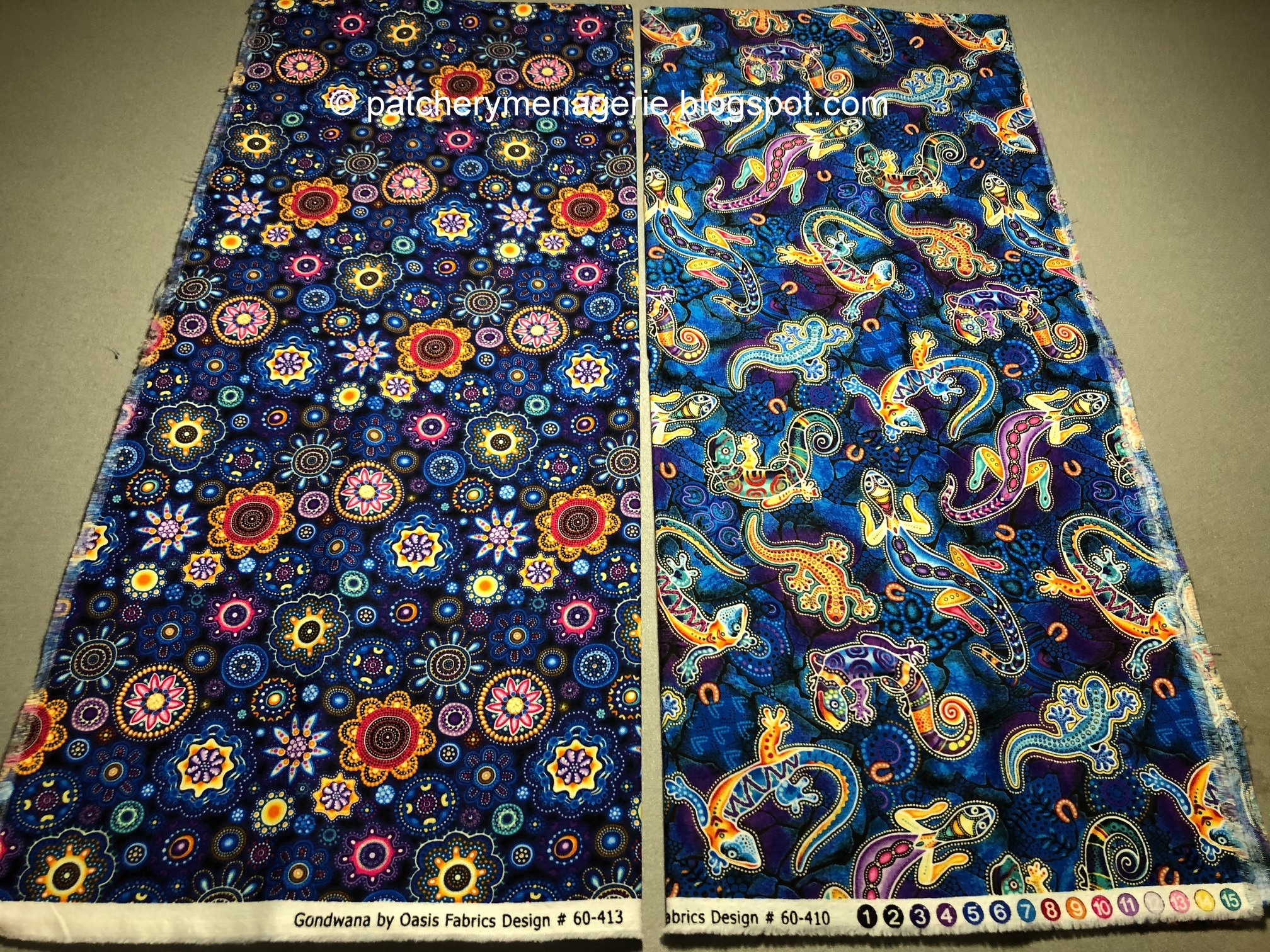
This is a gamble (for this quilt anyway.) It is Big. It is BRIGHT, it can steal the show. But all quilts need a little bit of the unexpected, a kick-ass fabric that grabs your attention and MAKES YOU LOOK. This could be it. Besides, as you will see from my other choices this fabric holds all of the other colors (literally) and will tie with all the other fabrics that have those colors in the quilt. AND ANOTHER THING. I have learned that the PRINT carries your eye, but also CONNECTS the colors throughout the quilt. This will have to be used very judiciously, so it doesn't take over. And if it does, it will be because I decided to let it.

I have no reservations whatsoever about this one. It will work just fine.

This will probably work. If the blocks are big enough this will be fine. But it wouldn't work for smallish blocks, because the light dragonfly bodies could bump up against other fabrics and "leak" into them. I don't like that. I generally like to see my fabrics and blocks clearly delineated.

There is ONE fabric designer I know and love dearly. This is Philip Jacobs. Why it is here should be no surprise to anyone who is familiar with my work. Clearly since I am planning to make "long rectangles" I will use this fabric in the direction for which it was intended, and because of the scale I bought a full yard. (Besides, it's Philip Jacobs!!!)

I don't think I fully realized the scale of this print when I threw it in my shopping cart, because it is pretty clear that while it is TERRIFIC, I should have bought more. This is a half yard cut, and I will have to use it very judiciously to get all the bang for the buck this fabric offers.

This is an interesting pair. They are from the same fabric line, and although when you look at them like this you can see they are clearly different, they share so much similarity, that in the quilt you may think they are the same print. So clearly I only needed a half yard of each.

These two are blenders. The one on the left, I have no doubt will work fine, the one on the right... I don't know. It's almost too pink. We'll have to see what happens on the design wall. Sometimes you don't know these things until the fabric is in your hands. If it doesn't fit in this quilt, no worries, it will land somewhere else.

Violet lives on one side of blue (blue + red = violet), and green lives on the other (blue + yellow = green). Teal is really blue-green. In the real world, according to our light spectrum, as things get darker they get more violet (not black, black is just the absence of all color because there is no light). So even though I am tinkering more on the blue violet side of the spectrum, as this moves to the light, there can also be green, and since so many of the other fabrics had some green in them, it is appropriate that these fabrics are in the mix.

(OK, so I didn't do that whole logical thing above when I was picking these fabrics. I just thought, Oh, these will go, so they went... right into my shopping cart.)

The fabric on the left brings the color story I have in my head into the light, but because it is a geometric, it might not work. (But it might, so that's why it's here. You never know until you try, and cut properly (you all know how much I love to fussy cut), this one could be perfect. The one on the left is roll-over-brain-dead obvious. (At least to me.) 

That's it for the "darks and mediums." Now for some lights.

If I want the one on the left to read as LIGHT I'm going to have to be careful about how I cut it. The one on the right is iffy, but again, no risk = no reward.

BY THE WAY... and totally off topic, go watch this: Seven Minutes of Terror. (It isn't what you think.)

Yes, you have seen this print before. This is a different colorway.
 

These are the fabrics I had in my stash when I got started. CLEARLY this are too much the same, and needed help. I put my hand down so you could see the scale.

Here are more from my stash. Some of these might work, some won't, but hey, better to have a BIG selection from which to choose.

Many of these PROBABLY won't work, but hey, quilts change direction midstream sometimes, and you gotta go where it leads. What the quilt wants, the quilt should get.

If you haven't heard me say it before, let me say it now: The success or failure of a quilt depends ENTIRELY on fabric selection.

Well that's it for now. I hope you have enjoyed this trip through my head and why I bought each fabric in this group.