Marybeth wondered where the wallpaper came from.
I got it online at Home Depot. I ordered the shower faucet, shower doors, the metal shelf and the vanity all at homedepot.com. The toilet, shower pan, enclosure and shelves, the lighting fixture, the sink faucet, towel racks and hooks, the new doorknob and the flooring came from the local Home Depot store. So did all the nuts and bolts, paint, plumbing and trim that you can't see. In other words, just about everything came from Home Depot.
The round beveled mirror came from the local Lowe's. HD had a lot of round mirrors the right size, but they all had frames I didn't like, and none of the mirrors were beveled.
The towels came from Lands End. The "gold" soap dish came from the local Target (found when I was shopping for something else). The bathmat came from the local Home Goods. The black teak shower stool, and the black clock came from Amazon. The print (it isn't pen and ink) was from my own collection. I had it framed locally. The floral vase wastebasket was from an online florist wholesaler.
Julie asked me if the real bathroom looked the same as it did in my head when I designed it. My answer was, "Yes." I have never had any trouble visualizing what something was going to look like. But this was a lot like designing a quilt. To wit:
I picked the wallpaper first. That gave me my color scheme. I knew the fixtures would be white, but now I had grey and gold. I knew right away I did NOT want gold faucets. I wanted shiny chrome. I wanted the gold to be an accent. (And this is interesting too: I prefer silver to gold jewelry.)
Then I chose the vanity - a medium gray.
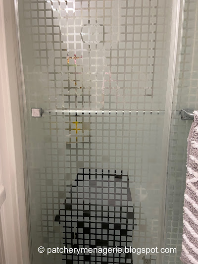
The grid on the shower doors,the towels,
The squareness of the soap dispenser.
The shower faucet
and the metal part of the light fixture was no accident. All those things were chosen because they relate to each other. They repeat the same shapes over and over.
Likewise the print with its black frame (and by the way, paper artwork in a bathroom is generally a no-no because of the humidity, but I live alone and never close the door when I shower).
The black shower stool, (the yellow Waterblade squeegee is no accident either)
the black clock and the black and white cat vase (top photo) were all carefully curated. In fact, the face of the clock itself,
the sink faucet,and the towel racks share the same modern/traditional elements. Not severely modern, but all ever so slightly curved.Even the flower vase wastebasket, chosen as Ruth noted, for it's small footprint, meets the design requirements. It also adds a touch of whimsy.
Everything is understated, not over the top, not fancy or fussy. If I had gone for an ornate mirror frame, fancy curvaceous fixtures and a lot of gold, the room would have looked overdone, and cheap. There is one gold element, and it's this small dish that I saw at Target. It satisfies your eye's need to find something else "gold" in the room, yet it's shape reflects the organic floral shapes in the wallpaper.
When I designed it, the idea I had in my head was that of a small glittery "jewel box." I wanted something modern in terms of utility, but attractive, stylish and classic.
Friends and guests mention it is a "pretty" room, implying it is explicitly female, I say that if the wallpaper is removed, and the room is painted a dark blue (for example), the round mirror replaced with a rectangular one, the room would be suitably "male" without changing anything else. To me, THAT is good design.


4 comments:
Your eye and the choices are perfect. The gold leaf dish an added touch.
The bathroom looks amazing!
Elegant but not fussy.
I also prefer silver to gold jewelry ;)
Nancy
Absolutely Lovely!!!
You visualized, designed and executed a resulting great room.
Post a Comment