So my question to myself is how do I show that? I've already made 7 words, how can I make this one just a bit different from all the others?
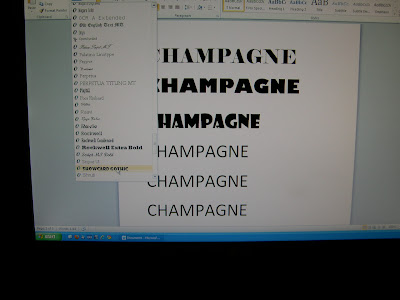
 Rather than reinvent the wheel, I decided to see what the word looked like in different fonts, and the easiest way to do that was just to open my word processing program on my computer and try some.
Obviously, working in fabric would make some of these virtually impossible, but there are a few interesting things to notice. Look at the uppercase M. Sometimes that middle piece touches the bottom line, and sometimes it doesn't.
 In this one, notice the really thin font (Papyrus. You can click the photos to enlarge, and then click again for more detail). Notice how the crossbar for the H is very high, but for the A it is very low. The loop on the P is tiny, and high up, and the cross bar on the E is high up too. Those help the letters feel light.
 In this last one, check out the triangle shape used as the crossbar in the letter A (in Showcard Gothic). That has potential!
I'm not sure what I'm going to do yet, but I have a treasure trove of ideas to play with.
7 comments:
That's a great source of inspiration!
I like the light Papyrus font.
Never though of looking at the word processing fonts for inspiration. What a brilliant idea.
Fantastic post. can't wait to see what you decide!
the champagne glass has potential for some of the letters, don't you think? Bonnie
I also have some cool fonts similar but different than showcard gothic, will email you pics tonight.
How about beigy gold fabric with bubbles? Or is that too obvious?
Vicky F
Vicky.. I'm already there ahead of you!
Post a Comment