Sunday, June 29, 2014

Portrait of a Chicken (or two or three..)

My very tall nephew helped me hang "Too Much Chicken" on the fence at the local playground so I could take some pictures.


btw, The Black Box has been accepted into the AQS show in Chattanooga. Here's the list of all the quilters whose work will be on display.

Saturday, June 28, 2014

Life Is 'Tweet!

It's officially a flimsy! And it has a name, "Life is 'Tweet!"

It is 40-1/2" x 47-1/2" (102.8 cm x 120.6 cm)

I'll take a picture of it outside tomorrow.

Thursday, June 26, 2014

Almost a Flimsy

It's almost a flimsy. Everything is sewn together. I need to add a couple of inches of WOW all around, and then square it off and it will be Finito.  


Julie suggests I keep unquilted flimsies around to show my students. She says that it's helpful for students to see how my work is put together. They can see that when they look at the wrong side of my quilts. This won't get quilted until my class is over.

I cannot tell you how happy I will be when this thing is off my design wall. It has been bugging me for some time.

(BTW, the top edge of the quilt looks wobbly because it is on the bias, and I've stay stitched the edge to keep it from stretching. It does look funny, but once I sew the border strips on, it will be fine.)

Wednesday, June 25, 2014

Asterisks, Front and Back

I am sewing the asterisks together, and since they are arranged any which way, sewing them together is pretty interesting. I try to visualize how to sew them together without sewing into corners. First I trim the edges of the asterisks straight, and I usually add a chunk of background WOW fabric to one side, then put it up on the design wall to figure out where the next piece goes, and keep going from there. I don't usually end up with "exactly" what was on the design wall, but as long as I have a photo to guide me (hint hint: use your phone to take photos for reference) I'm in good shape.

 I'm not done. I still have to add one asterisk in the upper right hand corner, and I have to sew two more to the left side.

In these photos you can tell I use WOWs interchangeably. I like the variation they provide. I like the way the light hits them differently. Whenever I go fabric shopping I always buy about five or six WOWs in half yard pieces.

Here's what the panel looks like from the wrong side.

How do I get it to look this nice? I press the crap out of stuff, and I use steam. After I press, or before I sew one piece to another, I trim the edge to make sure it is straight. When I sew I pin the pieces together.

Julie watched me when she was here. "I pin stuff," I told her as I was getting ready to sew something together.

"You use a lot of pins," she said.

I shrugged. "Whatever. It works for me."

At any rate, the backs of each and every quilt I make look as nice as the back of the asterisks you see above.

Tuesday, June 24, 2014

Back to Butterflies and Birds

OK, I am back to making the sample for the Birds & Butterflies class. This is what I have so far. Now I have to add the asterisks. 

As you can see I haven't lined up the elements so far (Partly because I think that would be boring). I like that the elements in each row bounce up and down a bit. I also like the feeling of impending movement.  So...

There's this version. The quilt seems to want more than just five asterisk flowers, so I have made an assortment.  Here they are floating away very slightly.

Here I have rearranged the asterisks a bit, and let one of them float higher than all the others. I think that topmost asterisk is a bit too high.

In this version I've lowered that top asterisk just a bit, and I think it's better. There might be a tiny bit too much space at the top too.

I'm trying to avoid making a big quilt, and I guess I'm failing. But I'm happy with this and it will give my students a lot of examples of birds, butterflies, hearts and asterisks. I think it will be quite lovely when it is quilted, and all that empty space has lots of possibilities.

Sunday, June 22, 2014

Chicken a Go Go!

The chicken quilt is all done.  I threw it up on the fence so I could get a quick photo. It's about 81" tall and the fence is only 72" tall, so there's a bit of the quilt on the ground.  I'll get more "official" photos later, but I am doing the happy dance of joy. It's finished! W00t!

Friday, June 20, 2014

Finally Friday

You wouldn't believe the gnarly problem I've been dealing with at work the last three days. It's been extremely stressful, but we finally figured it out, and I am very happy today is Friday.

Julie is posting about our trip to the MFA last week, so I thought I would share some of the quilts too.

These three quilts were made by the same woman. I'm not generally a fan of solids, but the combination of red, green and this eye-popping goldenrod made these quilts real show stoppers.  As you can see, "Millie" was very impressed.
 This quilt was spectacular in every possible way.

The maker of these three quilts made seven quilts with the same color combination for her children. I'm betting she knew she was "good."

 This is another stunner in red, green and dark blue. The colors in this quilt vibrated where the red and green touched each other. It was simply incredible. This phenomenon cannot be captured in a photograph.  I loved looking at these and thinking about the "quilt police." They'd pooh-pooh the mismatched HST's in the corners, missing the forest for the trees.

I tell everybody I love working with bright colors and abstract patterns,  but when I looked at these quilts I felt completely and totally inadequate.  Look what these quilters achieved with a limited palette and one or two shapes.

This is a pitiful photo of an absolutely awesome quilt. I can't do applique, but that doesn't mean I don't like it.
This is Julie in front of another stunning quilt. The quilting alone is enough to inspire awe (and lust). The quilt doesn't hang "quite" flat and look at where the green inner diamond meets the border - the triangles don't line up - and WHO CARES?

Another view of the absolutely drop-dead outstanding quilting.

All this magnificence in the first gallery!!!

Thursday, June 19, 2014

Color Inspiration

You never know where or when something around you will inspire you.
Julie and I found these gorgeous reddish orange tiles on the subway in Boston.

"Oh," you say, "those are just plain ordinary subway tiles. There's nothing exceptional about them."

Oh really?

Wednesday, June 18, 2014

Fun!

In addition to lots of quilt-related fun, Julie and I toured the Zimmerman House in Manchester NH. It was designed by Frank Lloyd Wright. Julie had already visited two other Wright houses, but she said this one was a lot different from the others.  This is the view from the driveway as you enter the property.
(The house is situated diagonally on a square lot.)

This is the view of the house from the beautifully landscaped garden.

 This is a selfie of Julie and I. When I picked her up at the hotel that morning she took one look at me and said, "I guess we both got the pink memo!"


I made the year numbers for the signature panel on the back of our quilt.

Tuesday, June 17, 2014

Julie & Lynne

O.M.G., did Julie and I have a good time together! We looked at quilts, talked about quilts, shopped for fabric to make quilts, took pictures of quilts and even made a quilt together. This is part of a signature panel for the back of this quilt:

Julie and I hadn't trimmed the quilt before we took these photos.


I showed Julie how to make a bird, then she made two more on her own. She thought they were great fun and said she'd made more when she got home.

Julie made the reddish bird on the left, and mine is the blue one. (Julie is taller than me in real life too.)


Julie and I "shopped in my stash" to find fabrics to use as the backing. They'll be mostly black with other colors, and the name panel above. I have to make the year, 2014, to add to the panel.

Clare, you were right! Julie and I had to sew together. We did, and we had a ball!

Monday, June 16, 2014

Missing U Finish

The Missing U blocks have been assembled into a flimsy. It's about 66 x 83 inches or so. It has been renamed "From Manchester to Memphis" as it will be going home with Julie. I'm happy with it.

Sunday, June 15, 2014

Guess what Julie and I did yesterday?  We went to my favorite quilt shop for some retail therapy.  How much retail therapy?  We were there for three hours and we both carried shopping bags filled with fabric when we left. I showed off the Crayons quilts and left the Bright Crayons to be hung on display.


Then we went to lunch.

Julie will lend me her new quilt to show my students in July, so she brought it with her. Julie likes to take photos of her quilts in interesting settings, so on the drive home we found a lovely park for a photo shoot.

The Mashed Potato Crayons is really a pretty quilt, when it isn't overshadowed by its bolder cousins.

Black quilts are notoriously hard to photograph, but I think Julie and I finally got a good one of the Black Crayons. You can even see the quilting in this photo. (What you can't see is me standing on the park bench, holding the quilt up!)


Saturday, June 14, 2014

Quilts and Color in Boston

"Magnificent Freaking Quilts" is exactly correct. Those quilts in the Quilts and Color show at the Museum of Fine Arts in Boston are amazing. They are SPECTACULAR.


Julie and I had a lot of fun with the sock kitty Millie, but these quilts were beyond anything we expected.

Sure, you say. I've got the catalog. I have pictures of the quilts in the show. I don't need to go to Boston. See this quilt below... an Irish Chain. No big deal, right?

You would be dead wrong. The pictures don't do these quilts justice. Forget about looking at the detailed quilting stitches. IN PERSON, these colors VIBRATE.

In person, these quilts SHIMMER. It was absolutely astonishing. And it has nothing to do with the intensity of the colors. It had to do with the way the colors affected each other. And this cannot be captured in a photograph. This effect happens in your eyes. Even Millie was agog.


Take this basket quilt, for example. Pretty standard stuff, right? When I saw this in the catalog, I just turned the page. Bo-ring, I thought. But then I saw it in person.

This quilt is made of SATIN, which means it really, literally, shimmers. It was an absolute knockout, and one of my favorites in the entire show.

All this in the first room! I have a lot to tell you, but today is a busy day so I'll show you more another day. If you want to read a review of the show, check out this rave from the Boston Globe.

And if you love quilts, you owe it to yourself to get to Boston to see this show. I am not joking. It is that good.

Friday, June 13, 2014

Julie's Here!

Julie's flight was delayed two and a half hours yesterday. While she waited in Atlanta, she got a manicure. I made a trip to the local chocolatier to buy her some of the famous Evil Little Chocolates

Julie brought me some gifts. Two small pins, the 2015 Engagement calendar featuring her quilt, See Rock City, and the most adorable Christmas ornament ever - a See Rock City mini birdhouse.

We toured the company where I work so she could see our conference room and I also brought her out to the manufacturing floor so she could get a better understanding of the items we make. Then we went to my house and I cooked dinner.

Today we are off to see those "magnificent freaking quilts."

Thursday, June 12, 2014

Countdown..

1. Clean the House. CHECK
2. Laundry.  CHECK
3. Prepare menus. CHECK
4. Groceries. CHECK
5. Order tickets for Quilts and Color show at MFA Boston. CHECK

6. Fill car with gas. CHECK
7. Get the car washed. CHECK
8. Vacuum studio CHECK
9. Print bus tickets for trip to Boston. CHECK
10. Figure out how to get to Tosci's from the MFA. CHECK
11. Make reservations for Zimmerman House tour. (The Zimmerman House was designed by Frank Lloyd Wright) CHECK
12. Millie performs QA check on Julie's new quilt.  CHECK
Millie's comment about Julie's quilt? "Mine."
13. Determine hours for Valley Cemetery. CHECK
14. Clear tables in sewing room (to do Thursday morning)
15. Plan visit to Quilted Threads on Saturday. CHECK
16. Make list of all possible places to get terrific ice cream. CHECK
17. Turn OFF alarm clock! CHECK
18. Do weekly bookkeeping and pay bills CHECK
19. Forget about work, housework, alarm clocks, diets, fabric budgets. CHECK, CHECK, CHECK, CHECK and CHECK.
20. Meet Julie at the airport. (Counting the minutes)
21. Have fun. CHECK!

Tuesday, June 10, 2014

Why?

I don't make quilts for the usual reasons, if there is any such a thing as a "usual" reason. Sure I make quilts for people I love, but the other quilts, the word quilts, those I make for me because I have an idea I want to push around.

It just so happens that the ideas I push around end up in fabric. I have arthritis in my hand, so I can't draw because it hurts to hold a pencil for two hours. It's also one of the reasons I don't paint.  I love fabric, I love to sew, I love color and I love solving puzzles. I can do all those things with fabric.

I love breaking the rules in such a way as to reinforce those rules at the same time. I love making you look. I love to fool you, to trick you, to make you get closer, to make you LOOK, to make you discover.

When I tell my students that one of my goals of my quilts is to reach out and grab the viewer by the shoulders, pull them close and say "LOOK AT ME! LOOK AT ME! LOOK AT ME!" I am not joking. I want more than the five second glance. I want more than the "oh look that's a --------- pattern / design in -------- color scheme. I can / did / know how to do that." I want my quilts to be the "greedy little songbird," the diva, the star of the show.

I want to knock your socks off.

Where I differ from most quilters is my Art training. Not that I learned design, color, balance and all of that. It's that I come from a place where if it isn't working you erase, and start again. You are OBLIGATED to start again. I come from a place where the emotional response of the viewer is more important than good technique. I come from a place where a great piece of Art cannot be quantified by the number of stitches per inch or how square or flat a quilt lies. In my world, the quilt police are burned at the stake ignored.

In my world, the nicely executed piece in a ubiquitous color scheme isn't given a second glance because it has nothing unique to recommend it. In my world a quilt made with ten thousand pieces is a yawner. So what? Big deal. Who cares? Who wants to make a quilt look like it was made by a machine?

There are lots of "pretty" quilts out there and they each have their purpose, and that's great, but that's not what I am after. I want more than "just" pretty. (There are lots of pretty paintings out there too, and I'm not in love with those either.)

When folks tell me my quilts are "cute," I have to restrain myself from rolling my eyes, although I've come to realize most viewers have no vocabulary for the kind of work that I do. I've come to appreciate the long pause, the silence, the soft "wow."

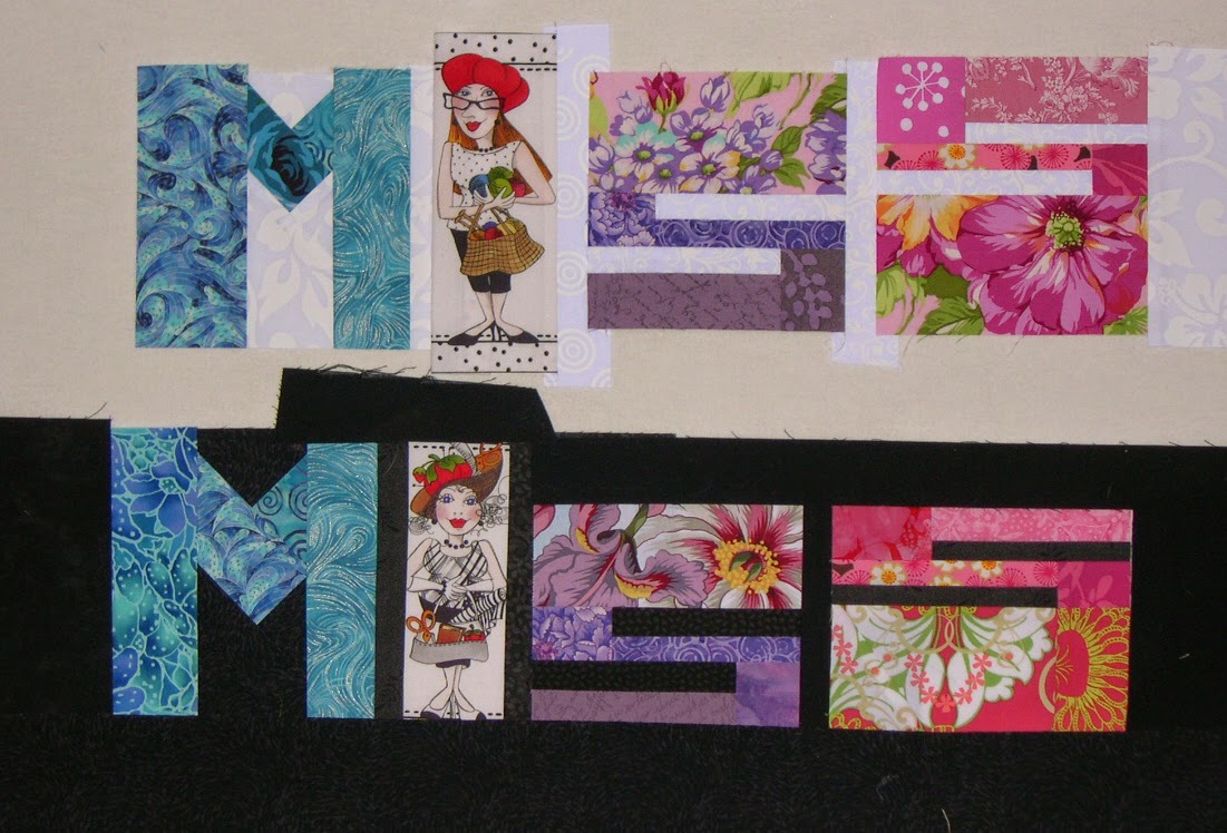
My son, who grew up in a family of artists and literally went to art shows every other week from the time he was two weeks old until he graduated from college in his early 20's, looked at one of my quilts in progress and said, "Mom, did you line this lady up so her hat was above the tops of the other letters? Because it looks like it's the dot on the letter "i."

Yes my darling.


"Wow, Mom," he said later, "These two MISS words. If you look quick you think they are made of exactly the same fabrics in each letter. But they're not. They're close, but they're different. You did that on purpose, didn't you?"

Indeed I did.


"Mom, those fabrics in that bland Crayons quilt. Did you pick them so they'd almost disappear? Did you do that on purpose?"

You bet.

"Why? You hate those bland colors."

Well everybody was making these "low volume" quilts and I was getting awfully sick of them. Like if it's low-volume it's more special. So I wanted to make a low-volume quilt of my own, and I wanted to make it with letters, mostly to show that it could be done. The thing that took the most time was figuring out what it should say, because I definitely wanted something that would be OPPOSITE of low volume. I wanted to make a low volume quilt that said, STICK IT! Yes, I wanted it to do two opposing things at the same time. And what could be MORE anti low-volume than something that said, "HEY BOZO! USE ALL THE CRAYONS!" We ALL have a complete set of magic crayons in our lives, and we need to use them ALL, and not just hide behind the ones that are "socially acceptable."

"You know what I like about the "USE ALL" in the Bright Crayons, Mom? I like that the letters start out tall, and get progressively shorter, then they grow again. And then on the bottom, you do the reverse. They each float higher, then settle down, making an arc. You did that on purpose, I know. It looks cool."

"Mom, you think about EVERY little thing? The shape, the placement, the negative space, the way one fabric element blends into another one next to it. You think about ALL of that?"

Yes dear. If it's in the quilt it's no accident.

"It's funny Mom. The Bright Crayons. It's bright, and happy, but at the same time it's kind of boring. So why did you make that one?"

Because I HATED the beige one so much I just HAD to make a bright one to cheer myself up, and to prove a point.

"What point?"

The Black Crayons. You have to work harder to see them. They are still low-contrast, just in reverse. But because you don't usually see black quilts like that, it makes you look, it draws you in. The great graphic artist Milton Glaser made a poster once called "Looking is not Seeing," and it broke every rule of posters. It was mostly black and dark colors. You couldn't read it from a distance. You had to get close, but that was the point. To figure it out, you had to give it more than the five seconds or less that we usually spend looking at something. It's exactly the same premise as the Mashed Potato beige crayons, but I've turned the idea on it's head.

"So okay, where did the Black and White Crayons come from?"

I wanted to do a black and white words quilt for a long time, and I really wanted to play with how you didn't necessarily need a fabric that had color from one edge to the other to "read" as a letter. To reduce that idea to it's simplest, most basic element, I had to eliminate color altogether, and use the strongest contrast there is, the Light/Dark contrast of Black and White. And I wanted to play with the idea that even the same black and white print could look different on a black background as on a light one. I wanted to play with that duality, that one wasn't complete without the other. So I knew I wanted to divide the words in half somehow, but I couldn't work it out.  You see, I was stuck with the idea of dividing the words in half horizontally. The words wouldn't be very legible that way, and if I'm going to make a quilt with words in it, you have to be able to read it.

"How'd you figure it out?"

Like I usually do. I set the idea aside and didn't worry about it. I knew it would come to me eventually. But it's the first time an idea for a quilt ever came to me in a dream.

"Really? I mean, Mom. Really? In a dream?"

Yes honey, cross my heart and hope to die. In a dream.  And I'm really pleased with it, because it shows what you can do when you have limited options. You have to pull out all the stops. You have to really get creative. Two colors and I can still tweak the phrase so that it means something. Use ALL the colors in the box, even if you have only two. And even though I give them only black and white, which aren't really considered colors at all, I get folks to THINK about all colors, about ALL options, and about pushing an idea around and not stopping at the first, obvious idea. Because obvious can be boring.

"I love you Mom. You rock."

Thank you my darling. I love you too.