Showing posts with label crayons. Show all posts

Wednesday, April 20, 2016

AQS Paducah

My quilt, The Black & White Crayons, entry # 4-1528 at AQS Paducah this week.


My quilt, Too Much Chicken, entry # 4-1214, also at AQS Paducah this week.

I can't remember the categories, Wall Quilts under 60" wide and possibly Modern Quilts, but with the numbers you ought to be able to locate them if you wish.

If you go to Paducah Kentucky this week and see my quilts, take a selfie with them and send it to me. Email it to patcherymenagerie AT gmail DOT com. If you want, send me your snail mail address, and I'll send you a postcard of the Crayons quilt (but only if I get a picture of you with it).

Tell me what you think. Here are some things to look for.

The Black and White Crayons has over 80 different fabrics, 60 different black and white, and about 10 different WOWs and 10 BOBs. Can you see the difference in the binding on the left and right sides of the quilt? Can you see how the different fabrics in each letter work to make the letter? Can you figure out what's common about the letters that straddle the divide?

Too Much Chicken has three foxes and several "jokes". Can you find the lazy A or the backwards S, and the drunken chicken? How many different fabrics did I use in the background? Can you figure out what happens to the Chicken words as you get to the bottom of the quilt?

Have fun looking for, and finding all the little things I have so much fun putting in.

Enjoy!

Friday, March 4, 2016

The Chicken Quilt is Going to Paducah!

WOO HOO!  My quilt, "Too Much Chicken" has been accepted into the American Quilter's Society show in Paducah Kentucky from April 20 - 23 2016.

I'd be lying if I told you I ever expected it to get into any show at all. It was Gerald Roy who told me the quilt was better than I thought it was, and that I should enter it in the AQS Paducah show.

The Black & White Crayons quilt has also been accepted into the show in Paducah.

Woot!


Saturday, February 27, 2016

Black & White Crayons in AQS Daytona Beach

If you happen to visit the AQS show in Daytona Beach this weekend, and see my quilt, The Black & White Crayons, take a selfie with it and send it to me!

Thanks,
Lynne

(email: patcherymenagerie AT gmail DOT com)

Tuesday, September 15, 2015

AQS Chattanooga

My quilt, The Black & White Crayons, is on display at AQS Chattanooga this week. If you go, take a selfie with it and send it to me at patcherymenagerie AT gmail DOT com (you know how to put them together.) And I'd love it if somebody would get me a show pin. I'll pay for it and the postage. Let me know, thanks!

Lynne

Sunday, July 12, 2015

BW Crayons to AQS Chattanooga

Woo Hoo!  My quilt, Black & White Crayons, has been accepted into AQS Chattanooga, and will be on display there September 16 - 19, 2015.

Thursday, April 30, 2015

Purple & Orange and Black & White

A certain purple and orange quilt arrived from Chris yesterday. I see some binding in my future.

I've entered the Black & White Crayons into the AQS Chattanooga show. I decided to enter it in the Wall Quilts - Modern category because it is "improvisationally pieced" and contains a minimal number of colors.  We'll see.

I've got a lot of the posts up in the new "Pages" and I've got them properly sorted. Over the next few days I'll add links to each of my quilts and the Red Letter Alphabet. I also have to add photos and connect the dots.  In the meantime, it's nice to be able to find something I'm looking for...

Tuesday, June 10, 2014

Why?

I don't make quilts for the usual reasons, if there is any such a thing as a "usual" reason. Sure I make quilts for people I love, but the other quilts, the word quilts, those I make for me because I have an idea I want to push around.

It just so happens that the ideas I push around end up in fabric. I have arthritis in my hand, so I can't draw because it hurts to hold a pencil for two hours. It's also one of the reasons I don't paint.  I love fabric, I love to sew, I love color and I love solving puzzles. I can do all those things with fabric.

I love breaking the rules in such a way as to reinforce those rules at the same time. I love making you look. I love to fool you, to trick you, to make you get closer, to make you LOOK, to make you discover.

When I tell my students that one of my goals of my quilts is to reach out and grab the viewer by the shoulders, pull them close and say "LOOK AT ME! LOOK AT ME! LOOK AT ME!" I am not joking. I want more than the five second glance. I want more than the "oh look that's a --------- pattern / design in -------- color scheme. I can / did / know how to do that." I want my quilts to be the "greedy little songbird," the diva, the star of the show.

I want to knock your socks off.

Where I differ from most quilters is my Art training. Not that I learned design, color, balance and all of that. It's that I come from a place where if it isn't working you erase, and start again. You are OBLIGATED to start again. I come from a place where the emotional response of the viewer is more important than good technique. I come from a place where a great piece of Art cannot be quantified by the number of stitches per inch or how square or flat a quilt lies. In my world, the quilt police are burned at the stake ignored.

In my world, the nicely executed piece in a ubiquitous color scheme isn't given a second glance because it has nothing unique to recommend it. In my world a quilt made with ten thousand pieces is a yawner. So what? Big deal. Who cares? Who wants to make a quilt look like it was made by a machine?

There are lots of "pretty" quilts out there and they each have their purpose, and that's great, but that's not what I am after. I want more than "just" pretty. (There are lots of pretty paintings out there too, and I'm not in love with those either.)

When folks tell me my quilts are "cute," I have to restrain myself from rolling my eyes, although I've come to realize most viewers have no vocabulary for the kind of work that I do. I've come to appreciate the long pause, the silence, the soft "wow."

My son, who grew up in a family of artists and literally went to art shows every other week from the time he was two weeks old until he graduated from college in his early 20's, looked at one of my quilts in progress and said, "Mom, did you line this lady up so her hat was above the tops of the other letters? Because it looks like it's the dot on the letter "i."

Yes my darling.


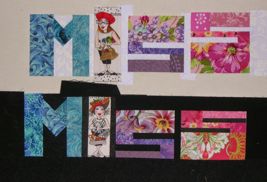
"Wow, Mom," he said later, "These two MISS words. If you look quick you think they are made of exactly the same fabrics in each letter. But they're not. They're close, but they're different. You did that on purpose, didn't you?"

Indeed I did.


"Mom, those fabrics in that bland Crayons quilt. Did you pick them so they'd almost disappear? Did you do that on purpose?"

You bet.

"Why? You hate those bland colors."

Well everybody was making these "low volume" quilts and I was getting awfully sick of them. Like if it's low-volume it's more special. So I wanted to make a low-volume quilt of my own, and I wanted to make it with letters, mostly to show that it could be done. The thing that took the most time was figuring out what it should say, because I definitely wanted something that would be OPPOSITE of low volume. I wanted to make a low volume quilt that said, STICK IT! Yes, I wanted it to do two opposing things at the same time. And what could be MORE anti low-volume than something that said, "HEY BOZO! USE ALL THE CRAYONS!" We ALL have a complete set of magic crayons in our lives, and we need to use them ALL, and not just hide behind the ones that are "socially acceptable."

"You know what I like about the "USE ALL" in the Bright Crayons, Mom? I like that the letters start out tall, and get progressively shorter, then they grow again. And then on the bottom, you do the reverse. They each float higher, then settle down, making an arc. You did that on purpose, I know. It looks cool."

"Mom, you think about EVERY little thing? The shape, the placement, the negative space, the way one fabric element blends into another one next to it. You think about ALL of that?"

Yes dear. If it's in the quilt it's no accident.

"It's funny Mom. The Bright Crayons. It's bright, and happy, but at the same time it's kind of boring. So why did you make that one?"

Because I HATED the beige one so much I just HAD to make a bright one to cheer myself up, and to prove a point.

"What point?"

The Black Crayons. You have to work harder to see them. They are still low-contrast, just in reverse. But because you don't usually see black quilts like that, it makes you look, it draws you in. The great graphic artist Milton Glaser made a poster once called "Looking is not Seeing," and it broke every rule of posters. It was mostly black and dark colors. You couldn't read it from a distance. You had to get close, but that was the point. To figure it out, you had to give it more than the five seconds or less that we usually spend looking at something. It's exactly the same premise as the Mashed Potato beige crayons, but I've turned the idea on it's head.

"So okay, where did the Black and White Crayons come from?"

I wanted to do a black and white words quilt for a long time, and I really wanted to play with how you didn't necessarily need a fabric that had color from one edge to the other to "read" as a letter. To reduce that idea to it's simplest, most basic element, I had to eliminate color altogether, and use the strongest contrast there is, the Light/Dark contrast of Black and White. And I wanted to play with the idea that even the same black and white print could look different on a black background as on a light one. I wanted to play with that duality, that one wasn't complete without the other. So I knew I wanted to divide the words in half somehow, but I couldn't work it out.  You see, I was stuck with the idea of dividing the words in half horizontally. The words wouldn't be very legible that way, and if I'm going to make a quilt with words in it, you have to be able to read it.

"How'd you figure it out?"

Like I usually do. I set the idea aside and didn't worry about it. I knew it would come to me eventually. But it's the first time an idea for a quilt ever came to me in a dream.

"Really? I mean, Mom. Really? In a dream?"

Yes honey, cross my heart and hope to die. In a dream.  And I'm really pleased with it, because it shows what you can do when you have limited options. You have to pull out all the stops. You have to really get creative. Two colors and I can still tweak the phrase so that it means something. Use ALL the colors in the box, even if you have only two. And even though I give them only black and white, which aren't really considered colors at all, I get folks to THINK about all colors, about ALL options, and about pushing an idea around and not stopping at the first, obvious idea. Because obvious can be boring.

"I love you Mom. You rock."

Thank you my darling. I love you too.

Sunday, June 8, 2014

Four

I had a little time last night after dinner so I quickly hung up all four crayons quilts on the new fence.  They look pretty much like I expected them to, but I have them all at my house so that's not a surprise.


What did surprise me was just how hard to read the Mashed Potato Crayons are. It's easier when you are closer.

This photo really shows up the wonderful quilting by Chris on the Bright Crayons.

The bright crayons are lovely, but to me there is no mystery. The whole thing is very straightforward. The colors and fabrics echo the sentiment of the phrase. Nothing unexpected here.

I took these photos in a hurry, the light was fading and I didn't have any help. I think this one is slightly out of focus, and when I do these again I'll make an effort to get them closer together.  At any rate, I knew when I made it that the letters in the Black Crayons were wider overall, and that's one reason why the quilt is wider also.  (Truth: I trimmed too much from the right side of the Bright Crayons quilt by mistake. The air was positively BLUE when I realized what I had done. It annoys the heck out of me. And yes, I wish I had used a different BOB on the background of the Y in the Black Crayons.)

I deliberately changed the placement of the birds in each of the quilts. I don't like making two quilts the same (actually I am constitutionally incapable of making two that are exactly alike).


 When I sat back in a lawn chair to look at all four of them together, the thing that really hit me was how much I love the Black and White one above all the others. It's a lot more interesting to look at.

This photo also shows off Chris's amazing free motion quilting artistry.


Thursday, May 29, 2014

More Black

In for a penny, in for a pound. I'm sewing the [black] binding on the [black] crayons quilt.

Although I've got all four Crayons quilts here, I've never looked at them all side-by-side-by-side-by-side. When the Black Crayons quilt is finished, I'll line them up and check them out. Yes, there will be pictures.


Monday, May 26, 2014

Black & White Crayons, Finished

Yeah, I know you've seen this six million times, but now it's finished and hanging in my dining room. I'll have a better picture once I can take a photo of it in natural light, but that will have to wait until later.

For all you quilters under say, 59, and those of you who DON'T wear bifocals, you can stop reading right now.

For the rest of you who remember when the first man went up into space, who probably wear bifocals and have a touch of arthritis... You all know how hard (practically impossible) it is to hand sew something black with black thread. I could barely see what I was doing, and for a lot of the time, I just guessed. If any members of the quilt police find fault, they can kiss my richly upholstered derrière. One of my most fervently held beliefs is that craftspeople need to leave the evidence of their hand in the work they do. We are not machines, and our work should not look like it was machine made.


Sunday, May 25, 2014

Binding Progress

I've sewn the binding on the black (right) side of the Black and White Crayons quilt. Millie sat on the arm of the chair while I worked.

We watched two movies while I sewed, "Saving Mr Banks" and "The Monuments Men."

Millie was very helpful. She kept the quilt from falling onto the floor when I had to set it down for a moment.

Which is why I hang the quilt when I am not working on it.

Friday, May 23, 2014

Binding the Black and White Crayons


I am so happy with this quilt. The quilting is beautiful. I am adding the binding, which is a slightly complex affair given that I am using two different fabrics that have to start and stop in precisely the right spots. Can you tell the two of them apart in the photo above?

.
I add the hanging sleeve at the same time I sew the binding on. And yes, I do my final sewing on the front of the quilt. I can blindstitch invisibly, so I show it off by defying you to see my stitching.

(It's an ego thing. I admit it.)

And if your binding is striped, as mine is, wouldn't you join sections as invisibly as possible?


I am very happy with this one and think it may be one of my all time favorites.

Thursday, May 22, 2014

Black & White Crayons, Quilting Preview


The amazing Chris has sent me these preview pictures of the quilting on my Black & White Crayons.

I'm very pleased and excited to get the quilt home and finished.

Thursday, April 17, 2014

Finishing the Bright Crayons

I've finished sewing the binding and hanging sleeve on the Bright Crayons quilt.

I'm really happy with it. 

 For now it's hanging in my office.

Saturday, April 5, 2014

Signature


This doesn't have the strong contrast that black and white usually has, but I didn't want that. I wanted this to be a bit more low key.  Next up I have to make the date.

Btw, do you have any idea how frustrating it is to line up black and white fabrics with a ruler that has black lines? (And don't tell me to use the ones with yellow or green lines because I don't find those accurate at all.)

Thursday, April 3, 2014

Back to Back to Back

I like to choose the right backings for my quilts. I never use whatever I have left hanging around unless it's perfect for the quilt. (You never know what you've got...)

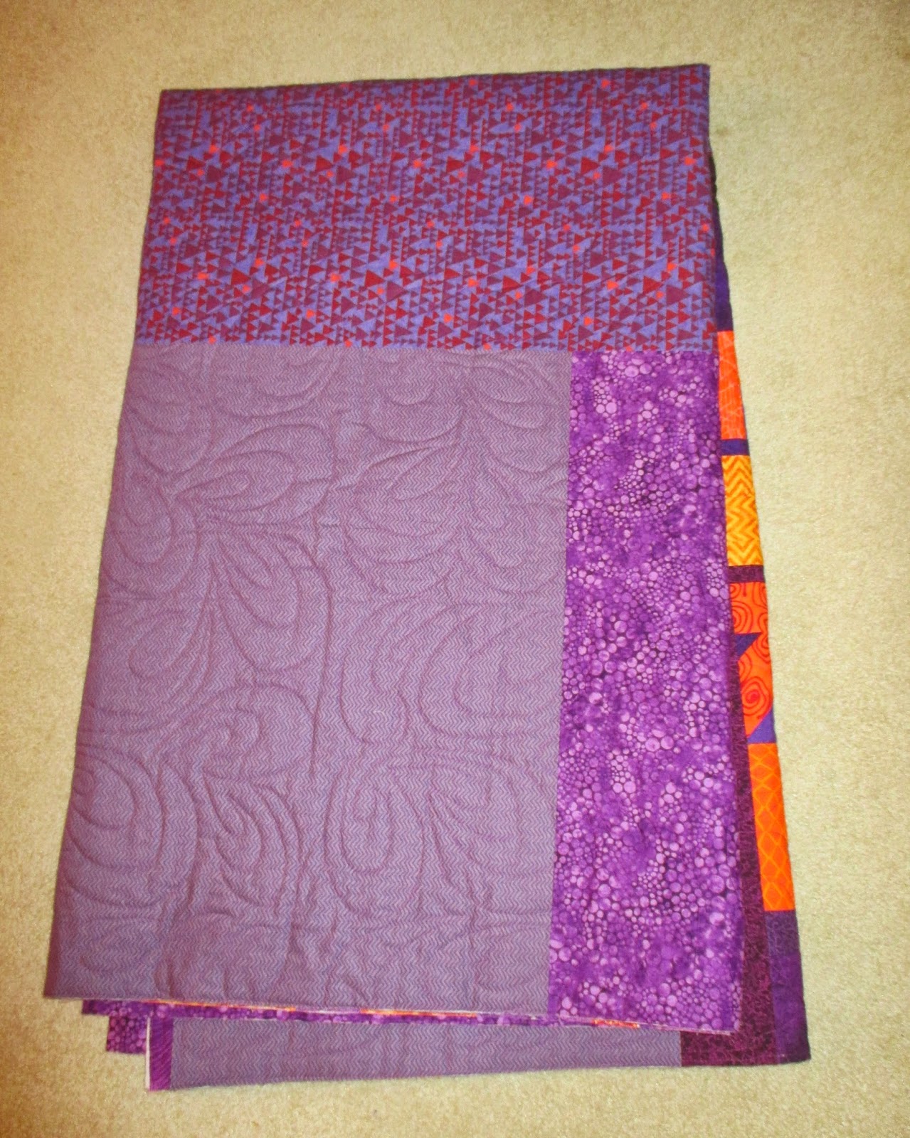
So here is the backing, binding and hanging sleeve for the Mashed Potato Low Volume Crayons quilt.
As you can see I chose an equally low volume print for the backing and I used the same fabric for the binding as I did for the hanging sleeve.

Here is the fun bright backing, hanging sleeve and binding for the Bright Crayons:
Yes it's over the top, but it's also fun. It was in my stash, as was the fabric for the hanging sleeve and the binding.

Here is the relatively plain backing for the Black Crayons. You can see I used the mid-century modern print for the hanging sleeve.  This I did have left over, and I felt it was appropriate. For the binding, I used a print of color crayons on a black background.


Wednesday, April 2, 2014

Four Crayons

My friend Julie asked if I had lined up all the Crayons quilt and looked at them all together. I didn't. I don't have a wall big enough. Brenda asked if I could put them all in one post so everybody could compare.

Here they are. As I am writing this, I have two rows of two photos in each row so you can almost see all four together. Let's hope Blogger cooperates!

Left: "Mashed Potato" (Low Volume) Crayons 
Right: Bright Crayons

.


Left: Black Crayons
Right: Black & White Crayons

For the record, I'm done. There will be no more Crayons quilts.  


Tuesday, April 1, 2014

Black & White Crayons Flimsy Compete

In the end, I decided to add the small contrasting border because I felt it helped define the edges of the quilt and emphasized the contrast of the black against the white, which is what this quilt is all about.


Seeing the quilt on a neutral background, like in the photo above, really shows the benefit of the border. Seen against a white wall, (below) the quilt does look off center, because you lose the edge.

Both vertical halves of the quilt(without the border) are the same width - 20". The border was cut 3" wide, but that will trim down a bit when the binding is added. I'm going to use an irregular black and white striped fabric for the binding, sewn crosswise, like piano keys. And for added interest, I have the fabric in both "colorways" - more black than white, and more white than black. Guess which one I'm going to sew where?


The quilt is 43-1/4" x 55-1/2" (110 x 141cm), has 52 different black and white fabrics, 10 different WOWs and 9 different BOBs.

I love this version of the Crayon Quilt series... and check out the backing and hanging sleeve fabric I have selected. (My son said to me once: "You know one of the things I love about you Mom? When you go over the top, you keep going.")


You know how much I love black-and-white, don't you?


Did you know that every cat I have ever owned has been black-and-white? (This is Millie.)

No Fooling!

Monday, March 31, 2014

With or Without?

As I was finishing up the Black and White Crayons, I needed a way to figure out how big the finished flimsy would be, so I stuck a piece of black fabric up on the design wall so I could see the left edge. When I stepped back, I had an AHA moment.

So I stuck up strips of more fabric to indicate what it might look like, and then I added some BW striped fabric I might use as a binding. I wasn't quite sure, so I tried it the other way.

I already know which I am going to do, but I thought you might like to see both versions and decide for yourself. With, or without? And why do you think so?


Sunday, March 30, 2014

New Birds, Please

White bird #2

Black bird #2 (Note these two have the same leg and beak fabric.)


Black bird #3 (Love those "Mondo" legs.)

White bird #3