Showing posts with label color. Show all posts

Thursday, May 7, 2026

Nightingale, Redux


This is the original black quilt, that started me writing the tutorial for what I came to call the Nightingale quilts. You can go read the whole story here. You actually should go read it, then come back. I'll wait.

I'd always known the quilt was different, but I often wondered if others might like to make one. When at the end of 2024 I decided to make another one, my friend Susan jumped right on the bandwagon, and made one of her own. She has some terrific insights here, and you can go read that too, if you want.

What really stuck with me however, was her comment that "you could be blind and make this quilt and it would still be beautiful."

I think she's right, and I kind of want to go back to that thought, because I have another idea. (You knew that was coming, didn't you?)

I think the reason these Nightingale Quilts work is because they are all about color and pattern, and not patchwork. The unifying thing is the black background. It's consistent, and colors really pop when surrounded by black. This is. because the light that hits the quilt reflects the colors back to your eyes, but the light that hits the black doesn't reflect back at you, it is instead absorbed. This allows the brighter colors to really shine and show off.

In this quilt, what you see first is the COLORS, and THEN you see that the quilt is made of many different fabrics, and THEN you realize the thing is PATCHWORK, and there is no obvious pattern. The patchwork is subordinate. The quilt is actually made of squares and rectangles, and it doesn't matter one bit if the corners of each block line up or not. How radical is THAT?

I wrote in the tutorial that I think it is the easiest quilt on the planet to make - all you need to do is use fabrics that have colors on a black background. IN THEORY, you could do this with fabrics with a consistent color as a background, but in REALITY, it is very difficult to find a lot of colored fabrics with (for example) THE SAME blue background. Or red, or yellow, or whatever other color. The effect would be slightly different with a color in the background as colors are affected by the colors that surround them. Black shows them off to great advantage, other colors, not so much. 

Susan and I were talking recently and she says that everybody who sees her Nightingale quilt "goes nuts, they love it so much," and she can't understand why the tutorial is not flying out of my Etsy shop, the way Lynne's Liberated Birds does.

Well, I was thinking along the same lines. The original black nightingale quilt (above) lives on my bed, and I've been sleeping under it for over 20 years. The quilt is made the way my grandmother made them, with no batting. It is tied, not quilted. On my bed it lives on top of the top sheet and under the wool blanket, so nobody ever sees it but me. One day recently as I was making the bed I noticed some of the edges were wearing. Maybe I should make another one?

But you know me, I like to push ideas around.

What if I made a white one? It isn't as easy as it looks. Sometimes you can get away with a slightly off white background, and sometimes a fabric looks like one thing online and then in real life it's different.

So I searched through my stash, and then did a bit of shopping. The fabrics arrived yesterday and they all took a trip through the washer and dryer, then I ironed them.


I love the dragonflies, but there seems to be too much gray in the background. I'm not sure about the butterflies in the upper right either.

Three of these seem to be out, one might be back in, but I'll bet it's not the one you think.

I originally thought the big print at the bottom wouldn't make the cut, but I am not sure. The second one from the right at the top is out. Too much gray in the background, although it looks fine in the photo.

These all fit the brief, but the bright blocks at the bottom left don't really "read" as print on white. Since I don't want any one fabric to jump out and grab your attention, this may not make the cut, but only time will tell.

These will all be in the quilt, and since this is a quilt that benefits from MORE fabrics rather then fewer, I've got another half dozen or so on order. And I haven't cut the ones I am on the fence about.

Remember, what I want is a "party of color," or a happy colorful dance of color across the surface of the quilt. I do NOT want to emphasize the patchwork or even the individual fabrics themselves.

In Drawing we call two adjacent shapes that share the same color or value along their shared edge to have "lost and found edges." In traditional patchwork you do not want that, because you want the edges to define the shape, like the difference between one block and another. In this quilt, I very much want those "lost and found" edges, because the colors will blend from one block to another and carry the viewer's eye across the surface, discovering things to look at, and to bring delight.

My goal is to surprise and delight the viewer.

Stay tuned.

Tuesday, September 17, 2024

A Lesson in Color


This was the last photo in yesterday's post. I have marked it up to show the areas that I think need work. If you look at them, you will see they are darks that are clumped together. I talk all the time about being wary of too many darks close together. 

Notice I said DARKS, not color. I'm going to give you a Big Hint. Pay attention. This is IMPORTANT. 

Value Supersedes Color.

You can say it another way. Value beats color. Whenever you design a quilt, I don't care what the COLORS are, the VALUES are more important. 

Every color has several properties. 

Hue is the actual color (Red, Yellow, Green, etc.) 

Value is the lightness or darkness. There is LIGHT BLUE and DARK BLUE. This is value. 

Intensity is the brightness. Do not confuse Intensity with Value. Think of an Orange. A real orange you eat. That's pretty much a true Orange color. That is Orange at its most pure, it's most intense. If you think of a light orange color, it isn't as bright. It has lost its intensity. A light orange isn't as intense as a real orange, neither is a dark orange. which gets closer to the color brown. Any time a color moves away from itself, it loses intensity. A lemon (a real one) is about as true to a true yellow as you can get. Because Yellow is so LIGHT (value) it loses its intensity pretty quickly. Yellow has a narrower range of value than a darker color, like blue, red or violet (purple).

OK, back to the quilt. In the areas that are circled in the photo above, the blocks are too close in VALUE so they make a dark blob. I do not like dark blobs, so I will have to break those apart.

The photo above shows my changes.

In the group at the upper right, I replaced the red block under the purple one with an orange one and switched the black one with the light green that was above it.

Moving to the left, I replaced a dark green block with a lighter green one.

On the far left, I swapped the pink and red blocks that were on top of the black one.

In the bottom group, I replaced the red block with a pink one.

This wasn't as easy as it sounds. EVERY color is affected by the color it is next to. Since each block has FOUR neighbors, I had to be careful not to create another dark area or a too light area. And since my own personal rule for this quilt was not to have two blocks of the same color sitting next to each other, it got complicated. 

I had made 12 different kinds of blocks: Yellow, Orange, Pink, Light Green, Dark Green, Red, Light Blue, Dark Blue, Light Violet, Dark Violet, Black, and Light blocks. In some cases I had to rearrange neighboring blocks to get the design the way I wanted it to look.

One note: In the camera, things always look a bit darker. The camera lens is not quite as sensitive as the human eye when it comes to distinguishing value. That can be an advantage for a real person, because the camera will often "pick up" a subtlety the human eye may miss. I can't tell you the number of times I have thought a quilt looked good, only to be reviewing the photo on my way OUT of the studio and see something I missed in real life.

These little blocks often became what I call "shape shifters" because while when I held one in my hand and thought it would be perfect for an empty spot, I'd put it there and suddenly it would look wrong, and I'd have to try a different block.

Yes, in some cases I went back to my sewing machine and custom made a block to fit into a particular spot.

How do I work this out when I design a quilt? I put the blocks where I think I want them to go, then I go across the room, take my glasses off (I am nearsighted) and look at the quilt. Sometimes I squint. I am not interested in the color at that moment, I am interested in the VALUE. 

Because of this I am very careful where I place my COLORS. I am always conscious of Value first. COLOR placement is secondary. I can think of two common color combinations where quilters get tripped up all the time: Red and Blue (often in red, white and blue quilts) and Red and Green (in Christmas quilts.) I see quilts using these two combinations all the time where I feel the quilt isn't successful because the values of the two colors side by side make the shape read as one thing instead of two separate, discrete things.

The eye notices CONTRAST first. It is hard wired to do this because it helps us see things in front of us. It helps us distinguish one thing from another. It grabs our attention. There are several kinds of contrast, and value is one of them. But it's the biggie.

So remember:

VALUE supersedes COLOR.

Now I am off to sew my blocks together.

Saturday, October 16, 2021

Flowers & Color Choices


I went to the flower shop yesterday because I felt I needed a pick-me-up. Normally I can go into the walk-in cooler and pick what I like, but there was a leak so all I could do was stand at the door and point. I pointed because I didn't know the names of half the stuff. I started with the black dahlias and then chose the Solidago (my SIL helped me with the names later). Then I added the purple orchids (one of them is a branch that extends out to the side in front of Millie.) Next I chose the lavender Lisianthus and added the two Gingers (the big pink things at the top). I picked the misty statice (filler) and then added a yellow green hydrangea.

Adam, the florist, kept saying how beautiful the bouquet I had chosen was. I lamented I had forgotten to bring a vase. Adam offered to put it in a vase for me. OK, so I let him go do that, telling him I wanted it pretty as it it were up against a wall, so pretty on 3 sides. And I told him to add whatever he thought it needed, since he was a florist and I wasn't.

Now, there were at least eight different colors of roses, and lots of bright colorful Gerber daisies in the cooler. But I wanted different. I was drawn to the black dahlias and the yellow-green of the Solidago. Just like buying fabrics, I checked out everything that was there before I made my choices. Once I had decided those two things, I knew which direction I was going in, so I picked the orchids, the lavender flowers and went from there. Adam suggested a Stargazer lily, but I said no, because I knew it would take over, and I didn't want that. I picked the two pink ginger things. I also selected the various greenery. Later I realized I was selecting flowers the same way I shop for fabric.

Since I didn't know what anything was, I hadn't paid any attention to the price chart hanging on the wall. I was not particularly surprised when he said it was eighty bucks. Hell, I thought the thing was eighty kinds of spectacular, and it was FOR ME. 

What surprised me was that Adam kept saying how beautiful what I had chosen was. I mean, like, DUH! But when I thought about it later, I realized that most customers wouldn't be drawn to a deep blue violet / yellow green color combination, so that combination wasn't on his radar for "beautiful." 

He packed it all up in a box with filler around it, and wrapped it carefully, and actually carried it out to my car and gently placed it on the floor on the front passenger side of my car.

I had to pick up a prescription at the drugstore, so I went to the drive through. After I completed my transaction, the gal inside told me she thought my flowers were beautiful. I hadn't realized she could see them. That kinda made my day.

Then I went home and cut binding for four quilts, which I will show you tomorrow!
 

Tuesday, March 24, 2020

Forecast Gone Wrong

It was supposed to be 2 to 4 inches.

ROFLMAO.

Until I had to shovel it.

Oh well. It'll melt.


About yesterday's post.

Yes Ruth, I saw those upside down kitties too.  Dammit. But they are staying, because a couch quilt doesn't have an UP or a DOWN. They may get shifted down to the third row, however.

And for those of you who noticed the pale yellow beehive fabric looked like a hole in the middle of the quilt, good for you. I saw it too. That block will be replaced.

Thank you Ann, and others, for your compliments. I don't have any trouble with color, and I choose fabrics without much conscious thought. You may all hate me, but Color Sense cannot be taught. You either have it or you don't. I can show you what I do, and explain why I do it, and knowledge of so-called color theory will help, but it isn't the same.

Now, that doesn't mean you can't make beautiful quilts. Years ago my sister was making a scrap quilt. She showed me, "Is this OK?" she asked. "I don't know what I am doing."

"Maybe not," I told her, "but what you are doing is lovely, keep doing it. If it doesn't feel right to you, don't do it." Now she probably won't admit she still doesn't know, but she trusts her instincts, and so should you. That and being willing to change what isn't working, will help you in the long run.

Saturday, October 19, 2019

Hit Me With Your Best Shot

Before I went to bed Thursday night, I had this, and I thought it was damned close to perfect.

Wanda had a suggestion. She wasn't sure it would work, but she thought I should try moving the two big spotty light prints up higher (the one with the green shamrocks and the one with the big light blue dots.) I thought, I can do that...

I didn't like it. For one thing, now those two pieces were close to other big prints and I didn't think it worked well at all.

So I rearranged them. Now they are at an angle and I like it better, and there aren't too many big prints in the same area. But I noticed the top had a place that was too light and needed to be fixed.


Four hours, dinner, a little bit of reading and I had this. Problem was, now there are two blocks in the top row that look like an entry point, and many of the others in that row just look too dark.

Another hour, and edging close to midnight, I had this. I think it's OK. I also tinkered with the darks in the upper right corner. I still have two blocks that are kind of light in the middle of the top row, but the whole top row doesn't look quite so heavy. They look worse in the camera than in real light. There are also two light blocks that make a clear horizontal divide between them and what's above, but I had that before. I've been tinkering with that area for days, and it's past my bedtime so I'll look at it tomorrow in natural light and see what hits me.

Right now I'm looking forward to my head hitting my pillow.

Wednesday, July 10, 2019

Oh Color!

I love knowing stuff. I have an insatiable curiosity about all kinds of things, and color is right up at the top of the list. I remember listening (over 30 years ago,) to the then technical expert at Winsor & Newton in the US tell me about the Cochineal Beetle and its story of RED!

No, I haven't read Kassia St Clair's book The Secret Lives of Color, but I will.


I HAVE, however, read Victoria Finlay's Color, A Natural History of the Palette, which is pretty definitive, and her The Brilliant History of Color in Art (This one was written for teenagers and the Getty Center and it's got lots of pictures.)

Finlay wrote a fascinating book about Jewels too, which led me to give my diamond ring to my son for when he found "The One," because no jewel is blood-free (and they're getting to the point where experts can't tell the "real" gems from the man-made.)

Philip Ball's Bright Earth talks about "the invention" of color and its use through the ages. It's rather dense reading and it helps if you know your Art History, but I do, so...


After hearing about the Cochineal Beetle (it's not a synthetic and to this day if you want RED lipstick, you are getting ground up Cochineal Beetles. Hey, it's natural and organic!!), I had to read A Perfect Red.

I've also read MAUVE, and The Rarest Blue.

PINK, The History of a Punk, Pretty, Powerful Color is on its way to my house. (This should surprise no one.)

Black, Green, Blue and Yellow, each my Michael Pastoureau are on my waiting list. (Actually Yellow will be released in November 2019).

I read these because I love to paint and I like knowing how my paints work and where they came from. Most of these are pretty in-depth, but there's a lot more to color than you think.

I should warn you, however, knowing ABOUT color may not improve how you WORK with it. Generally, color sense is inborn, and can't be taught. I remember once at a quilt show I was at a vendor booth and I was choosing fabric to buy. The lady behind the counter said to me, "You don't have any trouble with color, do you?"

"Nope."

Then, there are these:

 The great Mac Daddy of them all, The Interaction of Color by Josef Albers and this little one, Colors, the Story of Dyes and Pigments. I used the little one a lot when I was planning my Nine x Nine quilt.


When Julie and I were at the MFA in Boston five years ago, I bought this:

which is by no means scientific or definitive.

While I almost never wear any color like this one (Amberglow), I am pretty sure none of my friends would disagree with at least TWO of the attributes at the top of the page. Different and Daring definitely defines me.

And yeah, when I go over the top, I keep going.

As you can tell.


If you want to make free pieced letters, like the ones in my Nine x Nine quilt, you can get my tutorial here, at my Etsy shop. It's an instant download, so you can get started right away.

Friday, June 22, 2018

Perception

I made a couple of test four patch diamonds. On the shelf, the not blue fabric looked cream colored. Here, against the silver of my ironing table, it looks decidedly gray.

BIG LESSON ABOUT COLOR: Colors change depending on what colors they are next to.

To wit: I like the blue. The gray / silver next to it.. not so much.  And I'm not thrilled with the cream of the red violet either.

Hmm. Guess I have to go shopping.

Oh gee darn.

Wednesday, March 29, 2017

Why Color Might Not Be a Tutorial


In the next few days I will write pages about the gnarly little topics that caused so much angst earlier this week. I need to think about what I want to say, and may need to make some samples to say it. If there is any topic you would particularly like me to discuss, please let me know in the comments. I can't promise anything.

Anything, except one topic, apparently.

Way back in 2010, I bought these fabrics at a visit to Quilted Threads. I wrote about it on the blog at the time. One reader wrote to me. "I think the fabrics you selected are beautiful, and I can understand why you say they go together, except for one. I don't understand why you picked that raspberry color. If I cover it with my finger, the selection looks lost without it, but I would never have chosen it. Why did you do that?" (What was really weird about that comment was that I was surprised she did not say the BLUE was the oddball.)

I talked to my Mom about it. Remember she's an artist too, and has made her living as an artist and art teacher for over forty years. "That," my Mom said, "you can't teach."

Which was pretty demoralizing for me, a teacher, to hear.


One of the comments yesterday, reminded me of this story. Lynne from County Durham in the UK wrote: "I'm constantly in awe of your use of colour - I have real problems with mixing colours and have several times looked at what you are doing with a quilt, thought "Ugh that's going to look awful" and then been stunned at the final fantastic result!!!! Not sure that's something that can be put in a tutorial - but if it is I reckon you could do it !!!"

Believe me, Lynne from County Durham. I'd love to be able to teach it. I have given it a great deal of thought.

Here's another example:


Way back in 2005 I made this black quilt. It's all squares, and how I did it can be found if you look in the pages tab for "My Scrap Process." I had been collecting fabrics with black backgrounds because I thought they were interesting. I'd buy half yard cuts. You can read more about the quilt here.


Many were novelties, but not all. Some were Japanese, some were florals, some were full of fun colors (colored beetles, chopsticks, circles and dots or stripes. I collected them without much thought that I would ever use them together, and then, when I decided to make a quilt out of them, I bought more.

What I wanted was to have a quilt that was a mass of color. I wanted the viewer to see color first, dancing across the surface of the quilt. THEN I wanted the viewer to realize there were dozens of different prints. THEN I wanted the viewer to realize the quilt was patchwork. (And then I wanted their mouths to fall open in astonishment. Yeah, I'm a bad woman. I know.)

As I looked over my selection, I knew I needed some blacks that didn't have as much color or pattern as the others. If you look across the quilt, you will see the black with small white circles, the black with small white boxes, the black with white squiggles and the black with white dragonflies. I needed to break up all that color with the less busy black with small white prints, but I don't know how I knew it.

About a year or so later, I showed the quilt to a professional art quilter, and said offhandedly, "There's nothing special about this, it's just made from fabrics with black backgrounds."

"OH NO," she said, "Don't say that. This is a very sophisticated concept, and not everybody could pull this off and get it to look as beautiful as this does."

The point is not that I made a pretty black quilt, my point is that I picked the fabrics and colors and prints WITHOUT GIVING IT ANY THOUGHT AT ALL. Or at least any conscious thought. I was at a fabric store once and the saleslady said, "Can you help me? I need to find something to go with this, and none of us can come up with anything good." She handed me a piece of salmon colored fabric.

"Oh sure," I said, "gimme a few minutes. How many fabrics do you want?" She told me to pick four or five. So I wandered down the aisles, pulling bolts of fabric. It was years ago, so I have no idea what I pulled, but I'm pretty sure I picked some blue green, some blue, some soft greens, and maybe a rich dark blue. I brought the stack back to the counter. She looked up, surprised. "Omigod, those are gorgeous. I would never have come up with those. How did you do that? It didn't even take you two minutes." I shrugged. I didn't know where it came from.

I still don't. To me, it's as natural as breathing.


THAT, I can't teach you. THAT, you have or you don't.


What I CAN teach you is to start with something, a color or a fabric you want to use as inspiration, and to go from there, to look at what you HAVE and to choose colors that RELATE to it (think of the selvage dots, those will always coordinate). I can teach you to think about making a range of lights and darks, a variety of scale of prints. But look at this bird! He breaks all the rules!


I can tell you to think about where the color sits on the color wheel and to venture to either side of your chosen color for colors that will work. I can tell you about warm and cool colors. Yes, there are warm blues and cold ones. Cold yellows and warm ones. You may or may not want to vary the temperature of your colors in your selection, but you should consider that option.

I can tell you to look to nature for inspiration, but also to be aware of the proportion of the zingers. Yellow green and purple and dark green are one of my favorite garden combinations, but in a quilt, using all those in equal amounts can spell disaster. It isn't just the colors that contribute to a successful combination, it's the [visual] amount of each.  Some colors are simply bigger than others.

I can teach you how to look across the color wheel for the complement, the kicker, the diva, the one color that will shake the whole thing up and make it sing.


I can teach you to look and I can teach you to think, I can teach you how to notice and pay attention. I can encourage you to break all the rules from time to time, and see where it gets you. (Look back at the bird, above.)

The rest is up to you.


And I think I just found my way.

Again, folks, have I told you how much I love your questions?


Tuesday, May 10, 2016

More Bird Samples

I have to make six more birds so each student will have a sample bird at their station while they work. Here are the first three of six. DAMN I love making these birds!!


I originally made this bird for the back of my nephew's quilt, Lightning in the Night Sky, prompting my pal the Selvage Fairy to ask if this was as "Thunder Bird." Damn straight!  Anyway, something happened and I didn't get the bird sewn to the backing. My Mom came over one day, and claimed it. She had it framed, and now it hangs in her dining room.

By the way, this bird's beak is bright green. Is there any green in the bird? No!

Any blue (complement of green)? No.

HOWEVER... think about this for a minute. The three Primary colors are Red, Yellow and Blue. They look great together.

The three Secondary colors are... (wait for it...) Orange, Purple and Green.

Friday, January 22, 2016

A Square in a Square

OK! This is easy. Take a 7" square and sew some of the 4-1/2" strips around it to make a block like those above.

BUT WAIT.... THERE'S SOMETHING VERY IMPORTANT TO DO FIRST!!!!

If you select a "calm" 7" square, you MUST surround it with a "busy" print. And if you start with a "busy" 7" square, you MUST surround it with a "calm" print.  This is very important. For the quilt to be truly successful (and let's face it, nobody wants to make a dud quilt), you MUST follow this rule.

Half the blocks should have calm insides and busy outsides, and half the blocks should have busy insides and calm outsides.
Now I decided to keep my pairs together, but you are under no such restriction. Do whatever you want.  HOWEVER...

If you end up with a pair of blocks like this, (and really, this looks better in the camera. In real like I could barely tell this two fabrics apart at a distance) you must recognize failure when you see it, and set it aside and try again.

 This is a much better combination. There must be CONTRAST between the two fabrics. If you don't have that, you might end up with a dreaded blob of dark in your quilt, and it will look terrible.

 Sew the long strips around the square...

Then trim off the excess.

42 blocks will make a Queen sized quilt, 6 blocks in 7 rows.  The Sunshine quilt had 36 blocks, 6 rows of 6, and it's fine for a double bed.

So make your blocks. I'll show you mine tomorrow.


oh, by the way... DON'T SEW THE BLOCKS TOGETHER. We're going to  (...gasp!!!) cut them apart!!!

Thursday, January 21, 2016

Color Color Color!

Oh boy, do I love color. For my next project, I need contrasting pairs of fabrics. One of the pair needs to be "busy" and "bright". The other one has to be "calm." There has to be a good contrast between the two.

Here are the first four "busy" ones I chose:
And here are the first four "calm" prints. They won't necessarily be paired with the ones above them.


Here are the next eight pairs.

 Here are the last four pairs. Sixteen pairs in all will give me 32 blocks. The finished blocks end up 14", so yeah, this is big. Don't try to shrink this down to 12". It will not work. You'll see why later.

Remember, I'm making a Slashed Squares quilt. Here is the tutorial...

For each color, you'll need three 4-1/2" x 17" strips (this is more than enough, but I would always rather have the strips a bit longer than run out. The strips can't be shorter than 16" but the 4-1/2" is critical. AND you'll need one 7" square. Exactly 7" and square. No wiggle room there.

When fabric was sold 44" wide I could get all of this (with two 7" squares) out of a fat quarter. But now fabric is barely 42" wide, and sometimes you have barely 41" once you remove the selvages.  So now I often cut two 4-1/2" WOF (width of fabric) strips and one 7" square out of each fabric.


NOW! You do not need to make this with new fabric. You can use scraps. Simply sew 4-1/2" wide pieces of fabric around a 7" square, to make a square in a square, like this:

When you get to this stage, the square should measure 15" on each side.

Here's a photo of this pattern made with all yellows. It's the Sunshine quilt I made for my son.


OK! That's enough for today. More fun tomorrow. 


Thursday, June 19, 2014

Color Inspiration

You never know where or when something around you will inspire you.
Julie and I found these gorgeous reddish orange tiles on the subway in Boston.

"Oh," you say, "those are just plain ordinary subway tiles. There's nothing exceptional about them."

Oh really?

Tuesday, June 10, 2014

Why?

I don't make quilts for the usual reasons, if there is any such a thing as a "usual" reason. Sure I make quilts for people I love, but the other quilts, the word quilts, those I make for me because I have an idea I want to push around.

It just so happens that the ideas I push around end up in fabric. I have arthritis in my hand, so I can't draw because it hurts to hold a pencil for two hours. It's also one of the reasons I don't paint.  I love fabric, I love to sew, I love color and I love solving puzzles. I can do all those things with fabric.

I love breaking the rules in such a way as to reinforce those rules at the same time. I love making you look. I love to fool you, to trick you, to make you get closer, to make you LOOK, to make you discover.

When I tell my students that one of my goals of my quilts is to reach out and grab the viewer by the shoulders, pull them close and say "LOOK AT ME! LOOK AT ME! LOOK AT ME!" I am not joking. I want more than the five second glance. I want more than the "oh look that's a --------- pattern / design in -------- color scheme. I can / did / know how to do that." I want my quilts to be the "greedy little songbird," the diva, the star of the show.

I want to knock your socks off.

Where I differ from most quilters is my Art training. Not that I learned design, color, balance and all of that. It's that I come from a place where if it isn't working you erase, and start again. You are OBLIGATED to start again. I come from a place where the emotional response of the viewer is more important than good technique. I come from a place where a great piece of Art cannot be quantified by the number of stitches per inch or how square or flat a quilt lies. In my world, the quilt police are burned at the stake ignored.

In my world, the nicely executed piece in a ubiquitous color scheme isn't given a second glance because it has nothing unique to recommend it. In my world a quilt made with ten thousand pieces is a yawner. So what? Big deal. Who cares? Who wants to make a quilt look like it was made by a machine?

There are lots of "pretty" quilts out there and they each have their purpose, and that's great, but that's not what I am after. I want more than "just" pretty. (There are lots of pretty paintings out there too, and I'm not in love with those either.)

When folks tell me my quilts are "cute," I have to restrain myself from rolling my eyes, although I've come to realize most viewers have no vocabulary for the kind of work that I do. I've come to appreciate the long pause, the silence, the soft "wow."

My son, who grew up in a family of artists and literally went to art shows every other week from the time he was two weeks old until he graduated from college in his early 20's, looked at one of my quilts in progress and said, "Mom, did you line this lady up so her hat was above the tops of the other letters? Because it looks like it's the dot on the letter "i."

Yes my darling.


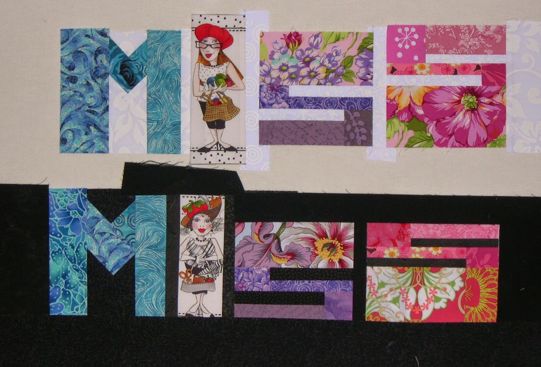
"Wow, Mom," he said later, "These two MISS words. If you look quick you think they are made of exactly the same fabrics in each letter. But they're not. They're close, but they're different. You did that on purpose, didn't you?"

Indeed I did.


"Mom, those fabrics in that bland Crayons quilt. Did you pick them so they'd almost disappear? Did you do that on purpose?"

You bet.

"Why? You hate those bland colors."

Well everybody was making these "low volume" quilts and I was getting awfully sick of them. Like if it's low-volume it's more special. So I wanted to make a low-volume quilt of my own, and I wanted to make it with letters, mostly to show that it could be done. The thing that took the most time was figuring out what it should say, because I definitely wanted something that would be OPPOSITE of low volume. I wanted to make a low volume quilt that said, STICK IT! Yes, I wanted it to do two opposing things at the same time. And what could be MORE anti low-volume than something that said, "HEY BOZO! USE ALL THE CRAYONS!" We ALL have a complete set of magic crayons in our lives, and we need to use them ALL, and not just hide behind the ones that are "socially acceptable."

"You know what I like about the "USE ALL" in the Bright Crayons, Mom? I like that the letters start out tall, and get progressively shorter, then they grow again. And then on the bottom, you do the reverse. They each float higher, then settle down, making an arc. You did that on purpose, I know. It looks cool."

"Mom, you think about EVERY little thing? The shape, the placement, the negative space, the way one fabric element blends into another one next to it. You think about ALL of that?"

Yes dear. If it's in the quilt it's no accident.

"It's funny Mom. The Bright Crayons. It's bright, and happy, but at the same time it's kind of boring. So why did you make that one?"

Because I HATED the beige one so much I just HAD to make a bright one to cheer myself up, and to prove a point.

"What point?"

The Black Crayons. You have to work harder to see them. They are still low-contrast, just in reverse. But because you don't usually see black quilts like that, it makes you look, it draws you in. The great graphic artist Milton Glaser made a poster once called "Looking is not Seeing," and it broke every rule of posters. It was mostly black and dark colors. You couldn't read it from a distance. You had to get close, but that was the point. To figure it out, you had to give it more than the five seconds or less that we usually spend looking at something. It's exactly the same premise as the Mashed Potato beige crayons, but I've turned the idea on it's head.

"So okay, where did the Black and White Crayons come from?"

I wanted to do a black and white words quilt for a long time, and I really wanted to play with how you didn't necessarily need a fabric that had color from one edge to the other to "read" as a letter. To reduce that idea to it's simplest, most basic element, I had to eliminate color altogether, and use the strongest contrast there is, the Light/Dark contrast of Black and White. And I wanted to play with the idea that even the same black and white print could look different on a black background as on a light one. I wanted to play with that duality, that one wasn't complete without the other. So I knew I wanted to divide the words in half somehow, but I couldn't work it out.  You see, I was stuck with the idea of dividing the words in half horizontally. The words wouldn't be very legible that way, and if I'm going to make a quilt with words in it, you have to be able to read it.

"How'd you figure it out?"

Like I usually do. I set the idea aside and didn't worry about it. I knew it would come to me eventually. But it's the first time an idea for a quilt ever came to me in a dream.

"Really? I mean, Mom. Really? In a dream?"

Yes honey, cross my heart and hope to die. In a dream.  And I'm really pleased with it, because it shows what you can do when you have limited options. You have to pull out all the stops. You have to really get creative. Two colors and I can still tweak the phrase so that it means something. Use ALL the colors in the box, even if you have only two. And even though I give them only black and white, which aren't really considered colors at all, I get folks to THINK about all colors, about ALL options, and about pushing an idea around and not stopping at the first, obvious idea. Because obvious can be boring.

"I love you Mom. You rock."

Thank you my darling. I love you too.