Guess what Julie and I did yesterday? We went to my favorite quilt shop for some retail therapy. How much retail therapy? We were there for three hours and we both carried shopping bags filled with fabric when we left. I showed off the Crayons quilts and left the Bright Crayons to be hung on display.
Then we went to lunch.
Julie will lend me her new quilt to show my students in July, so she brought it with her. Julie likes to take photos of her quilts in interesting settings, so on the drive home we found a lovely park for a photo shoot.
The Mashed Potato Crayons is really a pretty quilt, when it isn't overshadowed by its bolder cousins.
Black quilts are notoriously hard to photograph, but I think Julie and I finally got a good one of the Black Crayons. You can even see the quilting in this photo. (What you can't see is me standing on the park bench, holding the quilt up!)
Page 1
- Home
- Thoughts on Art, Creativity & Inspiration
- Friends
- Good Stories
- Tutorials
- Free Pieced Houses
- Lynne Tyler Word Quilts ~2009 - 2010
- Lynne Tyler Word Quilts ~ 2011
- Lynne Tyler Quilts ~ 2012
- Lynne Tyler Quilts ~ 2013
- Lynne Tyler Quilts ~ 2014
- Lynne Tyler 2015-2016 Quilts
- Lynne Tyler Quilts - 2017
- Lynne Tyler Quilts 2018
- 2019 Quilts
- 2020 Quilts
- 2021 Finished Quilts
- 2022 Quilts
- 2023 Quilts
- My Studio
- 2024 Quilts
- 2025 Quilts
- Doll Swap Quilts
- Details, Details & More Organization Stuff
- Couch, Bed & Table Quilts
- Scrap Slab Triangle Quilts
- Gizzy Quilts
- Slashed Squares Quilts
- Zebras
- Diamond Quilts
- Table Quilts
- Lynne's Bird Quilts
- Flight Of Fancy Hints
- Not Yet Finished...
- Quilts & Their Owners
Showing posts with label black crayons. Show all posts
Sunday, June 15, 2014
Tuesday, June 10, 2014
Why?
I don't make quilts for the usual reasons, if there is any such a thing as a "usual" reason. Sure I make quilts for people I love, but the other quilts, the word quilts, those I make for me because I have an idea I want to push around.
It just so happens that the ideas I push around end up in fabric. I have arthritis in my hand, so I can't draw because it hurts to hold a pencil for two hours. It's also one of the reasons I don't paint. I love fabric, I love to sew, I love color and I love solving puzzles. I can do all those things with fabric.
I love breaking the rules in such a way as to reinforce those rules at the same time. I love making you look. I love to fool you, to trick you, to make you get closer, to make you LOOK, to make you discover.
When I tell my students that one of my goals of my quilts is to reach out and grab the viewer by the shoulders, pull them close and say "LOOK AT ME! LOOK AT ME! LOOK AT ME!" I am not joking. I want more than the five second glance. I want more than the "oh look that's a --------- pattern / design in -------- color scheme. I can / did / know how to do that." I want my quilts to be the "greedy little songbird," the diva, the star of the show.
I want to knock your socks off.
Where I differ from most quilters is my Art training. Not that I learned design, color, balance and all of that. It's that I come from a place where if it isn't working you erase, and start again. You are OBLIGATED to start again. I come from a place where the emotional response of the viewer is more important than good technique. I come from a place where a great piece of Art cannot be quantified by the number of stitches per inch or how square or flat a quilt lies. In my world, the quilt police areburned at the stake ignored.
In my world, the nicely executed piece in a ubiquitous color scheme isn't given a second glance because it has nothing unique to recommend it. In my world a quilt made with ten thousand pieces is a yawner. So what? Big deal. Who cares? Who wants to make a quilt look like it was made by a machine?
There are lots of "pretty" quilts out there and they each have their purpose, and that's great, but that's not what I am after. I want more than "just" pretty. (There are lots of pretty paintings out there too, and I'm not in love with those either.)
When folks tell me my quilts are "cute," I have to restrain myself from rolling my eyes, although I've come to realize most viewers have no vocabulary for the kind of work that I do. I've come to appreciate the long pause, the silence, the soft "wow."
My son, who grew up in a family of artists and literally went to art shows every other week from the time he was two weeks old until he graduated from college in his early 20's, looked at one of my quilts in progress and said, "Mom, did you line this lady up so her hat was above the tops of the other letters? Because it looks like it's the dot on the letter "i."
Yes my darling.
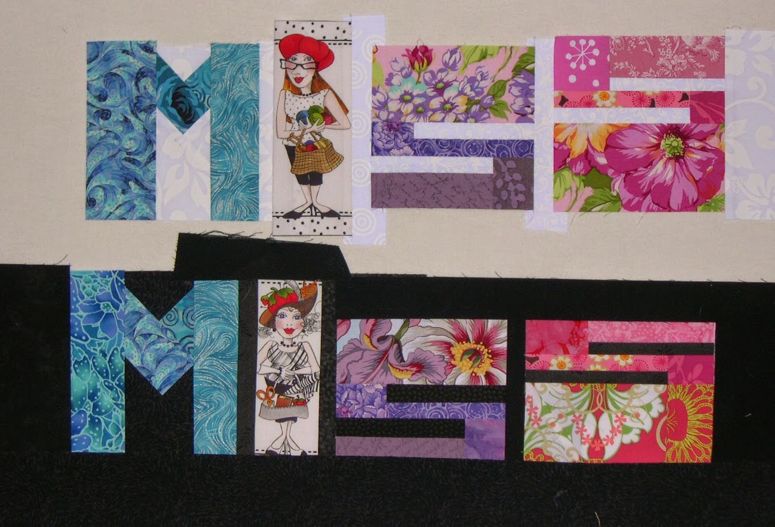
"Wow, Mom," he said later, "These two MISS words. If you look quick you think they are made of exactly the same fabrics in each letter. But they're not. They're close, but they're different. You did that on purpose, didn't you?"
Indeed I did.
"Mom, those fabrics in that bland Crayons quilt. Did you pick them so they'd almost disappear? Did you do that on purpose?"
You bet.
"Why? You hate those bland colors."
Well everybody was making these "low volume" quilts and I was getting awfully sick of them. Like if it's low-volume it's more special. So I wanted to make a low-volume quilt of my own, and I wanted to make it with letters, mostly to show that it could be done. The thing that took the most time was figuring out what it should say, because I definitely wanted something that would be OPPOSITE of low volume. I wanted to make a low volume quilt that said, STICK IT! Yes, I wanted it to do two opposing things at the same time. And what could be MORE anti low-volume than something that said, "HEY BOZO! USE ALL THE CRAYONS!" We ALL have a complete set of magic crayons in our lives, and we need to use them ALL, and not just hide behind the ones that are "socially acceptable."
"You know what I like about the "USE ALL" in the Bright Crayons, Mom? I like that the letters start out tall, and get progressively shorter, then they grow again. And then on the bottom, you do the reverse. They each float higher, then settle down, making an arc. You did that on purpose, I know. It looks cool."
"Mom, you think about EVERY little thing? The shape, the placement, the negative space, the way one fabric element blends into another one next to it. You think about ALL of that?"
Yes dear. If it's in the quilt it's no accident.
"It's funny Mom. The Bright Crayons. It's bright, and happy, but at the same time it's kind of boring. So why did you make that one?"
Because I HATED the beige one so much I just HAD to make a bright one to cheer myself up, and to prove a point.
"What point?"
The Black Crayons. You have to work harder to see them. They are still low-contrast, just in reverse. But because you don't usually see black quilts like that, it makes you look, it draws you in. The great graphic artist Milton Glaser made a poster once called "Looking is not Seeing," and it broke every rule of posters. It was mostly black and dark colors. You couldn't read it from a distance. You had to get close, but that was the point. To figure it out, you had to give it more than the five seconds or less that we usually spend looking at something. It's exactly the same premise as the Mashed Potato beige crayons, but I've turned the idea on it's head.
"So okay, where did the Black and White Crayons come from?"
I wanted to do a black and white words quilt for a long time, and I really wanted to play with how you didn't necessarily need a fabric that had color from one edge to the other to "read" as a letter. To reduce that idea to it's simplest, most basic element, I had to eliminate color altogether, and use the strongest contrast there is, the Light/Dark contrast of Black and White. And I wanted to play with the idea that even the same black and white print could look different on a black background as on a light one. I wanted to play with that duality, that one wasn't complete without the other. So I knew I wanted to divide the words in half somehow, but I couldn't work it out. You see, I was stuck with the idea of dividing the words in half horizontally. The words wouldn't be very legible that way, and if I'm going to make a quilt with words in it, you have to be able to read it.
"How'd you figure it out?"
Like I usually do. I set the idea aside and didn't worry about it. I knew it would come to me eventually. But it's the first time an idea for a quilt ever came to me in a dream.
"Really? I mean, Mom. Really? In a dream?"
Yes honey, cross my heart and hope to die. In a dream. And I'm really pleased with it, because it shows what you can do when you have limited options. You have to pull out all the stops. You have to really get creative. Two colors and I can still tweak the phrase so that it means something. Use ALL the colors in the box, even if you have only two. And even though I give them only black and white, which aren't really considered colors at all, I get folks to THINK about all colors, about ALL options, and about pushing an idea around and not stopping at the first, obvious idea. Because obvious can be boring.
"I love you Mom. You rock."
Thank you my darling. I love you too.
It just so happens that the ideas I push around end up in fabric. I have arthritis in my hand, so I can't draw because it hurts to hold a pencil for two hours. It's also one of the reasons I don't paint. I love fabric, I love to sew, I love color and I love solving puzzles. I can do all those things with fabric.
I love breaking the rules in such a way as to reinforce those rules at the same time. I love making you look. I love to fool you, to trick you, to make you get closer, to make you LOOK, to make you discover.
When I tell my students that one of my goals of my quilts is to reach out and grab the viewer by the shoulders, pull them close and say "LOOK AT ME! LOOK AT ME! LOOK AT ME!" I am not joking. I want more than the five second glance. I want more than the "oh look that's a --------- pattern / design in -------- color scheme. I can / did / know how to do that." I want my quilts to be the "greedy little songbird," the diva, the star of the show.
I want to knock your socks off.
Where I differ from most quilters is my Art training. Not that I learned design, color, balance and all of that. It's that I come from a place where if it isn't working you erase, and start again. You are OBLIGATED to start again. I come from a place where the emotional response of the viewer is more important than good technique. I come from a place where a great piece of Art cannot be quantified by the number of stitches per inch or how square or flat a quilt lies. In my world, the quilt police are
In my world, the nicely executed piece in a ubiquitous color scheme isn't given a second glance because it has nothing unique to recommend it. In my world a quilt made with ten thousand pieces is a yawner. So what? Big deal. Who cares? Who wants to make a quilt look like it was made by a machine?
There are lots of "pretty" quilts out there and they each have their purpose, and that's great, but that's not what I am after. I want more than "just" pretty. (There are lots of pretty paintings out there too, and I'm not in love with those either.)
When folks tell me my quilts are "cute," I have to restrain myself from rolling my eyes, although I've come to realize most viewers have no vocabulary for the kind of work that I do. I've come to appreciate the long pause, the silence, the soft "wow."
My son, who grew up in a family of artists and literally went to art shows every other week from the time he was two weeks old until he graduated from college in his early 20's, looked at one of my quilts in progress and said, "Mom, did you line this lady up so her hat was above the tops of the other letters? Because it looks like it's the dot on the letter "i."
Yes my darling.
"Wow, Mom," he said later, "These two MISS words. If you look quick you think they are made of exactly the same fabrics in each letter. But they're not. They're close, but they're different. You did that on purpose, didn't you?"
Indeed I did.
"Mom, those fabrics in that bland Crayons quilt. Did you pick them so they'd almost disappear? Did you do that on purpose?"
You bet.
"Why? You hate those bland colors."
Well everybody was making these "low volume" quilts and I was getting awfully sick of them. Like if it's low-volume it's more special. So I wanted to make a low-volume quilt of my own, and I wanted to make it with letters, mostly to show that it could be done. The thing that took the most time was figuring out what it should say, because I definitely wanted something that would be OPPOSITE of low volume. I wanted to make a low volume quilt that said, STICK IT! Yes, I wanted it to do two opposing things at the same time. And what could be MORE anti low-volume than something that said, "HEY BOZO! USE ALL THE CRAYONS!" We ALL have a complete set of magic crayons in our lives, and we need to use them ALL, and not just hide behind the ones that are "socially acceptable."
"You know what I like about the "USE ALL" in the Bright Crayons, Mom? I like that the letters start out tall, and get progressively shorter, then they grow again. And then on the bottom, you do the reverse. They each float higher, then settle down, making an arc. You did that on purpose, I know. It looks cool."
"Mom, you think about EVERY little thing? The shape, the placement, the negative space, the way one fabric element blends into another one next to it. You think about ALL of that?"
Yes dear. If it's in the quilt it's no accident.
"It's funny Mom. The Bright Crayons. It's bright, and happy, but at the same time it's kind of boring. So why did you make that one?"
Because I HATED the beige one so much I just HAD to make a bright one to cheer myself up, and to prove a point.
"What point?"
The Black Crayons. You have to work harder to see them. They are still low-contrast, just in reverse. But because you don't usually see black quilts like that, it makes you look, it draws you in. The great graphic artist Milton Glaser made a poster once called "Looking is not Seeing," and it broke every rule of posters. It was mostly black and dark colors. You couldn't read it from a distance. You had to get close, but that was the point. To figure it out, you had to give it more than the five seconds or less that we usually spend looking at something. It's exactly the same premise as the Mashed Potato beige crayons, but I've turned the idea on it's head.
"So okay, where did the Black and White Crayons come from?"
I wanted to do a black and white words quilt for a long time, and I really wanted to play with how you didn't necessarily need a fabric that had color from one edge to the other to "read" as a letter. To reduce that idea to it's simplest, most basic element, I had to eliminate color altogether, and use the strongest contrast there is, the Light/Dark contrast of Black and White. And I wanted to play with the idea that even the same black and white print could look different on a black background as on a light one. I wanted to play with that duality, that one wasn't complete without the other. So I knew I wanted to divide the words in half somehow, but I couldn't work it out. You see, I was stuck with the idea of dividing the words in half horizontally. The words wouldn't be very legible that way, and if I'm going to make a quilt with words in it, you have to be able to read it.
"How'd you figure it out?"
Like I usually do. I set the idea aside and didn't worry about it. I knew it would come to me eventually. But it's the first time an idea for a quilt ever came to me in a dream.
"Really? I mean, Mom. Really? In a dream?"
Yes honey, cross my heart and hope to die. In a dream. And I'm really pleased with it, because it shows what you can do when you have limited options. You have to pull out all the stops. You have to really get creative. Two colors and I can still tweak the phrase so that it means something. Use ALL the colors in the box, even if you have only two. And even though I give them only black and white, which aren't really considered colors at all, I get folks to THINK about all colors, about ALL options, and about pushing an idea around and not stopping at the first, obvious idea. Because obvious can be boring.
"I love you Mom. You rock."
Thank you my darling. I love you too.
Labels:
Black and White,
black crayons,
bright crayons,
color,
crayons,
mashed potato,
why
Sunday, June 8, 2014
Four
I had a little time last night after dinner so I quickly hung up all four crayons quilts on the new fence. They look pretty much like I expected them to, but I have them all at my house so that's not a surprise.
What did surprise me was just how hard to read the Mashed Potato Crayons are. It's easier when you are closer.
This photo really shows up the wonderful quilting by Chris on the Bright Crayons.
The bright crayons are lovely, but to me there is no mystery. The whole thing is very straightforward. The colors and fabrics echo the sentiment of the phrase. Nothing unexpected here.
I took these photos in a hurry, the light was fading and I didn't have any help. I think this one is slightly out of focus, and when I do these again I'll make an effort to get them closer together. At any rate, I knew when I made it that the letters in the Black Crayons were wider overall, and that's one reason why the quilt is wider also. (Truth: I trimmed too much from the right side of the Bright Crayons quilt by mistake. The air was positively BLUE when I realized what I had done. It annoys the heck out of me. And yes, I wish I had used a different BOB on the background of the Y in the Black Crayons.)
I deliberately changed the placement of the birds in each of the quilts. I don't like making two quilts the same (actually I am constitutionally incapable of making two that are exactly alike).
When I sat back in a lawn chair to look at all four of them together, the thing that really hit me was how much I love the Black and White one above all the others. It's a lot more interesting to look at.
This photo also shows off Chris's amazing free motion quilting artistry.
What did surprise me was just how hard to read the Mashed Potato Crayons are. It's easier when you are closer.
This photo really shows up the wonderful quilting by Chris on the Bright Crayons.
The bright crayons are lovely, but to me there is no mystery. The whole thing is very straightforward. The colors and fabrics echo the sentiment of the phrase. Nothing unexpected here.
I took these photos in a hurry, the light was fading and I didn't have any help. I think this one is slightly out of focus, and when I do these again I'll make an effort to get them closer together. At any rate, I knew when I made it that the letters in the Black Crayons were wider overall, and that's one reason why the quilt is wider also. (Truth: I trimmed too much from the right side of the Bright Crayons quilt by mistake. The air was positively BLUE when I realized what I had done. It annoys the heck out of me. And yes, I wish I had used a different BOB on the background of the Y in the Black Crayons.)
I deliberately changed the placement of the birds in each of the quilts. I don't like making two quilts the same (actually I am constitutionally incapable of making two that are exactly alike).
When I sat back in a lawn chair to look at all four of them together, the thing that really hit me was how much I love the Black and White one above all the others. It's a lot more interesting to look at.
This photo also shows off Chris's amazing free motion quilting artistry.
Labels:
Black and White,
black crayons,
bright crayons,
crayons,
four,
letters,
low contrast,
mashed potato
Thursday, April 3, 2014
Back to Back to Back
I like to choose the right backings for my quilts. I never use whatever I have left hanging around unless it's perfect for the quilt. (You never know what you've got...)
So here is the backing, binding and hanging sleeve for the Mashed Potato Low Volume Crayons quilt.
As you can see I chose an equally low volume print for the backing and I used the same fabric for the binding as I did for the hanging sleeve.
Here is the fun bright backing, hanging sleeve and binding for the Bright Crayons:
Yes it's over the top, but it's also fun. It was in my stash, as was the fabric for the hanging sleeve and the binding.
Here is the relatively plain backing for the Black Crayons. You can see I used the mid-century modern print for the hanging sleeve. This I did have left over, and I felt it was appropriate. For the binding, I used a print of color crayons on a black background.
So here is the backing, binding and hanging sleeve for the Mashed Potato Low Volume Crayons quilt.
As you can see I chose an equally low volume print for the backing and I used the same fabric for the binding as I did for the hanging sleeve.
Here is the fun bright backing, hanging sleeve and binding for the Bright Crayons:
Yes it's over the top, but it's also fun. It was in my stash, as was the fabric for the hanging sleeve and the binding.
Here is the relatively plain backing for the Black Crayons. You can see I used the mid-century modern print for the hanging sleeve. This I did have left over, and I felt it was appropriate. For the binding, I used a print of color crayons on a black background.
Labels:
backing,
binding,
black crayons,
bright crayons,
crayons,
letters,
mashed potato
Sunday, September 8, 2013
More Backings and Bindings
I've been working to get some things finished up. I've made four letter flimsies this year, and after I show them off at Quintessential Quilts 2013 in St Louis in October, I'll be handing them off to Chris for quilting.
I've selected this fabric for the backing of "Font Factory," the flimsy I made to help students construct free-pieced letters.
It would seem logical to use this fabric for the binding,
but I have some reservations about the flimsy:
It's kind of blah. I know it needs a bit more fabric on the left, but I'm not happy with all the empty white space beneath the columns of letters. I tried adding birds or hearts or asterisk flowers, but I didn't really think they fit. Since I use this as a teaching tool, I don't want to confuse or distract my students. Suggestions would be welcome.
For the "Mashed Potato" version of the Crayons,
I have selected this fabric for the backing.
And this one for the binding.
I liked the little pops of color of the tea bag labels.
For the Black Crayons,
I picked this for the backing,
I could have used lots of fabrics, but I really liked this one, and I felt it related to the cream version.
and this fabric just screamed "Pick Me!" for the binding, and who was I to resist?
I could have switched these two, but I really wanted the binding to be colorful.
I've selected this fabric for the backing of "Font Factory," the flimsy I made to help students construct free-pieced letters.
It would seem logical to use this fabric for the binding,
but I have some reservations about the flimsy:
It's kind of blah. I know it needs a bit more fabric on the left, but I'm not happy with all the empty white space beneath the columns of letters. I tried adding birds or hearts or asterisk flowers, but I didn't really think they fit. Since I use this as a teaching tool, I don't want to confuse or distract my students. Suggestions would be welcome.
For the "Mashed Potato" version of the Crayons,
I have selected this fabric for the backing.
And this one for the binding.
I liked the little pops of color of the tea bag labels.
For the Black Crayons,
I picked this for the backing,
I could have used lots of fabrics, but I really liked this one, and I felt it related to the cream version.
and this fabric just screamed "Pick Me!" for the binding, and who was I to resist?
I could have switched these two, but I really wanted the binding to be colorful.
Tuesday, September 3, 2013
It's not a Plane, or a Bird...
It's a flimsy.
It's 37-1/4" x 53" (94.5 x 134.6 cm)
Here are the other two, for comparison.
Cream, or "Mashed Potato"
Black
It's 37-1/4" x 53" (94.5 x 134.6 cm)
Here are the other two, for comparison.
Cream, or "Mashed Potato"
Black
Monday, June 10, 2013
Now You See It...
The Black Crayons flimsy is complete.
It measures 30" x 52"
(I had to improve the contrast a bit since the black looked like grey in the photo.)
Here is the bland Crayons, for comparison.
Interseting, isn't it?
(I had to improve the contrast a bit since the black looked like grey in the photo.)
Here is the bland Crayons, for comparison.
Interseting, isn't it?
Sunday, June 9, 2013
Saturday, June 8, 2013
Beeeee-cause!
OK! I'll admit I want to make everybody work a little bit harder to read the letters in this version of the Crayons quilt. Having made each letter from one fabric however, limits my options for the remaining letters. I have to find appropriate fabrics for the letters I have left. It isn't easy, as you can probably tell.
I've had this Jane Sassaman fabric for a while. I like using very large prints for the backings of my quilts, but the quilt I was planning for this fabric grew too large, so I selected something else.
I knew that if I just made a letter out of this fabric without regard to the pattern the letter would be rather disjointed looking. The letter B has curves, and this fabric has plenty of those. How should I use them? I didn't think the pink flowers would work well, and I knew the blue orchid would require too much cutting into the yardage. So I cut a couple of 2-1/2" strips crosswise and played with them.
I decided to use the leaves with the blue stems on either side of the lower "bowl".
I cut a piece of the same leaf and placed it on the bottom, underneath the black rectangle to look like a mirror image. Then I cut a piece on the bias to use in the corner. I didn't like that light area in the lower right corner, but a B is a curved shape, so I knew I could simply chop that out and make that corner suggest a curve.
Finding something to use for the upper part of the B was a bit trickier. I needed a longish, narrow piece of green.
I kept the top piece and the horizontal strip connecting the upper and lower parts of the letter in line with how I had used the fabric in other parts of the letter. That swirling green piece that connects to the blue is no accident.
Lastly I needed a long strip for the upright along the left side. The pattern on its own was a bit too big, so I did a bit of tinkering.
This is the finished letter B.
The pink dots on the left edge may disappear in the seam allowance when I sew the letter to the backing.
When I teach letter-making, the afternoon is devoted to teaching students to get the most out of their fabrics in this way.
I've had this Jane Sassaman fabric for a while. I like using very large prints for the backings of my quilts, but the quilt I was planning for this fabric grew too large, so I selected something else.
I knew that if I just made a letter out of this fabric without regard to the pattern the letter would be rather disjointed looking. The letter B has curves, and this fabric has plenty of those. How should I use them? I didn't think the pink flowers would work well, and I knew the blue orchid would require too much cutting into the yardage. So I cut a couple of 2-1/2" strips crosswise and played with them.
I decided to use the leaves with the blue stems on either side of the lower "bowl".
I cut a piece of the same leaf and placed it on the bottom, underneath the black rectangle to look like a mirror image. Then I cut a piece on the bias to use in the corner. I didn't like that light area in the lower right corner, but a B is a curved shape, so I knew I could simply chop that out and make that corner suggest a curve.
Finding something to use for the upper part of the B was a bit trickier. I needed a longish, narrow piece of green.
I kept the top piece and the horizontal strip connecting the upper and lower parts of the letter in line with how I had used the fabric in other parts of the letter. That swirling green piece that connects to the blue is no accident.
Lastly I needed a long strip for the upright along the left side. The pattern on its own was a bit too big, so I did a bit of tinkering.
This is the finished letter B.
The pink dots on the left edge may disappear in the seam allowance when I sew the letter to the backing.
When I teach letter-making, the afternoon is devoted to teaching students to get the most out of their fabrics in this way.
Friday, June 7, 2013
O-migoodness
Brenda, you are right. These Black letters are hard to read. I think their readability will improve when they are completely surrounded by black fabric. However, this exercise is designed to push the boundaries of what is easy to see.
Thursday, June 6, 2013
More Black
I thought the ladies would make the "U" pretty special, but I am not sure the letter will "read" properly. All the other letters are made from one fabric, and this letter should be too. The fabric of the "S" isn't working. The design is too large and the rabbit is too distracting. But you never know until you try.
I've been thinking a lot about WHY I like to make letters that make you look. I think it's because as an artist who loves to draw, I live in the land of subtle value changes.
Check out this Milton Glaser poster. It's called "Looking Is Not Seeing."
After I make this black version, there will be two more. One is the quilt "I" would make, using all colors, all values, using all the fabrics to their peak potential and including all my usual "inside jokes" and surprises. I'll make that one AFTER I make a "minimalist" version, which will include no color.
Oh I can't wait.
Wednesday, June 5, 2013
Not-So-Basic Black
I made some more black letters. I am really happy with these. I like the sheer unexpectedness of them.
They will look so much better when completely surrounded by black. I haven't sewn any of these letters together yet.
Tuesday, June 4, 2013
Black is Back!
Here's another version of the Crayons, and this one will be made from fabrics with all black backgrounds. It is very similar in concept to the "low volume" quilts, but in reverse. I am very excited about this version too!
Heh.
Subscribe to:
Posts (Atom)