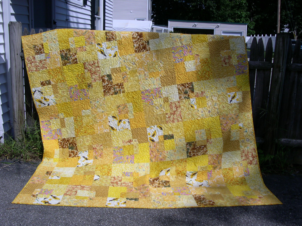
I had a little time last night after dinner so I quickly hung up all four crayons quilts on the new fence. They look pretty much like I expected them to, but I have them all at my house so that's not a surprise.
What did surprise me was just how hard to read the Mashed Potato Crayons are. It's easier when you are closer.
This photo really shows up the wonderful quilting by
Chris on the Bright Crayons.
The bright crayons are lovely, but to me there is no mystery. The whole thing is very straightforward. The colors and fabrics echo the sentiment of the phrase. Nothing unexpected here.
I took these photos in a hurry, the light was fading and I didn't have any help. I think this one is slightly out of focus, and when I do these again I'll make an effort to get them closer together. At any rate, I knew when I made it that the letters in the Black Crayons were wider overall, and that's one reason why the quilt is wider also. (Truth: I trimmed too much from the right side of the Bright Crayons quilt by mistake. The air was positively
BLUE when I realized what I had done. It annoys the heck out of me. And yes, I wish I had used a different BOB on the background of the Y in the Black Crayons.)
I deliberately changed the placement of the birds in each of the quilts.
I don't like making two quilts the same (actually I am constitutionally
incapable of making two that are exactly alike).
When I sat back in a lawn chair to look at all four of them together, the thing that really hit me was how much I love the Black and White one above all the others. It's a lot more interesting to look at.
This photo also shows off Chris's amazing free motion quilting artistry.