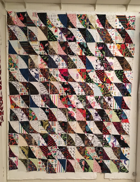
Alas, they did not. While this is moderately pleasing, it isn't exciting enough to float my boat. As my pal the Selvage Fairy said to me once, "It's interesting you think the worst [your design] could possibly be is nice."
But it was the Selvage Fairy who set me on this path of curves in triangles in the first place. She wanted to know what would happen with these blocks if I rearranged them. Dear Selvage Fairy, your request is my command...
So I started tinkering, but this did not float my boat either. This was boring boring boring. Too much been there done that.
However, there was one shape in this photo that I DID like very much.
THIS ONE! I thought THIS had distinct possibilities, so I moved the pieces around again...
By the time I was halfway down, I knew this was THE ONE!
I still have to rearrange the blocks to distribute the colors and patterns a bit better, and I need another vertical column over on the left to complete those dark shapes over there, but this overall layout is it.
I love the optical illusions it creates, the movement, and the sheer unexpectedness of it.
For those of you wondering how it works, this should explain it.


16 comments:
yep...Your Right again.... this one has form and flow and actual design line that draws the eye,
What a difference!
Play till it looks great, you did, , and it does, stunning arrangement.
I would have never thought switching the blocks around would make such a difference but WOW. Love it.
wow! you wanted movement, and you got it! I'm dizzy just looking at it! kind of shocking, really, how much that changed the quilt...
Love it!
NOT boring . . . really wonderful!
Very interesting to see the design process unfold, Lynne.
Megan
Sydney, Australia
Love it! Reminds me of sails in the wind.
Definitely not nice! I love the movement.
I makes me think of sheets hangin on a clothesline and blowing in the breeze. Love where you are going with it.
Oh, hell yes!
Just for the record, I didn't say that the worst YOU THINK is that it could be nice, I said that the worst it could be was nice.
Looks great! The squares look like they're being blown in the wind.
Oh yes! I love it!
Lovely, this reminds me of the strings of celebration flags fluttering in the breeze between buildings in Mexico
Post a Comment