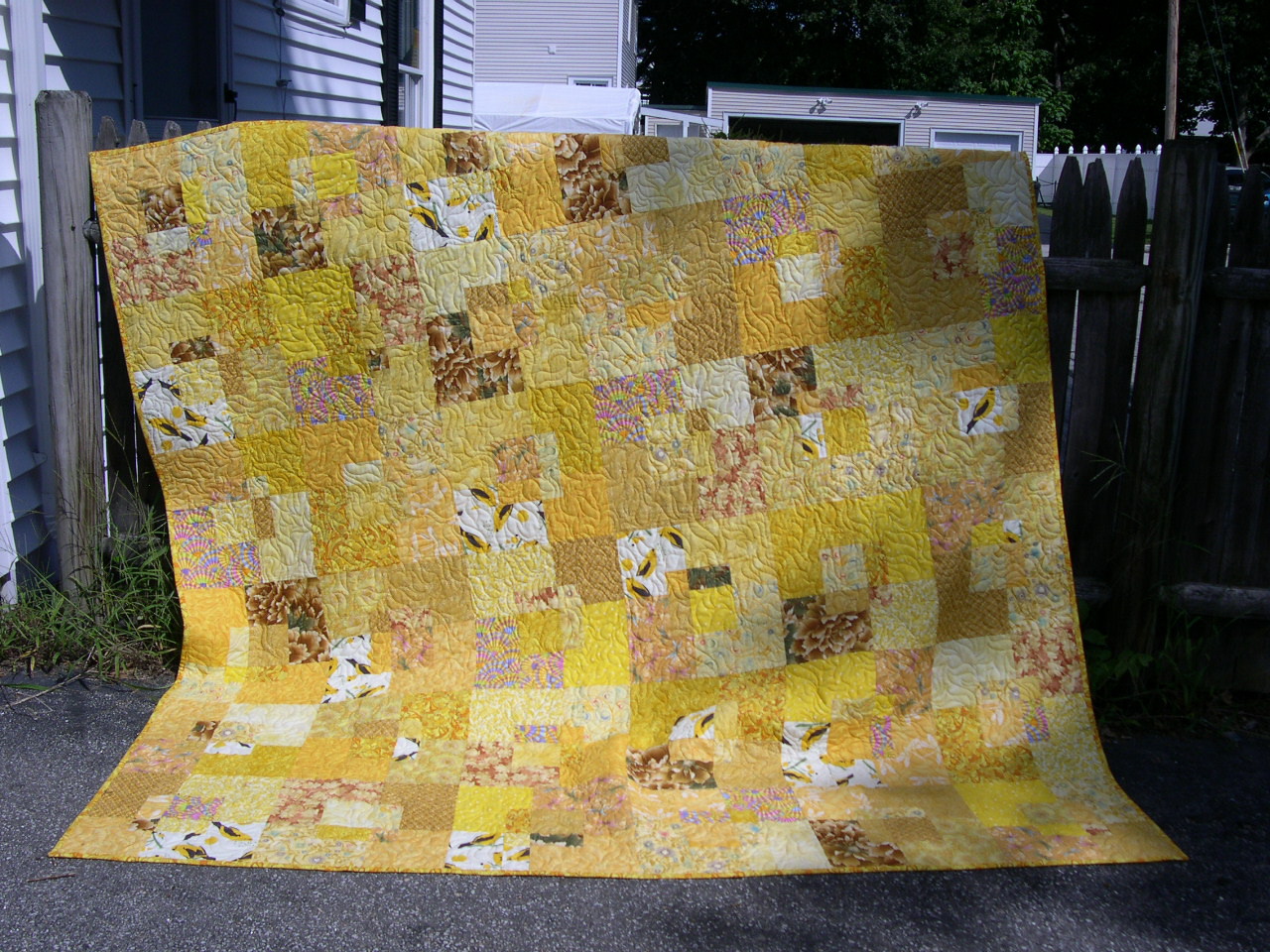
I'm not against low-contrast quilts. Julie has put together a lovely low-contrast flimsy she's called Beach Grass. You can see it here.
The center panel of this chessboard is relatively low-contrast. These two soft greens provide enough contrast for this checkerboard. The chessboard is livened up by the pink inner border. Without it, the piece would be less interesting.

Even the Red Sticks is a (relatively) low-contrast quilt. It's high "chroma" or "intensity" because red in an intense color, but check out the border - true low contrast.

My sister made this all-pink quilt for a little girl. Sure there are greens, purples and blues in it, but it's predominantly PINK and quite charming.


I keep using this word "interesting." It's because the eye likes contrast, and is attracted to areas of contrast - which define things. If it's all the same, the eye moves to something else. If it's got contrast, the eye stops to look around.
1 comment:
Wow this is 11 years old. But it's relevant to me in 2024. I am trying to use up my stash for donation quilts. I have piles of purple at all seem to have a similar value. Your page gives me ideas on how to accomplish this aesthetically. I hope this finds you well.
Post a Comment