Last night, I got home and wasn't really interested in making dinner right away, so I made the "k." After dinner I made the "e."
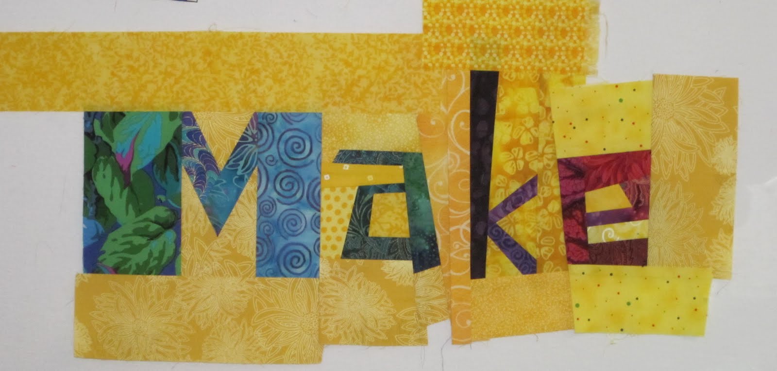 The letters aren't sewn together yet.
Those of you with eagle eyes will notice the "M" has been changed too. As soon as I put it up on the wall the day I made it, I knew that plum colored area on the left leg attracted too much attention. It had too much contrast; your eye went right to it - and stayed there. It was a big hole, and it had to go. I was kinda hoping it would go away on it's own, but you know how that works.
 So I fixed it.
 Here's the original, for comparison.
3 comments:
Making letters can be addictive. And it must be even more so when they come out as beautiful as yours do!
I learn so much from reading about the process of others...thanks for showing the before and after photo to compare.
If you EVER find any more of that blue nautilus fabric, buy me 2-3 yards!
New M is much better ... good to see the next-to-each-other comparison.
This is going to be an awesome piece!
Post a Comment