 Here's a photo you can use to compare the two, before and after. (Before is on the laptop.)
You can click the photos to enlarge.
(blogger is being a pita this morning)
Here's a photo you can use to compare the two, before and after. (Before is on the laptop.) Lucinda made it for me. I was one of the Swap Mamas for Doll Quilt Swap 9, and Lucinda made each of the Mamas a lovely chair quilt, personalized just for them. Mine had to have letters. What to fit in this tiny space?
  A small word, but she did it magnificently. This little quilt is 7-1/2" wide by 15" tall, and the letters are small - the S is barely 2" high.
 The M is quite large, and visually heavy. I didn't mind that, as it needed that to emphasize it's importance as the first letter in the phrase.
 But the "w" and "o" were also visually heavy. I couldn't place the "w" on the same left edge as the "M" because the "M" and "w" would make the design unbalanced. Even sliding the word "work" over to the right didn't completely resolve that problem.
 So I trimmed the "w" a bit, first in the middle, then on the left, and I also made the letter "o" skinnier. I removed the cool yellow strip of fabric just above the "w" because I felt it drew your eye away.
 I moved "work" slightly over to the right. I also wanted to create a bit of visual tension and interest and I didn't want the design to be too static.
 Working with words, I believe readability is very important. If I had wanted the piece to be primarily a graphic design, and the phrase a secondary element, I might have arranged them differently, but this piece is all about the phrase "Make it work!" so the letters had to be easy to read as words.
 (View from this morning... I might add a bit of yellow to the left edge, as it seems a bit cramped over there. I'll have to look at it for a while to be sure, and I'm not sure if "it" shouldn't be moved over to the left a bit...)
 Here are a couple of how-to photos for the "k".
  You can click the photos to enlarge.
 The phrase really needed an exclamation point at the end.
 ta-da!
 I've made all the letters for the Make it Work quilt, and now I am fine-tuning them. The upright on the last "k" needs to be a bit wider.
 So here it is. In the end, I was pretty pleased with the result. It will be trimmed, and it will not sit on the same baseline as the "w".
 You can click the photos to enlarge.
 I was so preoccupied getting the W to look "right" that I forgot to make it a little bit silly.
 But I love the free pieced letter W, so it's staying put. For now.
 The letters aren't sewn together yet.
 So I fixed it.
 Here's the original, for comparison.
 I will allow myself to use my "regular stash" for the yellow for the background, and the backing and binding for the quilt when it is finished.
 Oh, and since my pal Julie says my letters are very precise and planned... another self-imposed rule for this quilt... no drawing letters in advance. Just cut and sew.
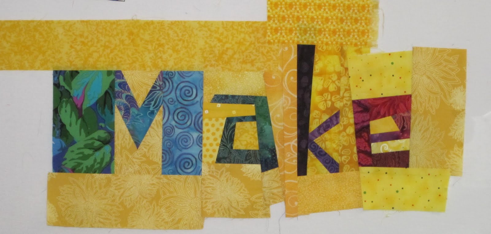
 Here's the first letter. I always make my letters big so I can trim them down if needed. This M won't be either as tall or as wide as it is right now.
 Black and white with a red tomato-pincushion hat, I thought she did a terrific job of looking like the letter "I."
 She disappears, he said. You don't see her at all. She has to go.
 Stepping back, I think she looks a lot better.
 Dear Son, once again, you are right!
 It's nice to be able to see the quilt from a distance in a well-lit space. The colors really glow, and the quilting really shows up.
 I forget, sometimes, how unique my quilts are.
 The white Rules quilt flimsy is finished. It's about 44" wide by 52" high. (112 cm x 132 cm).