Three of these Q's are better than the others.
This purple one looks silly. That purple extension doesn't really look like a Q to me.
This problem with this pink Q is the bottom piece is too thin. By the time it get's sewed up, it will be really skinny, and look stupid.
The X part of this green Q is too skinny. Or the rest of it is too fat.
The bottom part of the Q is too thick, and the angle of the slash is too shallow. I don't really like that long point either.
This one is sorta ok.
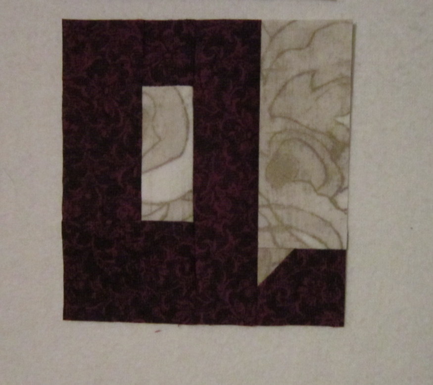
The angle of the slash is good here, but by the time I sew the bottom of this to another piece of fabric, the end of the slash that extends past the letter will just disappear and look confused.
This Q is a very good, simple version. I borrowed the idea from
Kathy at Q.U.I (Quilted under the Influence.)
This is
Tonya's original Q. It's fairly fussy to get lined up well, and this version did not appear in her book.
It's nice that there are several versions from which to choose. Which version do you like best?


5 comments:
The first one looks like a P on its side.
My fav one is Kathy's, but I do like the way you do yours with the slash. They really do look like Q's.
I think the pink sorta okay one looks like it would work well. I like it the best.
I hope you have sun today.
I like Tonya's original - however, I try to avoid words that contain a Q . . .
I like the third pink one. It looks the most like a Q to me. Have a good evening.
Marilyn
I like the pink one too. but suggest that the thing with a Q is that its tail goes down below th line. You could try a Q with a little strip of background underneath the letter to support the tail and be part of it. make any sense?
Post a Comment