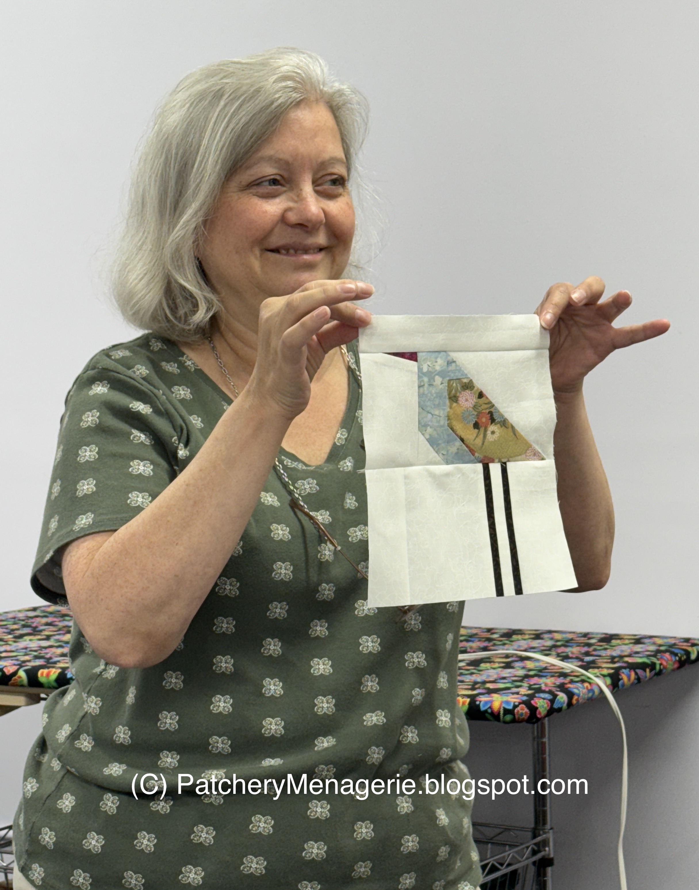
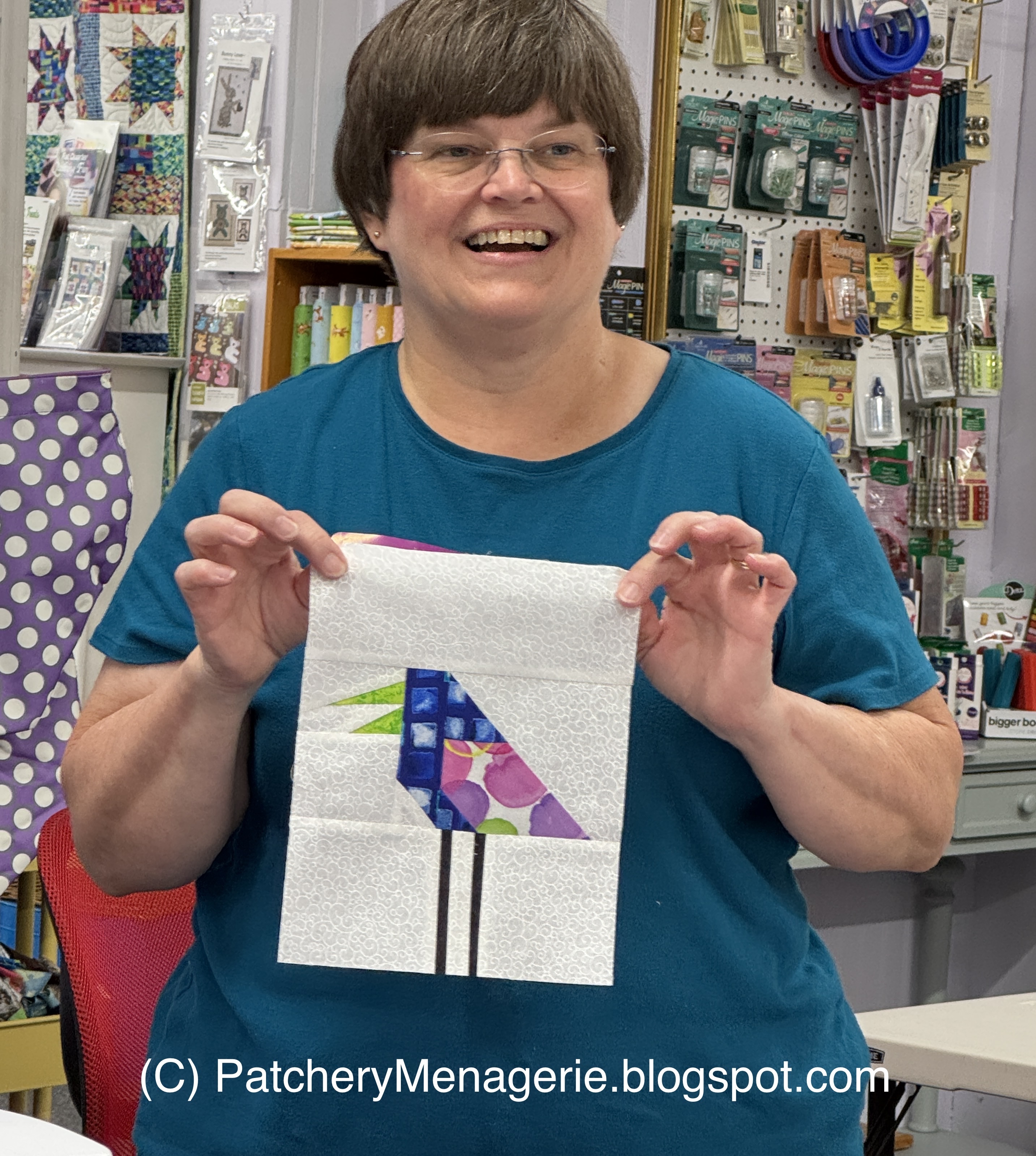
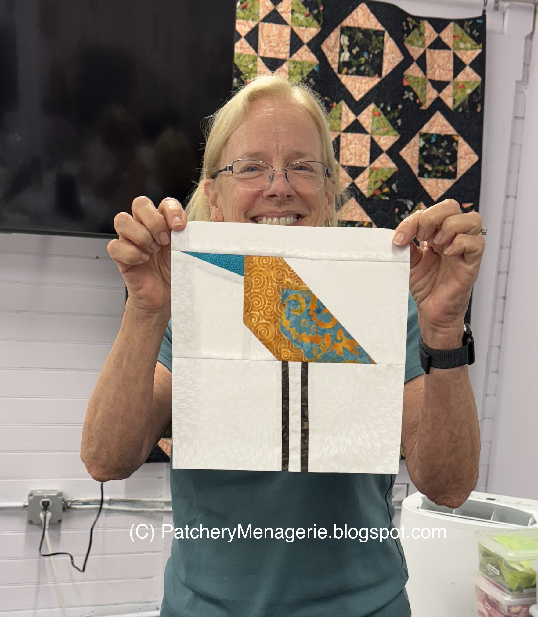
Friday, March 16, 2012

To

I hadn't planned on hiding a cat in the Black Box quilt, but when I saw this white cat washing herself, I just couldn't resist making it the center of the "o" in the word "to."

I am going, too.

I am going to visit friends and will be away for a few days.

Thursday, March 15, 2012

Do I Have To?

One of the things that happens when you do "something, anything" to dislodge a stuck idea is that you see things in a new light.

Last week when Julie recommended I use my dud letters as "placeholders" in the design of the Black Box quilt, I had no idea I would like what I saw. Now, there's no way I'm going to use these letters like this, but as soon as I put them up, something about their recklessness appealed to me. They reminded me of  the cut up, mismatched letters in ransom notes.

I have decided to include that concept in the letters in the Black Box quilt.  The brilliant "out of the box" letters will stay as they are, but many of the other letters will be mismatched, and made of fabrics that could be described by some as "fugly."  The ambiguous A / E from Monday's post is an example of what I mean.

Wednesday, March 14, 2012

Fugly


Here are some of the "fugly" (fun + ugly) fabrics I have used to make these "ransom" style letters in the Black Box quilt. I am quite happy with them, although as I make more, I may well make some substitutions.  The letters will definitely bounce around, like those in the "You."

Tuesday, March 13, 2012

Scale and Print

 When you make a free pieced letter, or any quilt block, you really have to be careful the scale of  your fabric doesn't overpower what it is you're making,
Of course, there are usually ways to get around it. I didn't know what I'd use this big print for when I bought it, but it was pretty gorgeous, and I thought it had potential.  So now it's an "h," and you'll have to stay tuned to see where it will go in the Black Box quilt.

Monday, March 12, 2012

Whatzit?


One of the neat things about free pieced letters is that the lower case "a" is the same as a lower case "e."  I actually designed this letter as an "a" but I like it better as an "e."

This letter will be going in the Black Box quilt. I just don't know where.

Friday, March 9, 2012

Why You Should Keep Your Duds

My friend Julie suggested I use my dud (excuse me, misfit letters) to fill out the rest of the phrase so I would better be able to imagine the scope of the whole thing. 

She's right. Now I have a better idea of how much space the quilt needs, and I'm much more able to see where things should go.

By the way, Julie's quilt has the same number of letters. Here it is on the same design wall.


Thank you Julie!


Thursday, March 8, 2012

So far

This is what I've got so far, and I've got a long way to go.  Last night I cleaned up my work table because my mind was either too cluttered or too empty to sew.  I know what that means -- it means I have to do SOMETHING, so I will!

Wednesday, March 7, 2012

Snip Snip!

Sometimes the answer to what you're looking for is right in front of your face.
 Yes, it's the Quick Brown Fox. This quilt hangs in my sewing studio and every time I look up from my sewing table I see it.

Yesterday morning, it finally hit me over the head.  The words in the fox quilt don't have letters that blend together. They are mismatched, and they look quite lovely.
 They are also a lot smaller than the letters I had been making for the Black Box quilt. Hmm.  I had to make those letters smaller.
 But look at what will happen to this "Y" with a little judicious trimming! Not only do the letters get smaller, but I might actually be able to fit "before you can think" on one line! (well, maybe not.)
And now I think the really bright "out of the box" letters really make sense, because finally they are significantly different from the others (and not just in intensity).

I am feeling much better. I think I know where this is going.

Tuesday, March 6, 2012

If You Don't Know...

Yogi Berra said, "If you don't know where you are going, you might wind up someplace else."

After Sunday's sewing session, I wasn't sure what I should do next (the letters, more asterisks, etc.) I remembered Berra's quote, and decided to make a test "starting box." After all, the quote has to work its way TO this plain box, and with the end in sight, I should be able to make letters that "go there."

It's a test because I am not quite sure of the size or the fabrics, or the angle of the box, and if it's going to sit on something instead of floating in the air.The front face of the box is 4" square.

Monday, March 5, 2012

So Far So Good

I am very happy with the brightly colored letters and the colored asterisks. None of the elements are sewn together yet.

This quote has 49 letters, which is a lot. There are a lot of letters left to make, and the quilt could get really big.  Which isn't really a problem, but as you all know, BIG quilts take LOTS of stuff, and frankly, I don't want this quilt to be TOO big.

We'll see!

Sunday, March 4, 2012

Asterisk Flowers

 In addition to the brightly colored letters, I will also have some brightly colored asterisk flowers in the Black Box Quilt.

You can make them like this... all one color with a contrasting center.

But I also like them two-toned, as in these.

 Remember they can be rotated for slightly different emphasis.

 They are about 4-1/2" across.
I used to make them all in one color (see the top one), but I goofed once, and made a two-toned one by mistake. I liked it so much I included it in the finished quilt, and now I make them two toned on purpose.

Saturday, March 3, 2012

Rainbow in a Box

Now THIS is much better!  The letters are largish, but they will be trimmed down to a more consistent height and width.

Woo hoo!

Friday, March 2, 2012

Shout it out!

 This is the run of colors I plan to use to make the letters "out of the box."
I think it's going to be a lot better.

And yes, all the letters shown are larger than they would be in the finished quilt. I do plan to make them a lot skinnier, but I have found it is best NOT to trim them until I start sewing them together.

Thursday, March 1, 2012

Then Again, I Might Be an Idiot...

So OK, we all know I didn't really like the "before you can think" letters yesterday.  I was looking at them on a different wall from the box.

I dragged the stepladder from its usual resting place next to the refrigerator to the sewing studio and set the letters above the black box.
When I stepped down, and moved across the room to get a better look, I realized I might have been a bit too hasty with my harsh judgement.

I still don't like the chopped up colored letters; HOWEVER, this makes me realize I've got the colors the wrong way around.  The "Before you can think" should be pale and subdued.  The letters "out of the box" should be bright and riotous, a cacophony of color, fun and full of surprises (I can do that!)  Then the "you have to start with a box" letters have to move back to duller, more washed out colors, until I end with the small box at the very end. OHO! Now my brain is swirling with ideas!

So, more letters for the misfit bin, and somewhat back to the drawing board for me, but no matter. It's like Thomas Edison said, "I have not failed. I've just found 10,000 ways that won't work."