1. I had originally envisioned the striped "all the" in an arc above the word "Fun." Since that would require the other letters to be centered, it might look like this:

2. Then I thought to left-justify the letters like this, slide the FUN over to the right, and use the "all the" in an arc filling up a bit of the space on the left.

3. Then I thought, hmm.. maybe the striped "all the" letters are too thin, and don't really carry on the theme of the other letters.. maybe I should make them more like the others and line them up too (and then "FUN" slides over to the right to balance the composition).

4. But what if I insert an asterisk between "all" and "the" and then center the word "FUN" under that...

5. Here I have gone back to the original skinny "all the" and positioned them in an arc again over "FUN" but kept the asterisk in between.
 It doesn't help that I'm not completely in love with this "u."
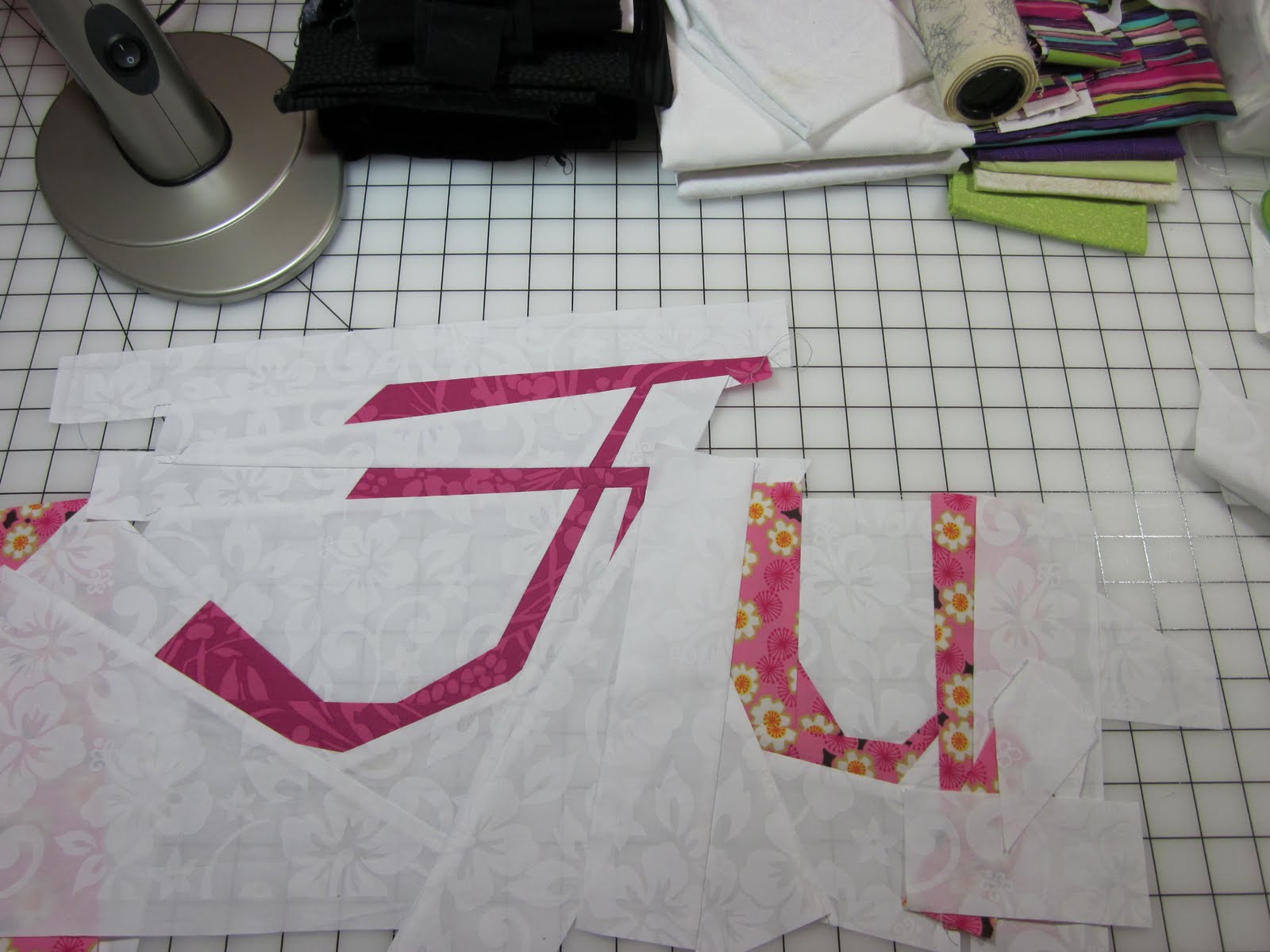
So here's the thing. There are LOTS of good possibilities, and several conundrums.
a. I want the quilt to be one unit, not two sets of disparate elements competing against each other. I am worried that the striped letters "all the" break the "rules" thought a bit too soon.
b. so I don't know if I should replace the striped "all the" with more regularly shaped letters (as in the ones above) or use the skinny ones, or the more "regular" set.
c. I don't know if I should make the "UN" in fun more curvy or make them straight. (This is a time where I really need to make both types and try them out to see.)
d. Much as I absolutely adore the curve-y "F" I don't know if it fits, and I can't answer that until I resolve the issue in my own head, because I can't make it do what I want if I don't know what I want.
Oscar Wilde once said, "The anxiety is unbearable. I only hope it lasts forever."
Your thoughts, positive, negative, whatever... are all welcome, and may help me get un-stuck.
thanks,
Lynne
5 comments:
for what it's worth, I instantly fell in love with option 2. of course always hard to tell since it's not complete, but that one really speaks to me. make the n then worry
The "F" looks like your handwriting right? So, the "un" maybe should look like cursive writing too. That could be why you don't like the "u".
I like #5 because I think it best highlights the word "Fun".
I'll miss being able to see it.
I suspect another niggling issue that lies beneath and bothers is the striped fabric used for ALL THE. Prior to that point, each letter features a different fabric - then suddenly two words/six letters are all made from one fabric.
Still feel like #2 has the greatest possiblities (as we've already discussed). Time to quit thinking quite so hard and let serendipity play a part. (will e-mail other thoughts later today)
Oh, and maybe the disconnect with that final "U" is how it is slanted so differently than your magnificent cursive F.
I like option #2 - especially since the "all" starts lower than "the" - which is JUST NOT DONE when one is lining up words - it sort of breaks the rules even more. LOL
I just have to say I think that "F" is really quite wonderful and would love to see that developed into something fabulous....
Post a Comment