Showing posts with label colors. Show all posts

Saturday, May 9, 2020

Colors Part Two

It was fun to read the comments that came in during the day yesterday.


I decided that I would photograph the shirt, vest and necklace with the various colors so we could all see what I had in mind.


GAIL the right answers! Although maybe "right" isn't the proper term. Her answers matched mine:

Hot pink!

Tangerine orange!


Grass green! In this, Gail got had a suggestion that was better.

My own answer was limey yellow green, as in this example, but as soon as I set it down I realized it was too light. It needed to be darker. Grassy green was better. You go, Gail!

Kathy suggested Navy blue and a golden yellow. Not at all the colors I had in mind. To make this successful you'd have to carefully balance the navy blue and the red violet. They are too close in value. But the colors are good together.

Sewing Up A Storm suggested a darker turquoise, the right shade of brown and a lighter shade of red violet. Those are simply darker versions of what is already here. To my mind it is missing something. She also suggested green and red orange.

Judy in Michigan suggested Red. That would work. She also suggested lime green and purple.

Mari suggested blue-violet. A lovely combination, to be sure, but again, for me this lacks a spark to tie it all together.


We've been talking solid colors here, which I never use, but this fabric shows you that many designers have already made those pesky color decisions for you. Even if you DON'T like this particular fabric, you can see a collection of colors that clearly work together. The important thing is the PROPORTION. The red orange in this print is only an accent, and should be kept that way, or you have to rearrange the proportions of all the other colors.

The original question yesterday asked about three colors that could make the combination "kick ass". When I wrote the post, I thought the lime green would be the answer, but as you can see above, it's just too pale. The pink (which if you all remember is simply a LIGHT red-violet) was good, but DAMN, the red orange was the one that in my opinion raises the bar, and emphasizes the Hot-Cold contrast between the greenish blue of the necklace and the orange. In this example, the red violet, yellow and red-orange are warm, and the greenish blue is cold.


This is where color theory goes to hell. Theory tells you what OUGHT to work, but placing your fabrics next to each other SHOWS you what will. So when you are planning, PLEASE put the fabrics next to each other. Because you really don't know until you try.

Friday, May 8, 2020

Colors

This is me. I wore this to work one day I don't even know when. The shirt is what I would have called a maroon, but really it's a deep red-violet, one of my favorite colors. The seashell necklace is a blue green, the vest is a sunny yellow.

I keep telling you all to notice things that catch your attention. Clearly it got mine, so I took the picture. So what's going on here, what makes these colors sing? The red violet is a deep warm color. The yellow is light, and it is also warm. The necklace is a cool greenish blue. There is a strong Hot/Cold contrast going on, along with a Light/Dark one. Red violet is not directly across the color wheel from the blue green (that would be a yellow green, or what we call today an acid or limey green, which is also a warm color,) but it is close to a Complimentary contrast.

The red violet (which could be described as Red, Red, Blue) and the cool greenish blue (Yellow, Blue, Blue) share the color blue, while the vest and the necklace share the color Yellow.


This got me to thinking. If I was to add a fourth color here, which would it be? To me there are only three options, and all the answers are in the descriptions above. I know which three they are, and any of the three would make this a kick-ass color combination.

What do YOU think the three colors are? And if you can't come up with all three, give it your best shot. I'm going to enable content moderation on this, so you won't be able to see what everybody else thinks when you enter your comments. You get bonus points if you can tell my WHY those three are perfect.

Good luck,

AND OH, Quilt Granma, the tumblers on my Easter Basket quilt were NOT sewn together randomly. I placed each and every one of them with care and precision. The leader-ender thing just doesn't work for me.

Why not? Two reasons:

One, I hate the random thing. Random isn't necessarily better, it's just lazy. I know how to make anything look good, so why would I "settle" for something/anything when I can make everything awesome? (Search my blog for "The One Strip" for more on that topic.

Two: It's the same answer as when folks ask me how many quilts I have going at one time (and backings don't count.) "I can only have one lover at a time."

Monday, March 6, 2017

Color Inspiration & California So Far

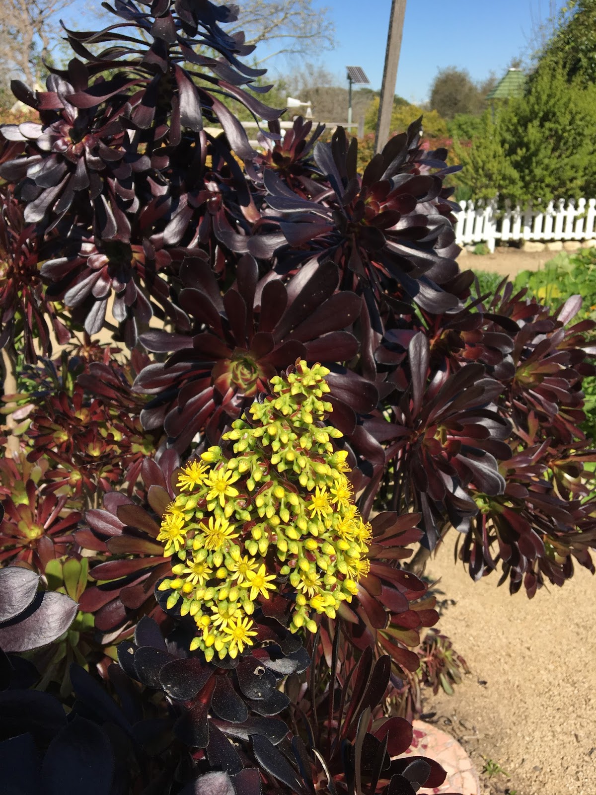
As my family and I were walking along the beachfront houses I saw these fabulous flowers, and thought the colors were amazing. Who would have thought the almost black succulent would have such a brilliant yellow green flower? It's even more amazing next to the hot pink flowers and the warm blue of the house behind.

We'd seen the same plant at the Arboretum a day before, and its colors had excited me then too.

The cacti are pretty amazing. This one was easily eighteen feet tall.

It rained yesterday. Very. Big. Deal. So unlike the California of my memory, this one is green. There is green everywhere. The grass is green, the flowers are blooming and there are actually weeds growing!

I've been eating some wonderful food too. I always try to eat things I could never get at home. The Carne Asada breakfast burrito at Phanny's was a revelation,


as was the cornflake crusted French Toast and Coconut curd at Manhattan House in Manhattan Beach. When the waiter came by to ask how the food was, I told him the Chef should be kissed it was so good!

And I just loved the Tortilla Scramble at the Ocean Diner. I took a picture of the description in the menu, because even though I knew I'd never be able to duplicate it exactly, it was something I want to try when I am back home.

I met a fellow Patriots fan while we were in Long Beach the other day, and was introduced to his two Airdales, one of whom was named.... Tom Brady, so the T-shirt has been a hit.


I've also had lunch with another California friend and quilter and spent a lot of time playing with the baby.

Funniest thing so far... was talking to somebody and somehow it came out that I was not a native Californian and would be going back to chilly New Hampshire soon.  This person's reply:

"Well, why would you want to do that?"

Why indeed.


Saturday, January 23, 2016

I'll Show You Mine...

Here are my sixteen blocks with the busy fabrics on the outside.

Kinda crazy, huh?  Yup, I like them too.

So here are the same 32 fabrics with the "calm" fabrics on the outside.

(Yes, I can hear you all saying... "But Lynne, that acid green Ogee patterned print in the top row of the second photo is hardly what I would describe as a 'calm' print...") It's true. Sometimes the "calm" prints can be a bit noisy. But that's not always a bad thing.

Next up, we are going to cut these suckers apart...

You will need a 6-1/2" wide x 24" cutting ruler. Fortunately, most of you already have one in your studios.  So, make your Square in Square blocks and I'll see you tomorrow for the next step!

Thursday, May 8, 2014

Sunny Yellow


It's easy to sew up a lot of scraps to make one of these blocks. It's a bit harder to sew up ONLY what's needed and not have a lot of of "chunks" left over.  In other words, these blocks (which are about 17" square or so) take a lot less fabric than you think they will.

I am happy with this sunny yellow block.

Wednesday, May 7, 2014

LAX Kinetic Light Sculpture

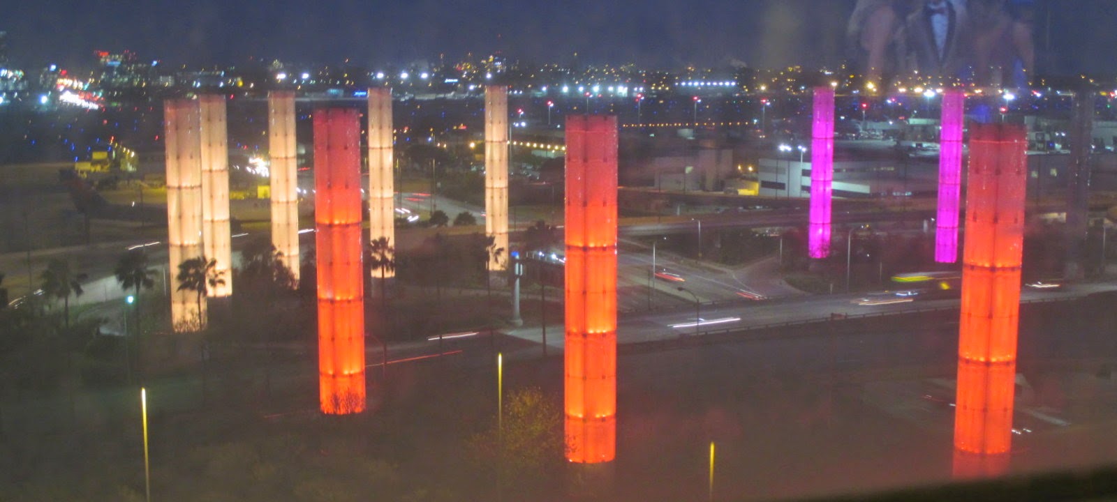
I'm home from Los Angeles and my son's wedding. Everything about the trip (Except my Mom's black eye) was perfect.  The night before we flew home, my Mom and I stayed at the Radisson hotel which overlooks the entry to LAX. (LAX is the abbreviation for Los Angeles Airport.)


These are the large towers or "pylons" outside the airport, as seen from our hotel room.


I've flown out of LAX before, and arrived there when it was still dark, so I knew the large towers were lit up at night

What I did not know was that they changed colors.


.


all night long.


It was totally and completely cool. I actually moved a chair over to the window so I could watch the towers change colors. They are "active" every night from dusk till dawn.

What a treat! I enjoyed it so much. My Mom said she hadn't seen  me so giddy in a long time.

You can read more about them here.

Tuesday, May 6, 2014

Orange!


The other night when I was sorting scraps, the orange bin was the fullest, (especially after making the Chicken quilt, with all the oranges in that) so I made this orange block.  Love, love love!

Tuesday, April 29, 2014

Color Blocks

It's fun to think all these blocks have come from the little scrap bins. I like this, and will need at least a dozen more blocks to make this big enough.

Even though the "Missing U" quilt from Sunday Morning Quilts has blocks made from only primary colors, I'll make a brown block and some blocks with only black and white fabrics, and I might even make a black block. It's fun to make these.

Thursday, April 24, 2014

It's Time...

When both work tables are covered in fabric to a depth of 18" it's time to clean. There's no room left to move anything over, and working becomes impossible. It's got to go.

Se the big bin on the far left? The one that's overflowing with fabric? Those scraps have to be sorted into the smaller bins on the table. As regular readers know, they are sorted by color.


The color blocks I have been making have come exclusively from fabrics in the little bins. I know there's a whole quilt in there, and I'm eager to see just how big a dent I can make in these bins.

I can see the red, orange, brown, teal and purple bins are overflowing. Guess which blocks I'll have to make next?

Sunday, May 26, 2013

More Colorful Crayons


I am liking this more and more. Since I got most of the housekeeping chores done on Saturday, I will have a lot more time to sew over the long holiday weekend.

Of course, I will also be watching the tennis at Roland Garros.

Friday, May 24, 2013

Bright Crayon

The light isn't very good here. The "C" is red-violet, the "r" is really a blue violet. The "s" will be red. That's all I know so far.  While these letters are made of only one fabric each, the others will be made from multiple fabrics. I have a plan. Sort of.

Which is just the way I like it.

Actually, that is always the way I like it. I hate being nailed down to one concept, I hate being made to follow a strict guideline. I see those complicated paper pieced compass roses (you know the ones that everybody does) and all I can think of is how I would do one differently. How I would break the rules and blow the whole concept to hell, yet make it knock-out awesome.  How would I do that?

I dunno. I'd figure it out.

Heh.

Tuesday, February 22, 2011

Nine x Nine Detail

Dolly commented yesterday that three letters in the same word were not the same size. That's not always the way I wanted it to be. The 'a' and the 'e' in chocolate are both too small. I made a mistake in each of them. I accidentally trimmed some elements (the crossbar in the 'A' and the top of the 'E') too thin.

Those two letters are fairly complex, and I had already made the 'A' once before, so I decided to just live with it. They are centered in the word more or less horizontally, because if I set them down on the baseline the word would have slanted downward and looked stupid.

HOWEVER... Notice the angle of the top loop of the 'a', the crossbar of the 't' and the top of the 'e' are all at the same angle? That was NOT accidental. That was deliberate, and serves to connect the letters visually.
Update:
PLEASE READ THIS: Ida, thank you for sticking up for me, but there is no need. Dolly left a lovely comment yesterday. My letters do have oddities, and her comment was in the vein of, "they aren't perfect, but they're perfect." I was pretty stoked!

I pay a lot of attention to how the letters look, and as regular readers know, I am a full believer in sharing my process. If there had been a goof, or mistake, my readers would have let me know long ago. If it's in the finished flimsy, it's there on purpose, and believe me, I KNOW about it.

This quilt was started way back in September with TURQUOISE, which I made to idle away a free afternoon. Back then I didn't know I had a quilt in the making. The whole quilt is actually a mini lesson in the possibilities of free pieced letter making. TURQUOISE, to me, is the way most beginners piece letters. A bit wonky, a bit uneven, but still very charming. The uneven letters are there quite deliberately.

AUBERGINE looks the way a quilter might make her second word, letters more even, straighter, more organized, more planned.

VERMILION is an example of a word that gets a little more inventive. Fabrics are "fussy cut".

The words get more creative after that, and also got somewhat trickier to sew. Regular readers know I made CHOCOLATE three times before I got the look I wanted.

In blogging, I open up my process for all to see. I value all comments, even dissenters. I'm not your average duck. I totally follow my own path, and it isn't traditional. I don't view the funky letters, the odd spacing, the irregularities as mistakes. I am using "artistic license". Quite liberally.

And enjoying every minute of it. Thank you all for your heartfelt support, and your thoughts!

Sunday, February 20, 2011

Nine x Nine

After a day of marathon handsewing, Nine x Nine is finished. I'd take it outside to photograph, but it's too windy. I am very happy with it.

Friday, February 18, 2011

Nine x Nine

My quilt "Nine x Nine" is back from Chris, who did the longarm quilting.
Now I am adding the binding and the hanging sleeve.
As you can see, Millie is helping.

Saturday, November 6, 2010

It's a Color, It's a Word, It's a Flimsy!

The last couple of evenings I have been adding fabric strips to the ends of the word panels, and then trimming them to make sure they are perfectly straight.

before sewing them together.
Now it's a flimsy, and it measures about 42-1/2" by 50" (113 x 127cm). I will trim the top and bottom down a bit. Right now the white space above NIGHTHAWK and below CHOCOLATE is 4" (10 cm) and that's too big.
I've squared it up and I stay-stitched the flimsy all around. Next I will get the backing ready, and it will go out to Chris next week.

Oh, you want to see the backing fabric, do you? Well my son said he would never have chosen it, "but it's perfect;" and the camera battery died, so it's charging.

Thursday, November 4, 2010

Either Or

I really like this arrangement of the colored words. It is reminiscent of a sunset. (It's the same one that is on the wall in this post.)

I'm not sure about the two lightest words - CHAMPAGNE and GOLDENROD. I'm a little worried they may look like a "hole" in the middle of the quilt. There's not much I can do about CHAMPAGNE anyway. It's color value is very close to the background, and photos just make it look worse. It's not going away, so as Tim Gunn says, I have to "Make it work!"

So I played with my paper strips, and tried looking at the colors in a light-to-dark arrangement. (and actually I worked it out before Davenandlo suggested it.)

It is a distinct possibility. I have to try it with the real strips, but I have been busy adding the binding and hanging sleeve to the Quick Brown Fox.

Of course, Millie has been helping.

Tuesday, November 2, 2010

How Do You...

How do you arrange the rows in a quilt when each row is over 40" long and to see them on your design wall, you have to go up and down a ladder?
The answer is, you find another way.
I printed a photo of all my colored words on a color printer, cut them apart, and then played with arranging them.I still haven't found a solution yet. But I'm much closer. And this is ever so much easier.

You thought I was joking, didn't you?