Showing posts with label Amish. Show all posts

Sunday, January 22, 2023

Snow...


We got some snow this weekend, but not all that much. It is wet and heavy, though, and my neighborhood lost power overnight on Friday night. I woke up about 3 AM and it took me a few minutes to figure out the power was out. The little motion sensitive lights lit my way around the house, so that confused my sleep addled brain the power was out. I called the power company to report the outage, and later got a message telling me when they expected to restore it. So I went back to bed. About 7:30 AM I heard the rumble of my heater, so that was good.

We are supposed to get more snow tonight into tomorrow, and it is likely I will work from home on Monday.


Here's the resewn Amish quilt. It's an improvement, although it's hard to tell. I'm not sure the quilt top can take being taken apart again so I am really going to have to think about my next steps. But it has got me back into the studio (even though it's a bit chilly in there!)

Saturday, January 21, 2023

Amish


WAY back in September 2015 I tried to recreate my all time favorite quilt. The inspiration quilt is in the foreground, and my attempt is on the design wall at the top. Sharp-eyed viewers will notice I got the proportions wrong.

I was poking around in my studio the other evening and found the bin of this top, the fabric and the four variations I later made. (More about those later.)

Anyway, as often happens, I couldn’t see what was wrong in real life when I made it,  but I saw it right away in the camera. While it looks like the red center square is too small, what it really is is the teal around it is too fat. I figured out if I took it all apart I could trim down the teal and put it all back together and it wouldn’t bug me so much.


So I got out my seam ripper and got started.

Stay tuned.


Saturday, November 7, 2015

Backing for Four Amish Daughters

Of the six Amish flimsies I made, I only plan to have two quilted, my interpretation of the original in solids, and the Four Amish Daughters, shown below.


Last night I pulled the leftover fabrics from each version and put together the backing for this one.

I chose the big print in the middle because I didn't want to use the red in the center of the back. I wanted something that would relate to the front, but not be an exact copy. That center fabric will be a big surprise to anybody who turns the quilt all the way over.

Sunday, September 13, 2015

Back to Back to Back

It's one thing to make a bunch of flimsies, it's quite another to make the backings for them. It's the part of making quilts I dislike the most.


I've got the backing done for the Triangle Dance. Here it is, wrong side up on the finished backing. I like to take pictures of the wrong side of my quilts.

For the Triangle Dance, I wanted to use more of the black on black fabrics I had kicking around. This was my starting point. Bleh.

This is what I eventually sewed up. Regular readers will notice the black on the lower left as the backing for the Spools quilt I made for my DS and DIL. The big print on the upper right is a Jane Sassaman fabric was used as a backing for the Black Rules quilt. The big Jane Sassaman print (with the bleeding hearts) was bought as a backing for something and I ended up using something different. So there's a lot that's been recycled here.

Sometimes you just get lucky. This is the solid Amish flimsy on top of the backing I selected.

It's perfect, the right tone of greens, and it's got violet and teal to boot. I knew immediately it was the one.

I made four blocks of twelve colors for the digital pinwheel quilt, and only used three of each in the flimsy itself, so I had one each left over and I decided to use some in the backing.  The other fabrics were from my stash. Three of them had been in there over five years. Time to get rid of them.

Here's the backing with the digital pinwheel flimsy wrong side up.


Three backings in one day. Phew!

 The next day I prepared the backing for the Blue Boy Rail Fence quilt. Woo Hoo!

Friday, September 11, 2015

The Four Amish Daughters

All Four of my Amish versions in one quilt.

I was talking to my pal Julie the other night about these Amish quilts and I said that I should fold all the flimsies next to each other so I could see how they looked like next to each other. Then I said that I could always just MAKE a quarter of each quilt and put them all together in one.


I thought it was a good idea, so what the heck.  I stayed up late (REALLY late) and got half of it done. The only reason I couldn't finish the second half was I needed to buy more of the green for two of the quarters.

You may wonder why the darker greens are on the left. It's because two of the quilts share the same inner Red, and I couldn't put those two sections next to each other.

The wrong side of the flimsy. Yes, all my quilts are this neat on the back, although I don't usually press the seams open.


If anything, these four serve as notice as to why it's a BAD IDEA to use all blenders, or all batiks or all prints of the same scale in one quilt. You need variations of scale to make any quilt a success.

Thursday, September 10, 2015

The Amish Flimsies Complete

I have finished all the flimsy variations of the Amish quilt. Here they are, starting with the original that I love so much, and my interpretation of it.

The original. Maker unknown, Lancaster County Pennsylvania, circa 1900.
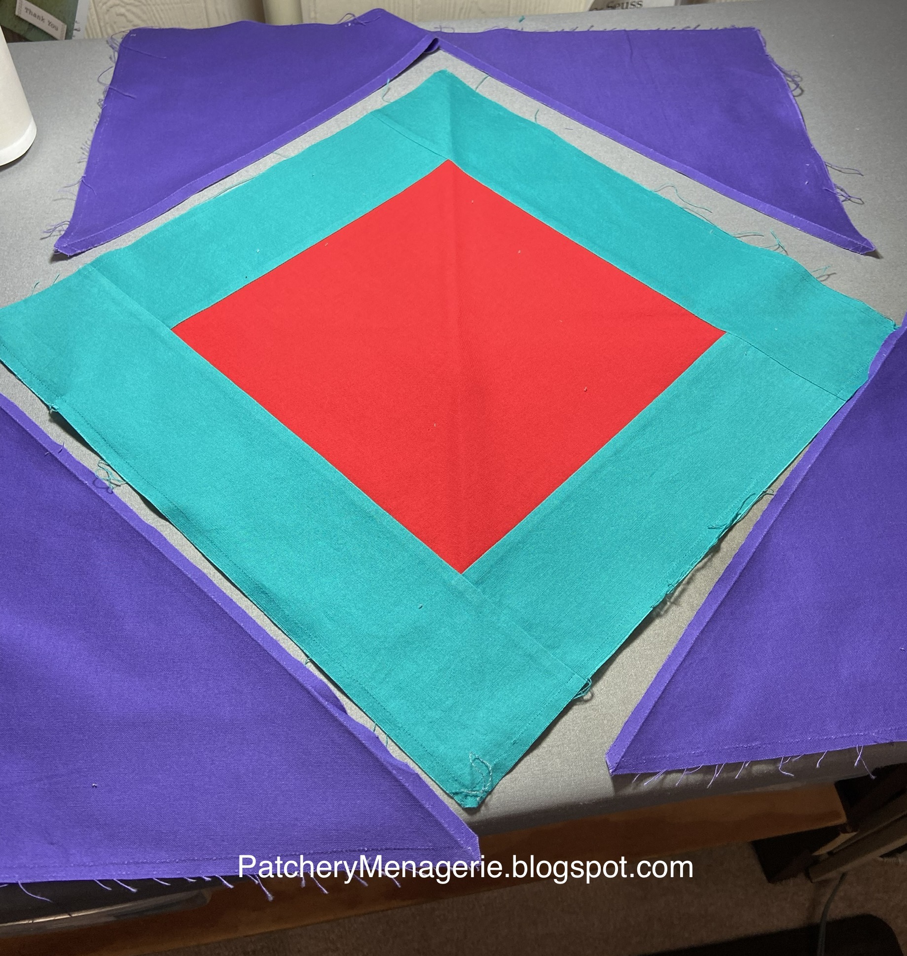
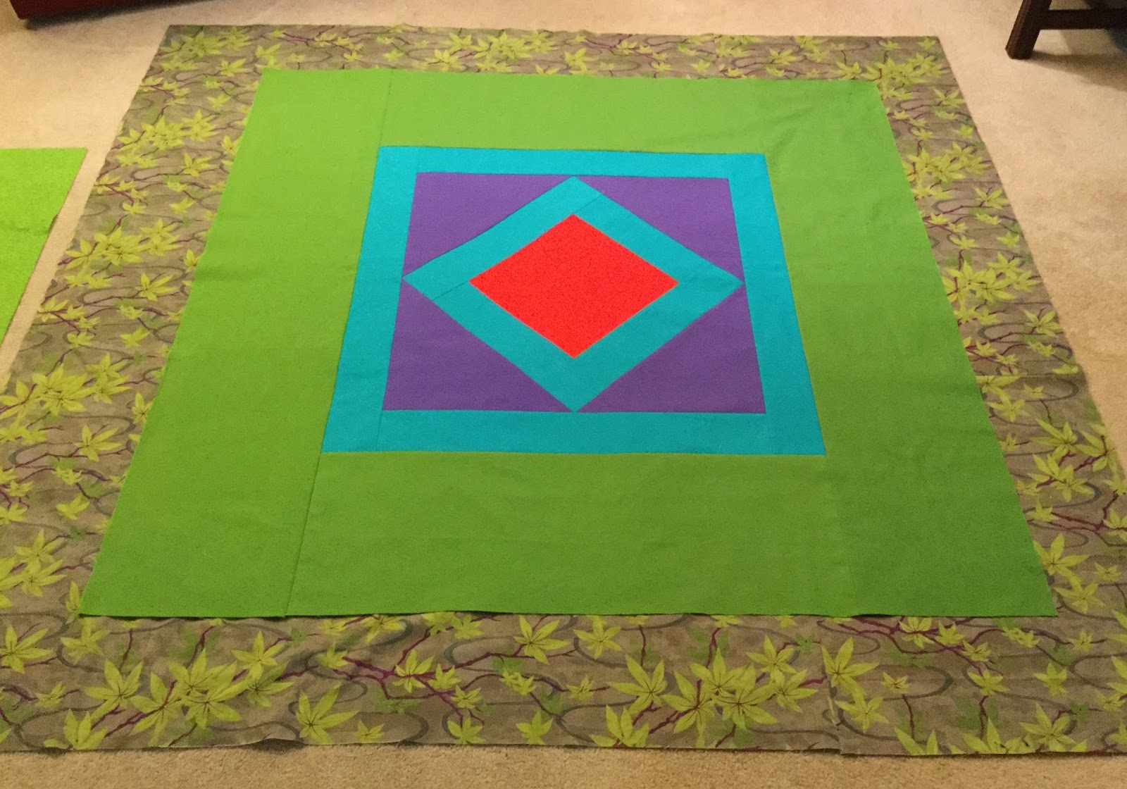
My version in solids. (Yeah, I know my center red square is too small.)

My version number Two, in blenders.

My version number Three, in Batiks. (Mostly, the center red square is not a Batik)


My version number Four, in prints.

My version number Five, which has prints and a Batik.


I sure do hope some poor lady in Pennsylvania isn't spinning in her grave.

The original, with its vibrant colors, simple geometry, and utter abstractness of design absolutely defines what it is I love about quiltmaking. It doesn't need one extra thing. So I am sure some of you are wondering WHY I felt the need to push the idea around and make four additional variations. Let me attempt to explain.

First of all it was a, "why not?" With a simple pattern that works, and using the same four colors, I was curious to see how different types of fabrics would affect the design. Actually I had a pretty good idea, but sometimes things happen in real life that you can't imagine in your head.

From my experience as a painter, I can tell you that you cannot make any color more intense than it comes out of the tube. Think of the color (and the fruit) Orange. In oil paint, you buy the color Cadmium Orange. Any time you add any other paint to that Cad Orange, you reduce its intensity. Translation: it becomes duller. It may also be lighter or darker, but it will NEVER be as intensely bright as it came out of the tube. So if you want it absolutely BRILLIANT, you try to leave it alone.

The original Amish quilt, and my variation, play on this concept. The colors are pure and intense, and the red alongside the cool teal is a complementary as well as a strong hot/cold contrast. The red center is also a complement of the green outer border. An important color lesson you should know is if you want to make a color APPEAR more intense, place it next to its complement. So if you want RED to look even more RED, then put it next to GREEN (the complement of Red is Green.)

The blender version is pretty close to the original, but because blenders are subtle patterns, they can't capture the brilliant intensity of the version with the solids. Like I said, they're close.

Every other version, the batiks, and both versions with prints, continue to degrade the intensity of the original colors, so the design doesn't have that same impact the original has, but the patterns in the batiks and the prints add different elements to make the quilts interesting.

And that's what it's all about. Taking something tried and true, so common you don't even notice it any more, and shake it up and make it look NEW. That's an experiment that's always worth doing.

So Lynne, you say.  Is there any way you can show me all four of those variations next to each other so I can really see how they are the same and how they are different?

Mais bien sur! (But of course!)

Check back tomorrow.


For those of you who want to see these fabrics in more detail, you can visit this blog post. You can also click each photo then double click for more detail.

Tuesday, September 8, 2015

Amish Variations

When I decided to recreate my favorite Amish quilt, I didn't think I do more with it, but once I got the fabrics home I couldn't help but compare the solids I had selected to the existing fabrics in my stash.


I thought, "Gee, wouldn't it be fun to push that idea around. How far could I go?"  Making a version with blenders would be one idea. Here is part of it. Actually, I think it's a snoozefest (translation: boring.) I don't have enough of the green fabric on the bottom to go all the way around. If I decide to finish it, I'd have to go fabric shopping.

Here's a batik version. I haven't sewn this up together yet. I decided to make these all the same size because, what the heck, I had the fabric and it was easier than recreating a new set of dimensions. I don't really consider this version particularly successful - the batiks are all too busy. In the real world I would use fabrics of different scales of pattern. Still though, it's a fun variation on the original.

I almost didn't make this one, but I'm really glad I did because I like it a lot. I'm not thrilled with the green here, but I was trying to find something that was a value match to the original. It's a tough green to find, and I wanted something with a largish scale. Still though, I count this as a success.

There's one other version in the works. It came about when I saw fabrics in my stash I thought might work. I'm really pleased I tried it, because I think it works. I'll have to go shopping for the green, but oh gee darn, how tough is that? This one just goes to show that sometimes the stuff out of left field is a lot more interesting than anything obvious. (Which is sort of obvious, really, because the obvious is usually dull as dishwater.)


*All these photos will enlarge when clicked, and then supersize when clicked again.

Monday, September 7, 2015

Amish Flimsy in Solids


 The easiest thing about this flimsy was putting it together.

 
The trickiest thing was figuring out how wide to make the teal strips. I worked it out on paper, but in the end I had to do it by eye. I thought I had it right, and then decided it needed to be thinner, so I made it thinner.

Then it was just "cut it up and sew it."

It was all a guesstimate, and I thought it looked OK.

I am not a solids fan, but these Konas are fabric that is a real pleasure to work with.

Compared to the original, I think I nailed the colors although I can see the teals should have been still thinner. I'm not going to do it over. Nobody's going to see the original anyway.

The flimsy is 45-1/2" square (115.5cm).


UPDATE:

FORGET IT! There's NO WAY I can look at this and not feel there's a problem, so yup, I took it apart...

 It was really a bummer to have to do this, but I did it, trimmed the teal strips down 1/4" and then I sewed it up again.

This time, I'm DONE. The quilt is 44-1/2" (113 cm) square. (Could the teal have been narrowed down a bit more? Probably, but I didn't want it to be too thin. The original is 78" square, so I had to guess to work out the dimensions, and in the end, I just did it by eye.)

By the way... If any of you saw the Quilts and Color show at the MFA in Boston last year, you cannot fail to remember how intensely the red and green quilts in the first gallery made you eyes go buggy. It's called simultaneous contrast, and it cannot be photographed. My quilt has that, and yeah, it's a lot better in real life.

Monday, July 27, 2015

Does This Look Familiar?

Pop Quiz. No prizes for correct answers. Just some fun.

Does this look familiar?

Yes, it's my attempt to match the colors in my favorite quilt ever. (I had a D'oh moment on Saturday when I realized the solid REDS at QT were around the corner from the oranges. Oops.) For you Kona nerds, the red is LIPSTICK, the teal is JADE, the blue violet is BRIGHT PERIWINKLE, the green is GRASS GREEN and the binding is DARK VIOLET.

Here's the original*.

You all know how I like to push ideas around. So how does this next one look?
 This is made with blenders. Practically simple (Not!)

Would you like to try another?
This one is mostly batiks. I'm trying to push this around a bit more than the other one, but still keep the basic feeling of the original. So how much farther can I go with this?  How about one more?

Actually the limits of how far I can are dependent upon how far afield I am willing to shop for fabrics and the bottom of my checkbook.

So, big question, am I gonna make all four?

Um, yeah, but the last three won't be very big. I really haven't decided how big any of these are going to be yet. I have to start drawing and then I'll know.


*The original, btw is... made in wool, 78" x 78", circa 1900, Lancaster County, Pennsylvania. The maker is unknown. I found it in the book Sunshine and Shadow, the Amish and their Quilts by Phyllis Haders, Universe Books, 1976.

Wednesday, July 15, 2015

Call Me Crazy...


Call me crazy, but I adore that Amish quilt that's on the screen on my computer, (you can see another photo here...) and I finally gave in and decided to make a mini version to have and to hold. I tried matching the colors on the computer, and obviously the orange that came with the others is too yellow. The quilt really needs RED, but I have red in my stash, so I think I'll be all set. 

Unlike my pal Valerie Levy, I am NOT a Kona acolyte, and have precious few solids. Solids do not sing to me. Instead, they generally groan. I find them flat and boring.

Yeah, I know. They work best when you have hundreds from which to choose, and I do not have the patience for hundreds. Don't bother correcting me, or cajoling me, or trying to convince me. I ain't going there.

I don't know how big my version of this quilt will be (certainly under 40" square) and I sure as hell don't know where I'll hang it, but this quilt has spoken to me for years and finally I am going to have one I can look at without having to remember which book it's in.

The original is in wool and is quilted in black thread, and I'll have mine quilted in black thread too.


I think.


Haven't got there yet.


Isn't life fun?

Tuesday, April 16, 2013

Inspiration

Sometimes, it's just the color that hits you.  This is a dark blue-violet with violet, lime-y green, aqua and sort of a cerulean blue with red. There isn't a color scheme program on the planet that's going to select these colors because they aren't based on some "rule."  But it's a terrific color combination that can have a lot of sizzle.

Then again, now that I think of it, the colors remind me of this.


funny how that works.

Tuesday, January 31, 2012

Favorite

This is arguably my most favorite quilt.  I don't know where it is, if it's privately owned or in a museum somewhere. We don't know who made it, but it was made about 1900 in Lancaster County, Pennsylvania.  It's 78" square made of wool and exquisitely hand quilted with black thread.

I'm reading a lot about Amish Abstractions, and my mind keeps coming back to this beauty. The vibrant colors just hit me. The simple geometry, the utter abstractness, in one image absolutely defines what it is I love about quiltmaking.

Could I make a wonky version? Nope.


It's from the book Sunshine and Shadow: The Amish and their Quilts, by Phyllis Haders, Main Street Press, 1976.