Showing posts with label blue ice. Show all posts

Tuesday, March 23, 2021

Ice Blue


I added a small deep space border to the Ice Blue quilt.

Here is the finished flimsy on top of the fabric I have selected for the backing. This quilt is going to be gorgeous. Or maybe "handsome" isn't a better term.

This isn't the quilt I had expected to make, but that is what making art is all about. It's about following an idea where it takes you, and if it's a dead end, then you have to switch gears and figure something else out. You can't judge your end result against the first IDEA you had. Because an idea is only an idea. It doesn't exist until you make it real. If I had not brought you all along on the road of this quilt from first inspiration to the final quilt, you would never know that I had stalled.

However, I do think the color story of the quilt matches the original color story I had in my head, and that works for me.


On to the next thing.


Sunday, March 21, 2021

Ice Blue Slides to the Finish Line!


My extra fabric arrived on Friday and I was able to get it through the washer and dryer before my "work day" ended so I could get right to it after dinner. (Actually I brought Megan's quilt to FedEx first.)

Gosh, it is so nice to work in a super clean studio. Nothing to shove over... I should do it more often (LOL).

By ten PM on Friday I had this. The top was all sewn together. The last step was to sew the blocks in the bottom two rows together. I wanted to get the top finished before I went to bed.

Mission Accomplished. Now I want to add a small border of the deep space fabric all around.

This is the fabric I have chosen for the backing of the Ice Blue quilt.

Tuesday, March 16, 2021

Blue Ice Laughing Out Loud


in 2009 I made this quilt, Laughing Out Loud. It is a takeoff of the "Reading in Bed" quilt in Freddy Moran & Gwen Marston's book, Collaborative Quilting

It was the first quilt I ever made with sashing and cornerstones, and it taught me something. If one fabric is used for the sashing, and if it is used well, the blocks appear to be floating above them.

When I started laying out the blocks for the Blue Ice quilt, I saw the two darkest fabrics wouldn't work the way I wanted, so I decided to use them as the spacers between the blocks, but when I stepped back, the dark solid looking fabric looked dead. Notice them around the block with the dragonfly in the center, above. Notice how the other spacer blocks with the deep space "stars" in them, appear lively by contrast, and they seem to connect to each other. 

I decided to use only that fabric for the spacers, but I didn't have enough. So I have placed an order for more of that fabric. As long as I was at it, I ordered the backing fabric, and something I might use for the binding.

Sunday, March 14, 2021

Blue Ice Close Up

I got up on Saturday morning, and went into the studio where I worked for three hours. Gail is right, the big light green block went. It was a warm green, closer to yellow-green than blue, and this is a predominantly blue quilt, that if anything, leans closer to a cool blue, and the light warm green was also a temperature contrast that just didn't fit in with the rest of the quilt. 

The cream and whites work because they have a lot of blue in them. There IS a lot of green in the quilt, but a greenish blue is a cool color, so all those blue greens fit right in. There is also a bit of blue-purple in the quilt, which is shown in the purplish fabrics - even the blueberries. So this quilt features blues that are in the green-blue, blue, blue-violet range. There are also some fabrics that fall closer to violet. 

The photographs in this post are full-sized, so the resolution when you click, and then click them again allows you to see all the details of the fabrics. There are 44 unique fabrics in this "blue" quilt.

This is the upper left corner of the quilt. Gail wondered why I put the warm light green in this quilt that is supposed to be "blue." The answer is because I always like to have something unexpected, something unusual, something to make my viewers pay attention, and reward the ones who do. In short, I like to break the rules, and yet make it so the rule breaking fits right in. 

You don't know this, but when I was cruising through my books looking for an easy pattern to play with, I wondered if I would make another version of Ola Pola, a quilt I made five years ago. Ola Pola has some unexpected fabrics in it, so that idea was in my head before I picked this pattern.

Ola Pola (named for a Ukrainian candy, the quilt lives with my friend Daniela, who is Polish and loves sweets) is a quilt that is predominantly orange, pink and cream. Some of the pinkish fabrics had bits of blue in them, so that is why I have some blue center blocks. But they also have some green, so I decided to include a green block. But the OTHER surprise in this quilt is that I added a light green center fabric to the center of an Orange block. The RULE for this quilt was the colored blocks had cream centers, the creamish blocks had colored centers. The light green in the middle of the orange block was chosen because I wanted it to look like a light color. 


 I knew I wanted to play with this same idea in the Blue Ice quilt even before I started cutting fabrics. In the end the warm green block didn't stay (it probably would have worked if it was a cooler green), but the warm green looks just fine as the center of some of the blocks. Remember I also cut some pink and red violet fabrics for blocks in this quilt, and I just felt they didn't work either. The plan for this quilt was "dark blue" and the pink and purples and warm light green didn't fit. Neither did the red rocket.

One final note about the purplish brownish fabric on the right - I KNOW it doesn't LOOK blue. I don't care that it doesn't. I don't want you to think it is. I want you to SEE it is different. My point in this quilt is that it is close enough in VALUE that it can WORK even though it is DIFFERENT. It does fall into the color range I decided to use in this quilt, but it is just enough outside the range to catch your attention and make you say, "Wha..?" 

My Number One Goal when I make my quilts is to draw the attention of my viewer and to Make. You. Look.

Gotcha!


Saturday, March 13, 2021

Blue Ice Grows

 I made another set of blocks and put them up on the design wall.

Even though I added some darks to the edges of the blocks, this still looks ok, but nothing to write home about.

So I straightened everything out, and then filled in the sides with the dark fabrics. I need two rows at the bottom to get this the size I want. And I am 90% sure that green box in the lower left is going to go, but when I got this far, and stepped back, I thought it was looking rather good.

I picked out some of my favorite of these fabrics, and then chose center fabrics for them and made about fourteen blocks, the set them up on the design wall and started tinkering. An hour or so later, I had this, and felt I was making progress.

After another hour, I had this. It isn't perfect, and I want to look at it in the computer before I start sewing it up, but I am getting closer. This is a LOT harder than it looks.


Also... It is so interesting to work on something like this and NOT get any comments. I can practically hear you all thinking, "I'm not sure about this." Or, "I'm going to have to wait and see what Lynne does." Or, "Gee, it's kinda dark." Naturally it is a lot prettier in real life, and I know I will have to make some changes. I can see blocks that don't really work, and I know I have to make more. I will talk about the fabric "spacers" in my next post, and which fabric works, which doesn't, and why.

Friday, March 12, 2021

Fun Stuff & Fixes

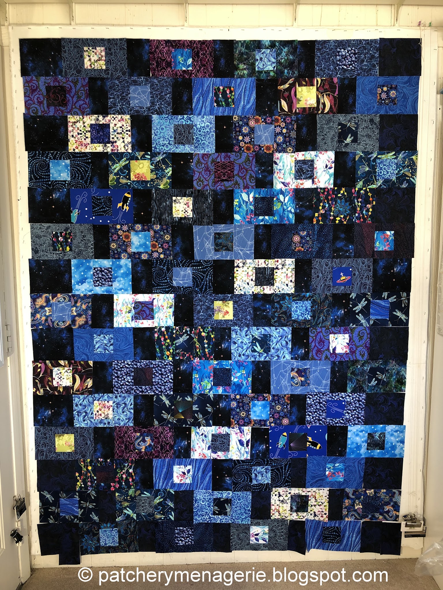
 If, when you look at your quilt, and you see stuff that bugs you, you should fix it. (You really should. DON'T fix it, and it will bug you every single time you look at the quilt for the rest of its existence.

Take these two green dragonflies, for instance. They are too much the same too close to each other, and they create a focal point on that block that I do not want to be there. 

It was a simple fix, and now it looks better.

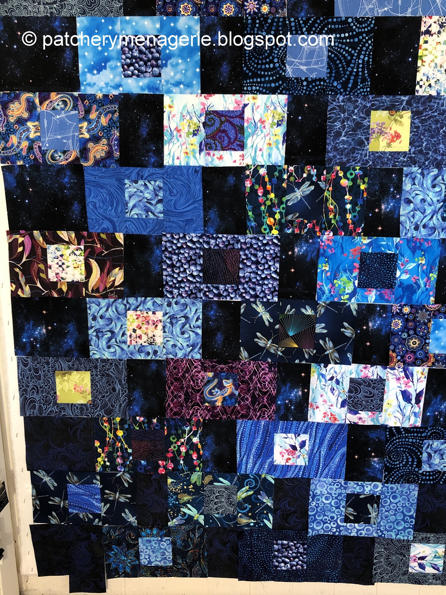
SOMETIMES you get ideas and you should act on them. Or at least try them out. With one of the background fabrics looking decidedly like outer space, when I noticed this scrap in my stash...

I thought I could fussy cut it to get a couple of the cute rockets and stars in a block.

Great block! Just what I was after.

Until I looked at in on the design wall when I stepped across the room. It was the biggest, brightest red orange thing on the wall, and my eye went RIGHT TO IT. (sigh)

I wanted the curious viewer to see it, but I didn't want to make the rockets "hit you over the head" obvious.

This is much better.

 I am going to use the little satellite in another block!

Regular readers know how much I like to fool my viewers. The light green center of the block on the right is one example. It clearly isn't white, or light blue, but there are enough light values in the quilt so the casual viewer might not notice it is green right away. I'm not quite convinced, but so far the presence of this light green in the quilt doesn't bother me. 

But look again at the fabric surrounding the green in the block above. It isn't black, and it isn't dark blue. It is a purplish brownish color. I am going to put it in the quilt anyway. Purple is close to the dark blue and the blue black I am looking for in this quilt, and more importantly this fabric exhibits another one of those color rules you know, but probably never put into words. It is this: Value trumps color. If you get a fabric close enough to the chosen value of another fabric, it will look like it belongs there, and not disturb the eye.

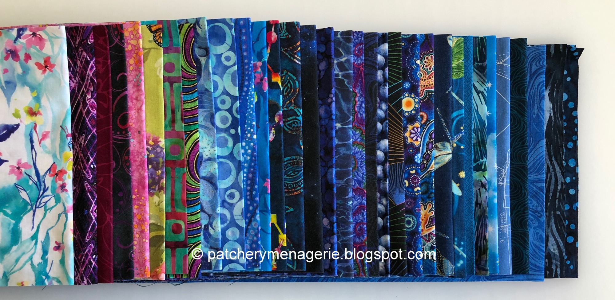
If you were in one of my classes, you would have heard me say, (if you, for example, said, "I can't use this, the color doesn't match...") "Don't be so darned literal. Back up. If you can't tell the difference from six feet away, your viewer won't either." This is another example of how you can get your stash to work for you You do not need to have a room full of fabric to find the right one to use. You just have to look at your fabric creatively.

I was at Quilted Threads last summer, and while I was waiting in line (six feet apart, masked), I happened to look over to where a lady and her husband were holding a pile of blue fabrics and conversing over a pattern the lady clutched in her hands. From where I was standing, six feet away, the four bolts the man held in his arms looked like the same color. I had to look away and think of something else. WHAT I REALLY wanted to say was, "Are you planning to use all four of those dark blues in that one quilt? Because from here they all look alike, and I don't know what you're planning to do with them, but unless you separate them somehow, they are going to look like one big blob and you aren't going to like it." Of course I kept my mouth shut.

What was the difference in the two situations? In my example, I wanted to fool the viewer into thinking the two fabrics were the same color. In the second, there was nothing to distinguish the various fabrics apart from a distance, and you know I've said more than once that you want to avoid areas in your quilts where there are too many darks clumped together, because it will read like a dark blob.

Finally, my friend Julie sent me this medallion to stick to my sewing machine. It's about the size of a quarter. As a member of the mask-making brigade, it is entirely appropriate.

Thursday, March 11, 2021

Adds & Deletes

 You probably noticed I added some fabrics to the blues I bought.

Here are some blues. Some of these I have had for a Very Long Time.

Here are some purplish/red violet/pinks. 

Here are some lighter fabrics and a busier one. IN THEORY, all these COLORS will work. Actually forget about theory, all these colors WILL work [together] in the right situation. The fabrics, we shall see.

Here are the blocks I made the other day. They look pretty nice. Remember, this is about one-third of the blocks, so there isn't a lot of thought to arrangement and virtually no variety.

In between the blocks you are supposed to put the "spacers" which are all the fabrics that make up the blocks. Uh, no. Pretty big no.

So I pulled all the bright prints and colors out and left in place the spacers that were the darkest fabrics. Immediately the horizontal blocks appeared to be floating in space just in front of the dark background. That meant all the blocks I had made with those two fabrics had to be replaced.
 

So I shopped my stash. Again, some of these are REALLY old.

The more I looked, the less I liked the pink, and the red violet, so I took those out. I tried using some of the teal test blocks I made the other night. Nah, didn't like those much either.


I do, however, LOVE these two new blocks. Both of these centers are digital prints, btw.

I dug out the dark fabrics and cut a lot of spacers. Never underestimate the usefulness of blue painter's tape. I needed 5-1/2" pieces. You all know how I hate measuring and how the lines on these rulers make me crazy.

I think this is a lot better. I am still not convinced that light green or the swirly multicolored fabric around it (upper right) is going to stay. And there is a teal blender in there that is so solid-looking, it "reads" like a hole, so that may go bye-bye too. And the blocks will be rearranged when there are more of them.

Yeah I know it's dark - it's dark blue, for heaven's sakes - but you can click the pictures and then click again for more detail.

So far so good.


Wednesday, March 10, 2021

33 Paired Up


Here are the 33 fabrics, paired up for the first set of blocks. There will be 3 sets. I wanted this set to be mostly low-key. Each fabric is used twice, once in the center square and once in the box around it. You ought to be able to see all the fabrics in this picture.


Step One.

Step Two.

Working on Step Three.

Working on Step Four.

This is what a block looks like.

Tuesday, March 9, 2021

Cut Up

These are the fabrics I selected for the new quilt. I wanted to have some colors other than blue in it, but I wanted it to be predominantly blue. That's the current plan. As usual, as I design the quilt, it may change.

I cut these wide strips on Sunday morning. I gave myself an hour in the studio (because I had other things to do) but in the end I worked for two hours, and got all the strips cut. Because the fabrics were folded, I had had to iron them first, so it took longer than if I had left them flat.

Later I went back into the studio and subcut the big strips into pieces. One of the things that is nice about the book is the accuracy and clarity of the cutting instructions. It makes a very efficient use of fabric.

This is not a complicated pattern. The shapes are simple. I stacked them up as I went along. 

At some point I looked up at the clock and knew that I wanted to finish cutting the pieces even though I was tired and my legs hurt from standing.

I did get all the pieces cut. (woo hoo).  Unlike the curves, I am eager to get started sewing this together.