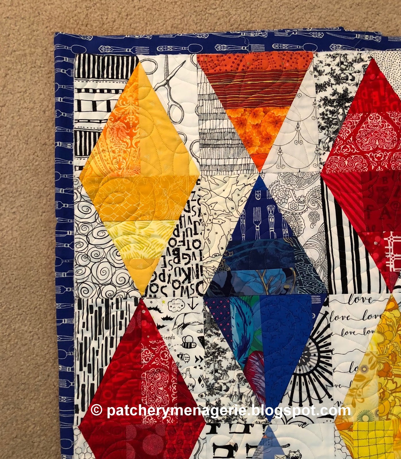
I drove out to Janet Lee's house yesterday to pick up the Sparkling Winkel and Dark Majesty quilts. What will I use for the binding of the Sparkling Winkel?
Light blue maybe?
Orange?
Yellow?
Dark Blue?
Or red?
Well, I'm leaning towards one of these, but I want to try some other options.
Here's a fabric with a lot of colors, but it disappears.
This is a cream, but the quilt disappears too.
This is a black and white and when cut will look sort of like piano keys, but these disappear too.
This fabric isn't in the quilt at all, and that's usually a no-no for me, but it has a lot of the colors in the quilt. But the edges still disappear, which I don't want.
Any of the colors would probably work well, but I have made up my mind. What do you think?


I am drawn to the blue. I wonder what you will choose?
ReplyDeleteJulie
I vote for light blue, if you're asking for opinions. Which I know you're not.
ReplyDeleteI'd vote for light blue or yellow, depending on the effect you're trying to achieve.
ReplyDeleteMegan
Sydney, Australia
I like the dark blue or red or even the orange. Something bright and fun to frame the quilt.
ReplyDeleteTry a black that reads solid.
ReplyDeleteHi Lynne,
ReplyDeleteI like it, when a quilt is "framed" by the binding, so I would prefer one of the dark colors. And because my favorite colors are yellow, orange, red I would take the red fabric.
I am curious, what you choose.
Many greetings from Germany - Beate
Since your mind is already made up, I would pick either the orange or the yellow with the orange being may favorite.
ReplyDeleteI like the fork-y darker blue best with the lighter blue second. But the red could also be a contender unless it becomes "too much" when it encircles the whole top.
ReplyDeletemy mind ??? ... ich think the orange ist my first!!!
ReplyDeletebut dark blue and red are also very nice ... maby you can make a multicolorbinding ...
happy stiching
Anja
I like the red, but the dark blue is my 2nd choice. I also like the idea of a multicolor with the red, dark blue and orange!
ReplyDeleteIf you want the border to indicate a full stop, then I like the dark blue or red options. But I have to say that I like the first multicolor--it looks like your colors are pixelating as they rush to join the quilt.
ReplyDeleteI truthfully like the orange. It's just seems to be the perfect edge. Not too bright, not to dark, just a good finish.
ReplyDeleteAn orange or orange/yellow-gold tone on tone would be my choice with these blocks. Bright and cheerful. It'll be fun to see what you have chosen.
ReplyDeleteI love the dark blue or the red! Your quilt is wonderful. Hugs,
ReplyDeleteI vote for the dark blue or the red.
ReplyDeleteI like both the blues.
ReplyDeleteCan I guess the darker blue print, or the orange. Both catch my eye
ReplyDeleteBeautiful quilts
Love the orange for the binding. The quilt is beautiful.
ReplyDeleteMy vote is for the lighter blue. And I LOVE to see all your black & white prints. What a collection!!!!! This is a beautiful quilt.
ReplyDeleteThe orange sings!
ReplyDelete