The flimsy isn't quite finished, but it's getting close. The word OBEY is too tall, and needs to be trimmed. I haven't sewn the last hidden fun to the IF YOU panel yet, and I need to add a bit of black at the bottom, and square up the sides. This is shaping up to be a favorite.

So why do these letters POP so much? A couple of reasons...
First, visually, light areas always pop forward, and big dark areas recede. You can't get darker than black, so the most intense light/dark contrast will always be black and white, but lighter colors against black will really attract your attention.
Secondly, we see color when light hits an object and reflects back at us. Different colors absorb different amounts of light. White
reflects all light back at us, black
absorbs all of it. So bright colors next to black appear to really jump out at you.
A more intense color will jump out at you more than a less vibrant one. Think of an orange (a real orange you can eat).

You can't get a BRIGHTER orange than an orange. If you make it lighter, it loses some intensity, it gets a bit duller. It's the same thing if you make it darker, you lose the intensity, the brightness. (I swiped this picture from
earthinpictures.com)
I used a lot of bright colors and bright fabrics in this quilt, so they really jump out. In the White Rules,

the brightest color is probably the big pink F, but that doesn't have as much light/dark contrast as the U next to it. These colors are much more subdued than the colors in the black quilt.
The letters "YOU OBEY ALL THE RULES" are exactly the same in both quilts. I used the same fabrics. Actually, the reason I made TWO quilts was to show how differently the same colors look when using a white, then a black background.
Amazing, isn't it?
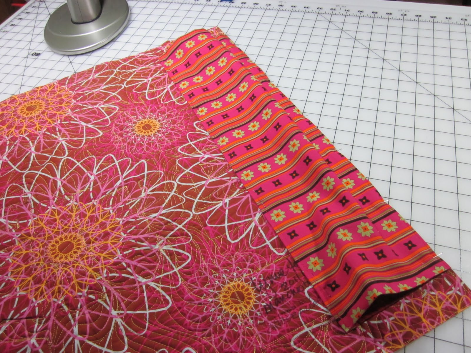
 I like to use large prints on the backs of my quilts. The back of a quilt is a big area, and if you use a small scale print, it just looks... boring. I like BIG prints. I simply adore a lot of the Westminster fabrics, and the large Kaffe Fassetts, and Jane Sassaman, who designed this fabric.
 Yeah, I know these colors are not quite perfect for the quilt, but they match the feel of it, and it's my quilt, so I can break the rules if I want to!
 I had to piece two lengths together to get the backing wide enough (the quilt is 50" wide, and the backing has to be 12"bigger...) Fortunately the repeat wasn't big, and I was able to match the pattern with no loss. Woo hoo!