 I used the same fabrics and the letters are made the same way in each word. This is a good example of how the background fabric affects how letters look.
Monday, January 31, 2011
Rules
The letters in each of these words are about 4-1/2" tall.  I used the same fabrics and the letters are made the same way in each word. This is a good example of how the background fabric affects how letters look.
I used the same fabrics and the letters are made the same way in each word. This is a good example of how the background fabric affects how letters look.
Sunday, January 30, 2011

Saturday, January 29, 2011
Breaking The Rules
My pal Julie has been following my Rules quilt closely, and when she saw I wasn't going to use the black and white word "RULES" in my quilt, she asked me to send it to her, so she could use it on the back of the quilt she is making (using my orphans.)
I looked at it the other night, and didn't see what was there... I saw what it could be.
 Remove the "R", substitute a "J"; add an "I" between the "L" and the "E" and you get...
 When that was finished, I looked over and saw the letters "R and "S" looking lonely, and knew they needed a "C, "H", and an "I" to become:
 Chris, our friend, who does the spectacular longarm quilting on our quilts, and will quilt this one when it is finished.
I knew Julie wanted the letters right away, because she was ready to work on the backing. I mailed the "Rules" letters on Wednesday.
Thursday morning I woke up with a brainstorm, and when I got home from work that night, I went into my sewing studio and got right to work. Friday morning I sent Julie another word panel, and let her know something else was coming her way.
Friday afternoon I got an email from Julie, surprised and happy to receive the name panels. "Any chance you can make B&W letters for Lynne and send them to me... I have an awesome idea."
"And what do you think was in the envelope I mailed to you this morning?" I wrote back.
 Great minds (and great friends) think alike!
I looked at it the other night, and didn't see what was there... I saw what it could be.
 Remove the "R", substitute a "J"; add an "I" between the "L" and the "E" and you get...
 When that was finished, I looked over and saw the letters "R and "S" looking lonely, and knew they needed a "C, "H", and an "I" to become:
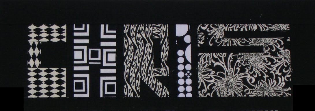 Chris, our friend, who does the spectacular longarm quilting on our quilts, and will quilt this one when it is finished.
I knew Julie wanted the letters right away, because she was ready to work on the backing. I mailed the "Rules" letters on Wednesday.
Thursday morning I woke up with a brainstorm, and when I got home from work that night, I went into my sewing studio and got right to work. Friday morning I sent Julie another word panel, and let her know something else was coming her way.
Friday afternoon I got an email from Julie, surprised and happy to receive the name panels. "Any chance you can make B&W letters for Lynne and send them to me... I have an awesome idea."
"And what do you think was in the envelope I mailed to you this morning?" I wrote back.
 Great minds (and great friends) think alike!
Friday, January 28, 2011
Shark
 The new iron is a Shark lightweight. I use steam, and I hate emptying the water reservoir when I am finished working.
 I've bought expensive irons, and I've bought cheap ones, and I've bought "mid-range" ones. They all seem to have a finite life span. So now I resign myself to getting a new iron about once a year. When I buy an iron, I usually want it Right Now, so my selection is what's limited to what's on the shelf at whatever big box store I'm in. But I want an iron that gets HOT (1500 watts as opposed to 1200), a large water reservoir, a stainless steel soleplate and a LONG cord. Nowadays you can't seen to get one without the "auto off" feature, which is a PITA for quilters.
This one is lightweight, which is nice. It's easily maneuverable, and it's smaller than most models.
It's not like I'm going to iron clothes or anything like that!
Thursday, January 27, 2011
A Little Dull
 Ok, here is a dull "the" in soft greys. I think it works with "RULES." Now the real fun begins.. making the remaining letters completely unique.
(I bought an iron at one of the big box stores on my way to work yesterday morning.)
Wednesday, January 26, 2011
Tuesday, January 25, 2011
The Rules, again, again, again
So I was thinking about the word "RULES" and what I could do to make them different. I got to thinking.. what is it about "Rules" (in this context) that makes them so... negative?
Limiting
Restrictive
Uncreative
Closed-minded
Dull
DULL! That was it! I could try to make the word look DULL! Can you see it? These colors are less intense, more washed out, more low key.
 I dunno if it totally works, but I like this version of the word better than the black-and-white letters.
Dolly, can you see the "O" now? You should click the photo to enlarge and see what I did in the middle of it.
Limiting
Restrictive
Uncreative
Closed-minded
Dull
DULL! That was it! I could try to make the word look DULL!
 Can you see it? These colors are less intense, more washed out, more low key.
 I dunno if it totally works, but I like this version of the word better than the black-and-white letters.
Dolly, can you see the "O" now? You should click the photo to enlarge and see what I did in the middle of it.
Monday, January 24, 2011
The Rules, again, again
I had this idea for making the word RULES in only black and white fabrics.  When I see it here with the bright colors against the black, I think it looks washed out.
So I have to come up with a better idea.
 When I see it here with the bright colors against the black, I think it looks washed out.
So I have to come up with a better idea.
Sunday, January 23, 2011
What's Up?
What's up on my design wall?  Letters. I'm having a grand time. This picture (which you may click, then click again to enlarge) shows how Tonya has changed my life. Yup, those free pieced letters completely redirected my quilting mojo.
 Letters. I'm having a grand time. This picture (which you may click, then click again to enlarge) shows how Tonya has changed my life. Yup, those free pieced letters completely redirected my quilting mojo.
Saturday, January 22, 2011
Black and White
I've been wanting a Rules quilt of my own for a long time, but didn't want to do the same thing over and over. I decided I really loved the rhythm of the long narrow negative spaces that go vertical and horizontal in these letters.

So I just decided to go for it. Actually I made the letters with the white backgrounds first, but while sitting at my desk at work yesterday, I had a brainstorm, so when I got home I made the letters with the black backgrounds. I do have a plan for where each of these is going to go, and they won't be going to the same place.

So I just decided to go for it. Actually I made the letters with the white backgrounds first, but while sitting at my desk at work yesterday, I had a brainstorm, so when I got home I made the letters with the black backgrounds.
 I do have a plan for where each of these is going to go, and they won't be going to the same place.
Friday, January 21, 2011
more letters
 I just had to play.
 I am so amazed at what Julie has done with my "misfit" letters. She's done things I would never have considered... and I think are so awesome! I absolutely cannot wait to see what she does next, how the whole thing turns out.
It just goes to show the benefit of another point of view. All the pieces I sent her had been consigned to my "dud" bin. I have a feeling there won't be anything "dud-ly" about this quilt.
Julie, honey, you gotta keep something a surprise though. I want to be able to discover things when I get it!
Thursday, January 20, 2011
Another Christmas Present
 My friend Margaret gave me a gift card to Target for Christmas. I don't often shop at Target, so I spent an hour there the other evening looking around. When I saw this, I knew it was coming home with me.
 I love it! It's height adjustable, on wheels, and it's comfortable! Amazing how much difference it makes! Woo hoo!
Monday, January 17, 2011
The Fox Moves
 I was looking at my Quick Brown Fox quilt, and decided it wasn't being displayed to it's best advantage in the dining room, so I moved it into my bedroom. It didn't look right there either, so I moved it into my sewing studio.
It looks just right, and I love looking up and seeing it there.
(I did not make the four smaller quilts that flank the Fox. Two are swap quilts from the Doll Quilt Swap, and two are gifts from the Doll Swap Mamas.)
Sunday, January 16, 2011
Grandmother
 My family is French-Canadian so this is our term of endearment for a grandmother. It is pronounced "mim-may." (And don't you go correcting me if you think different.)
These letters haven't been trimmed or sewn together yet. That lower case "m" needs a bit of T.L.C., which it may get.
Saturday, January 15, 2011
Family
 Usually when I make a word, I trim the letters to the desired height (within 1/2") before I sew them together. This time, I didn't.
Looking at the photo, I want more space between the "A" and the "M", and less space between the "F" and the "A."
Oh well.
This word may or may not be part of a quilt I have been rolling around in my head. I know the words I want to use, and the extra components I want to include, but I have no idea how they will fit together, so I figured I should just start making things and I'd figure it out as I went along.
Tuesday, January 11, 2011
A Christmas Present
This is what my son gave me for Christmas.  Yes, it's one of those Bluetooth wireless headsets you wear over your ear so you can talk on your cell phone "hands-free."
When I opened it, I am pretty sure I didn't look very excited.
My son spoke up, "Mom, I hate the idea of you trying to get your cell phone out of your pocket when you are driving."
"But," he continued, "you don't have to use it only when you are driving. "With this, you can talk to me when you're sewing."
Suddenly, it became my very favorite Christmas present! He's right. The thing works like a charm, and I can (and have) used it to talk to him when I am working in the sewing studio, as well as while cooking.
I'm so lucky to have a great kid like him! Is it any wonder I'm crazy about him?
Here are some more blog posts about him: Here, here, here, here, here, and here.
 Yes, it's one of those Bluetooth wireless headsets you wear over your ear so you can talk on your cell phone "hands-free."
 When I opened it, I am pretty sure I didn't look very excited.
My son spoke up, "Mom, I hate the idea of you trying to get your cell phone out of your pocket when you are driving."
"But," he continued, "you don't have to use it only when you are driving. "With this, you can talk to me when you're sewing."
Suddenly, it became my very favorite Christmas present! He's right. The thing works like a charm, and I can (and have) used it to talk to him when I am working in the sewing studio, as well as while cooking.
I'm so lucky to have a great kid like him! Is it any wonder I'm crazy about him?
Here are some more blog posts about him: Here, here, here, here, here, and here.
Sunday, January 9, 2011
Rolling in the Deep
My son played this song for me the other night, and I went wild! I love it and wanted to share.
It's by a singer named Adele, the song is Rolling in the Deep, and her website is here.
Enjoy.
(Since Blogger cuts off part of the image, you'll have to click the video itself to see it on youtube, or click the link to see the full thing. And it's worth it!)
It's by a singer named Adele, the song is Rolling in the Deep, and her website is here.
Enjoy.
(Since Blogger cuts off part of the image, you'll have to click the video itself to see it on youtube, or click the link to see the full thing. And it's worth it!)
Saturday, January 8, 2011

Thursday, January 6, 2011
The Best Ideas...
A spiral bound book will stay open and lie flat. Julie told me I could have a book spiral bound at Staples or Kinko's. I had bought an extra copy of Tonya's book to use in a classroom setting, and thought having it lie flat would be useful.
 So I brought it to Staples last night and they did it while I waited.
The cost? $2.99.
The best ideas can often be very inexpensive. This is a keeper!
 I had bought an extra copy of Tonya's book to use in a classroom setting, and thought having it lie flat would be useful.
 So I brought it to Staples last night and they did it while I waited.
 The cost? $2.99.
The best ideas can often be very inexpensive. This is a keeper!
Subscribe to:
Posts (Atom)